︎︎︎Projects
+ Work In Progress
2025
︎︎︎beyondthevines.com
Also a current web designer for beyond the vines.
Desktop and mobile, banners or other information update according to product launches, upcoming events and store openings
Coming soon - revamping “the vine club’ page and entire website colours theme.
Assisted in art direction.
2025
︎︎︎BTV Paraseries Exhibition
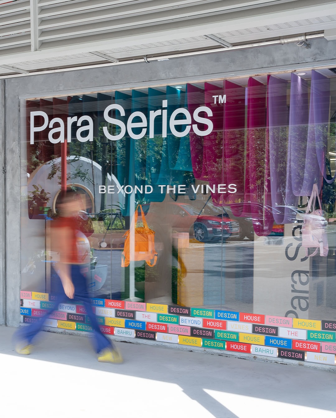
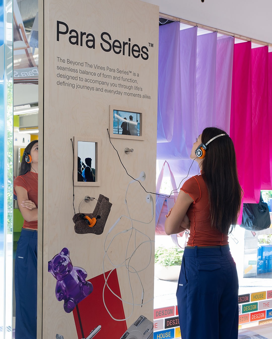
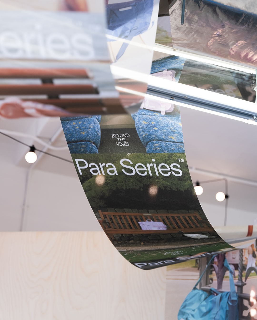
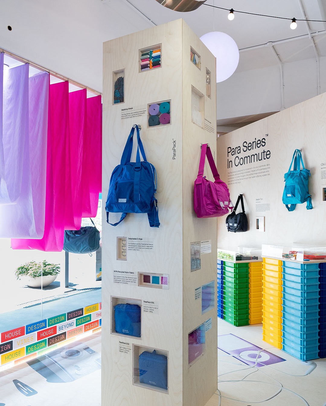
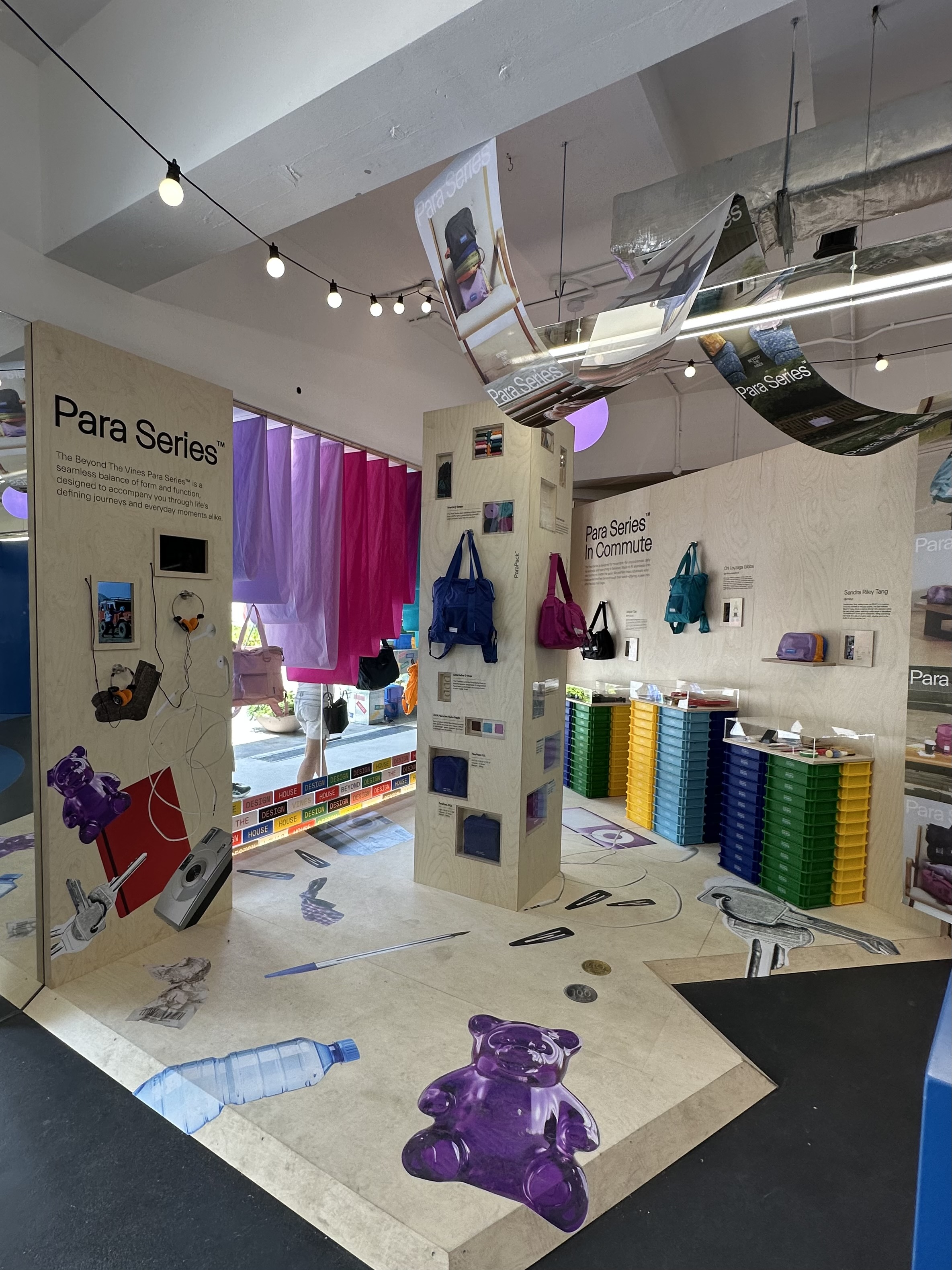
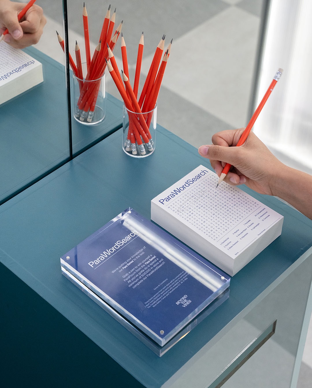
Para Series Exhibtion graphics — Posters, wall/floor text and stickers, wordsearch sheet.
Assisted in art direction.
Photos not by me.
2025
︎︎︎BTV x Fassbenderandmelloncollie
(Tie Dye Workshop)
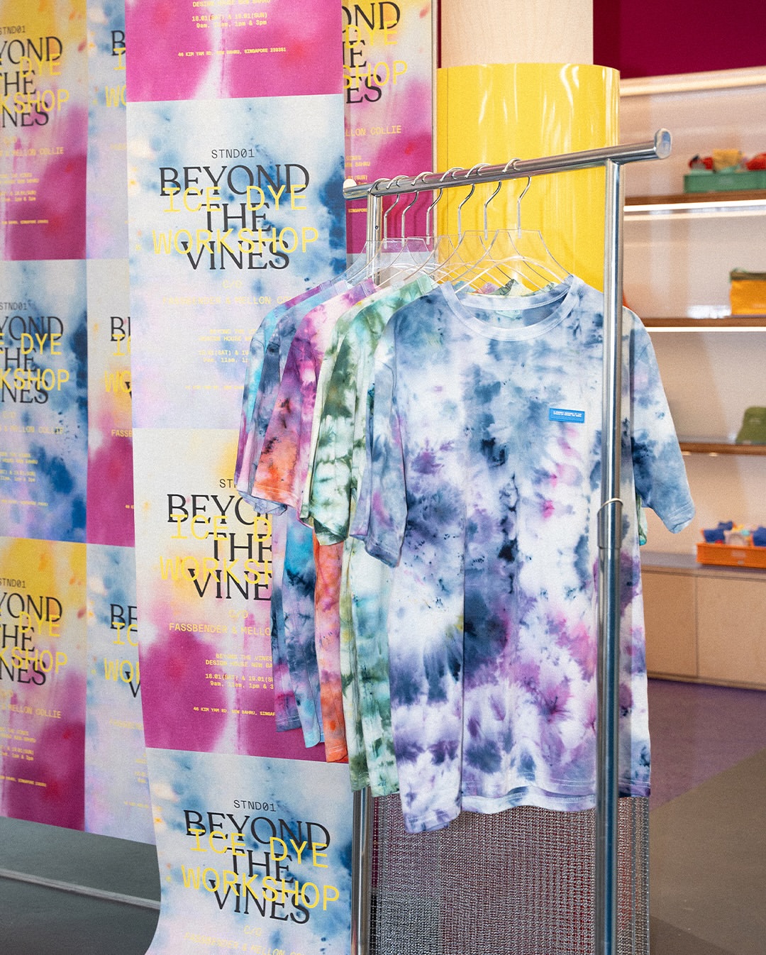
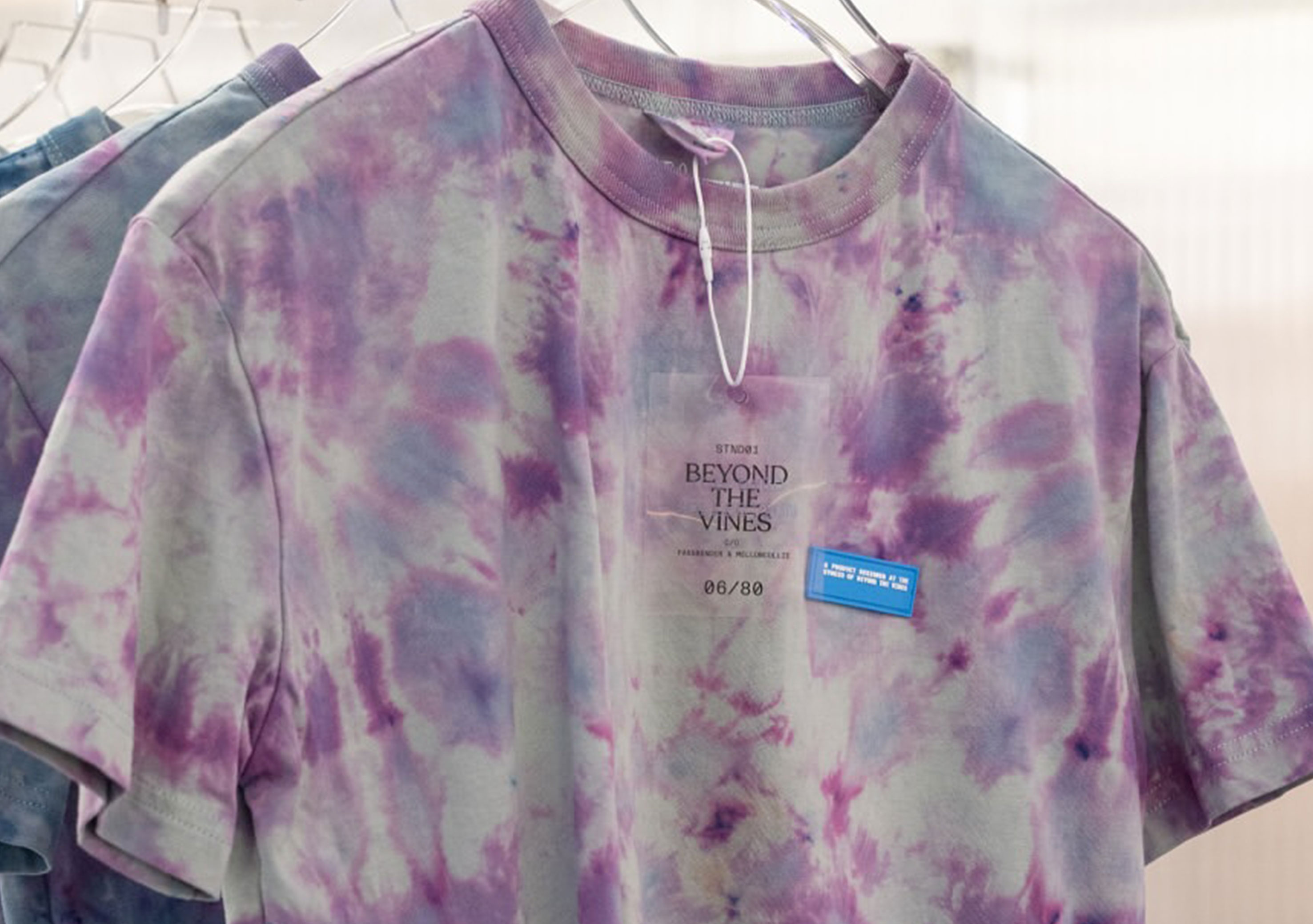
Tie dye workshop event graphics — Posters, T-shirt Hangtags.
Assisted in art direction.
Typography layout by me. Photos not by me.
2024
︎︎︎BTV Festive Merch
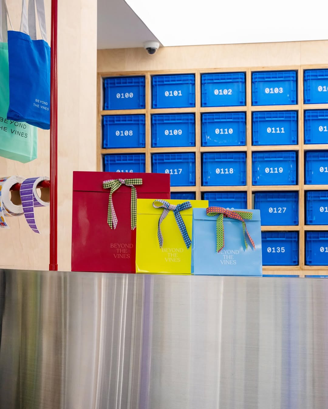
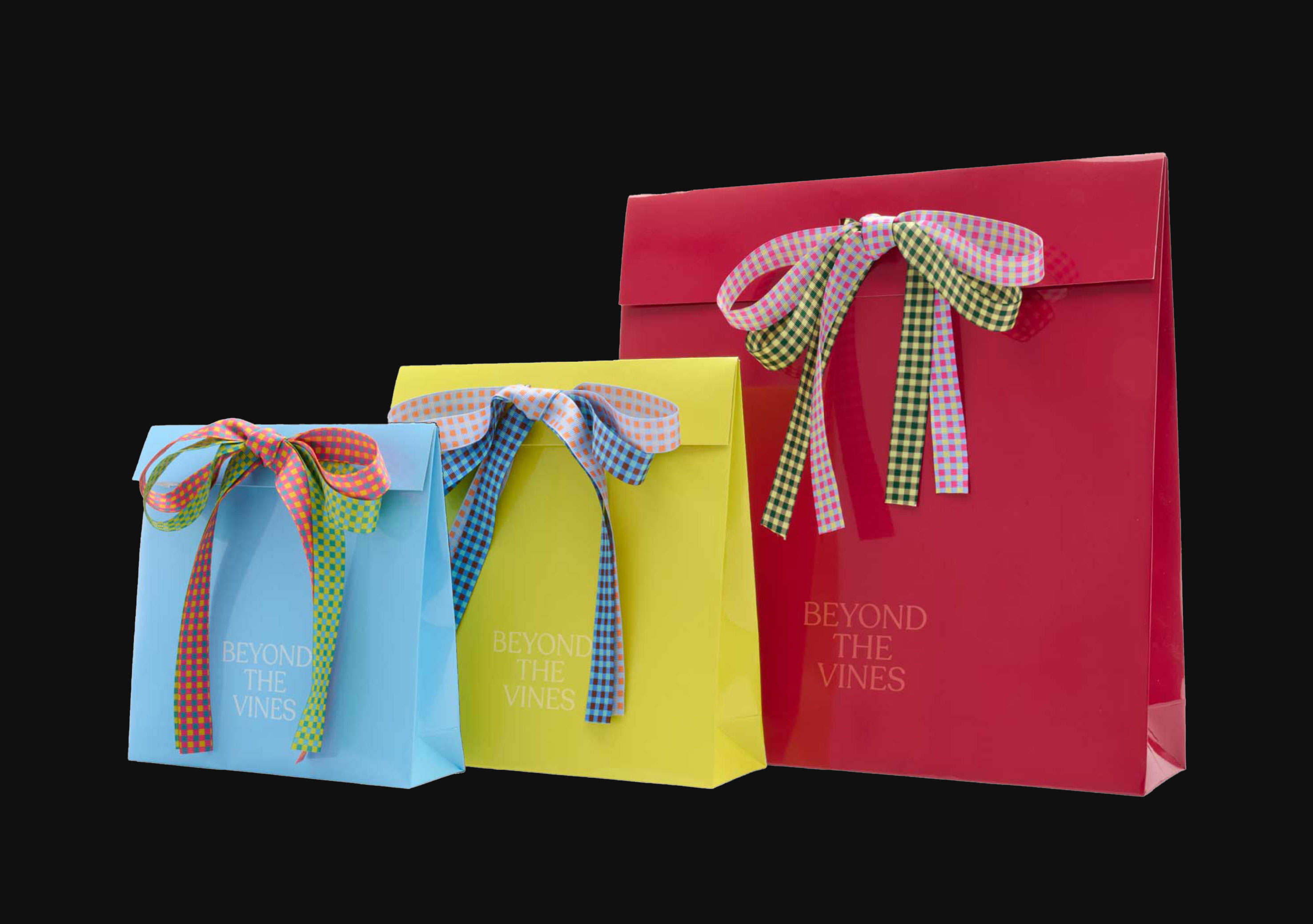
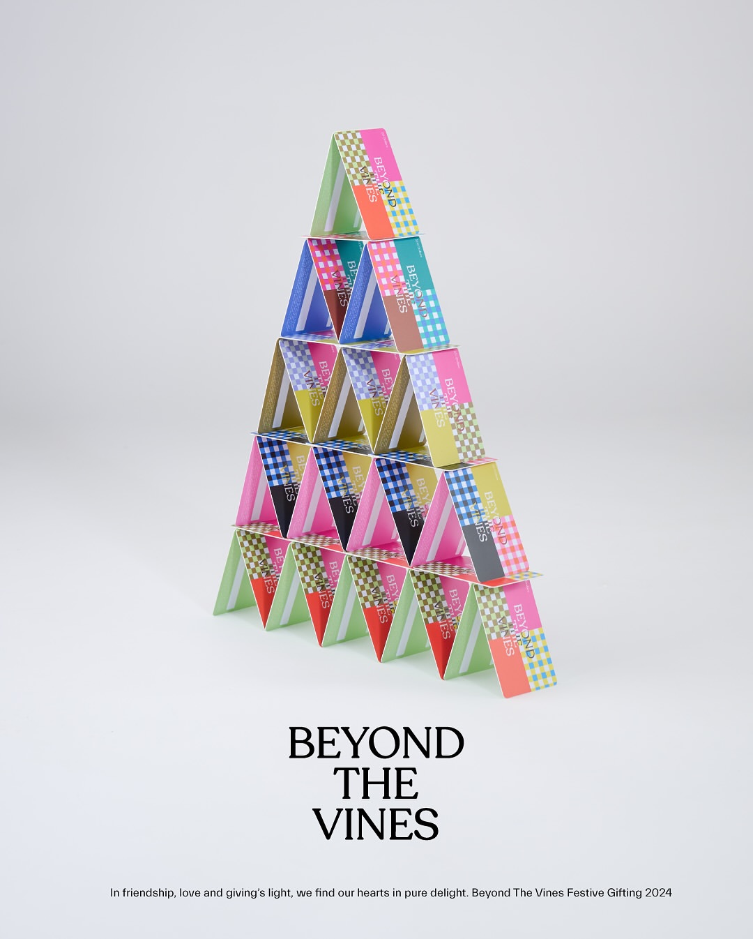
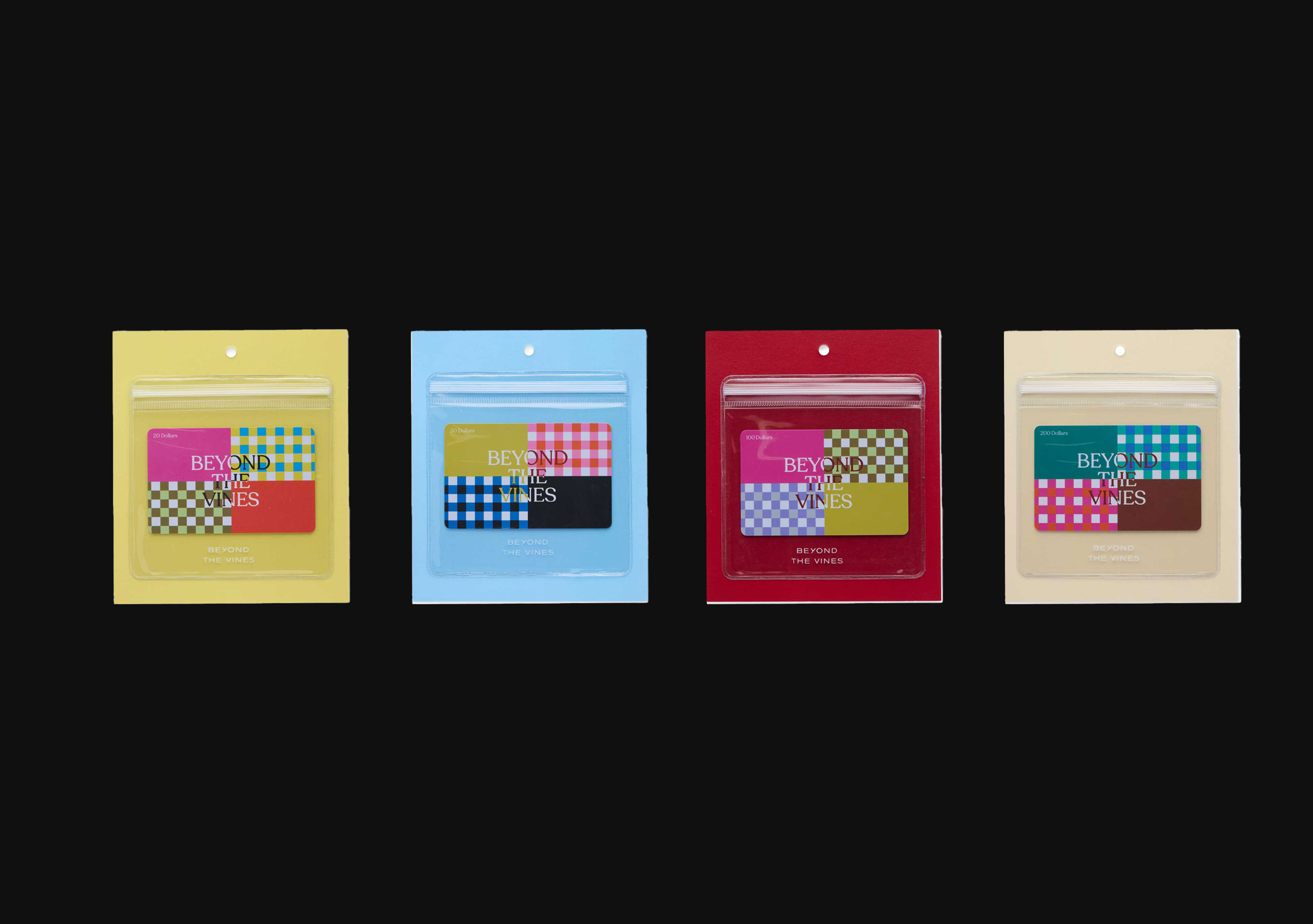
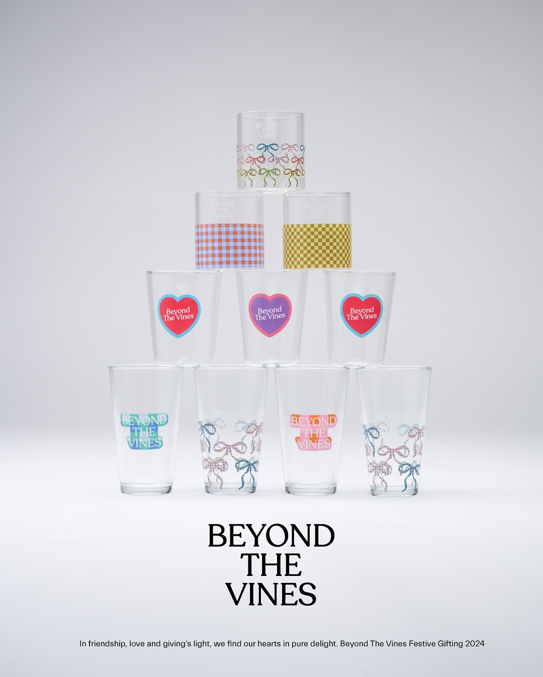
Festive graphics on merch — gift wraps, cups, tumblers and gift cards.
Assisted in festive art direction.
Typography layout for socials by me. Photos not by me.
2024
︎︎︎BTV New Bahru Launch
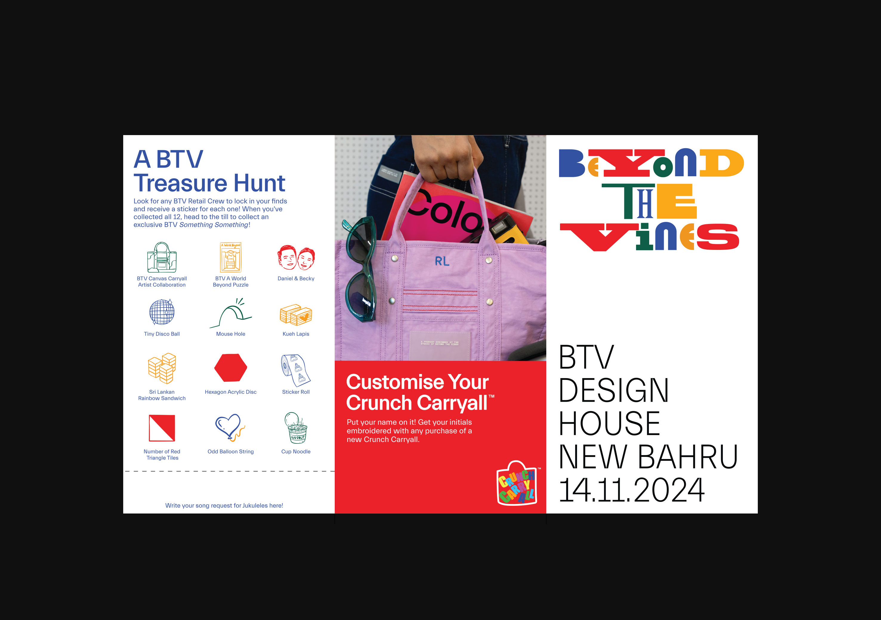
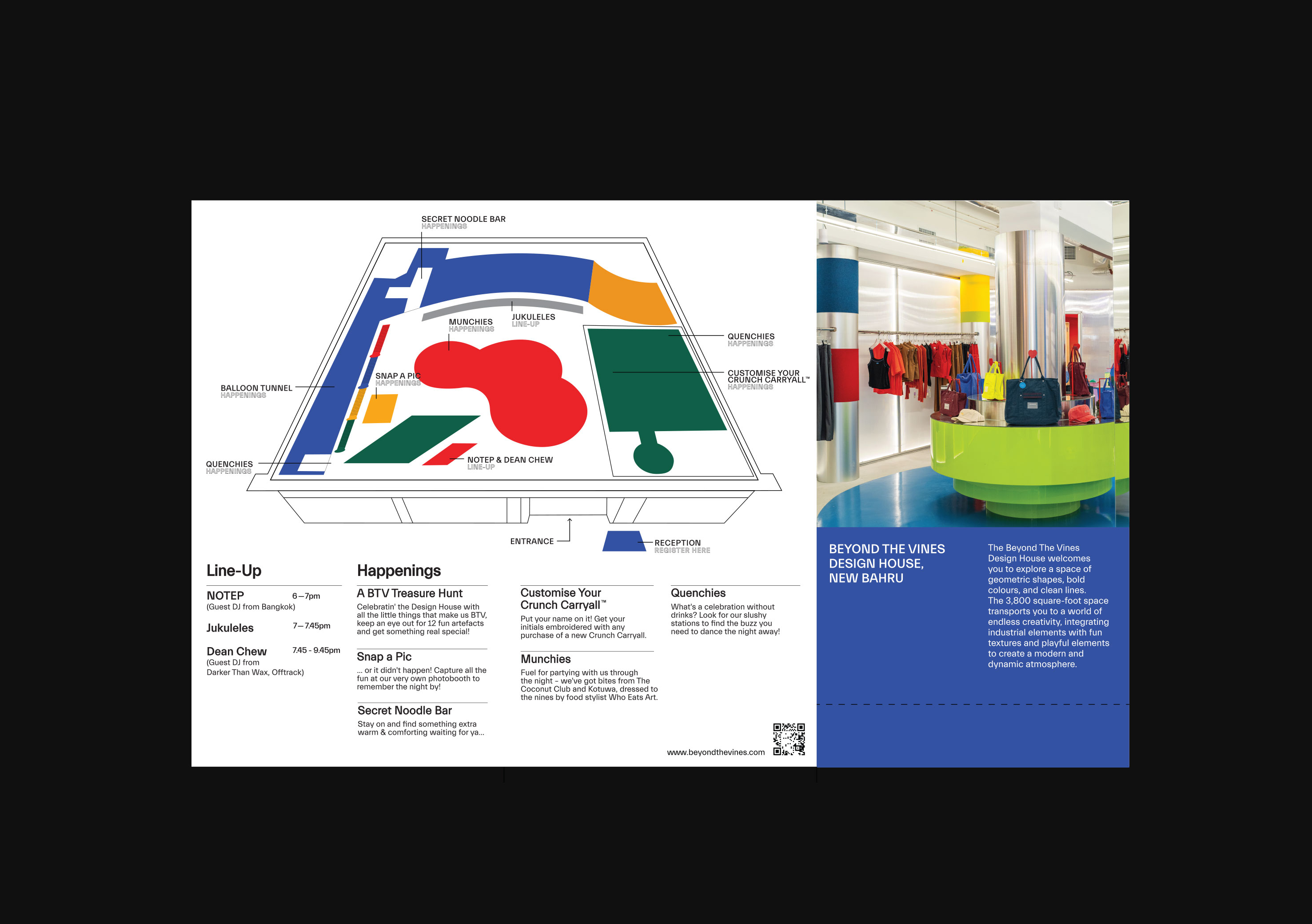
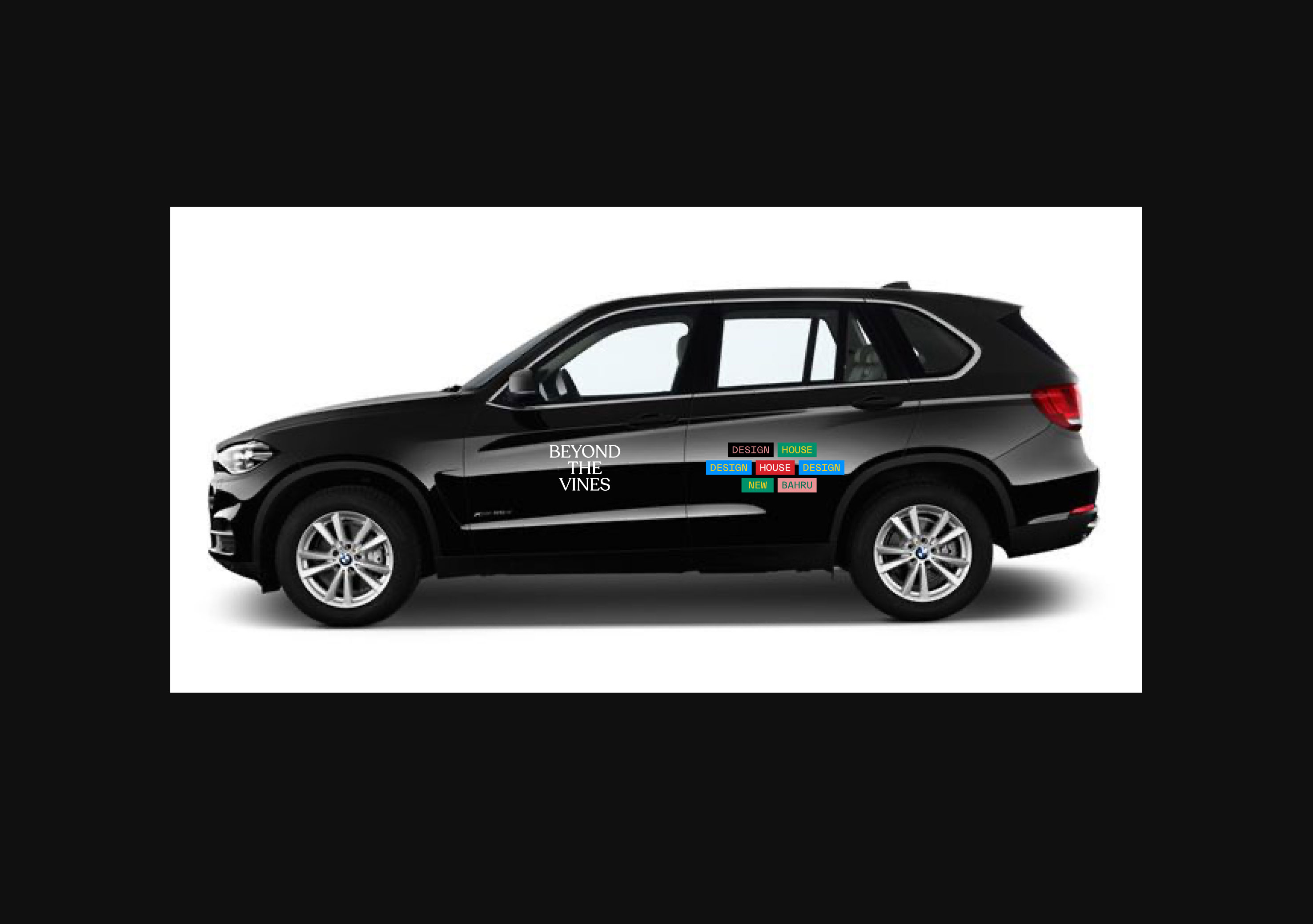
New Bahru Launch party brochure, photobooth, car decals etc.
Store photos not by me.
2024
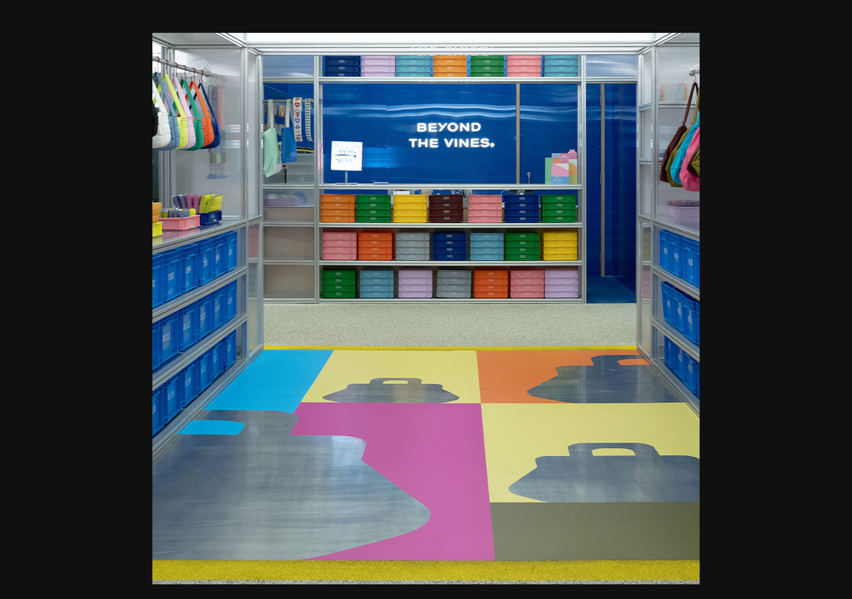
︎︎︎BTV Infographic Wall
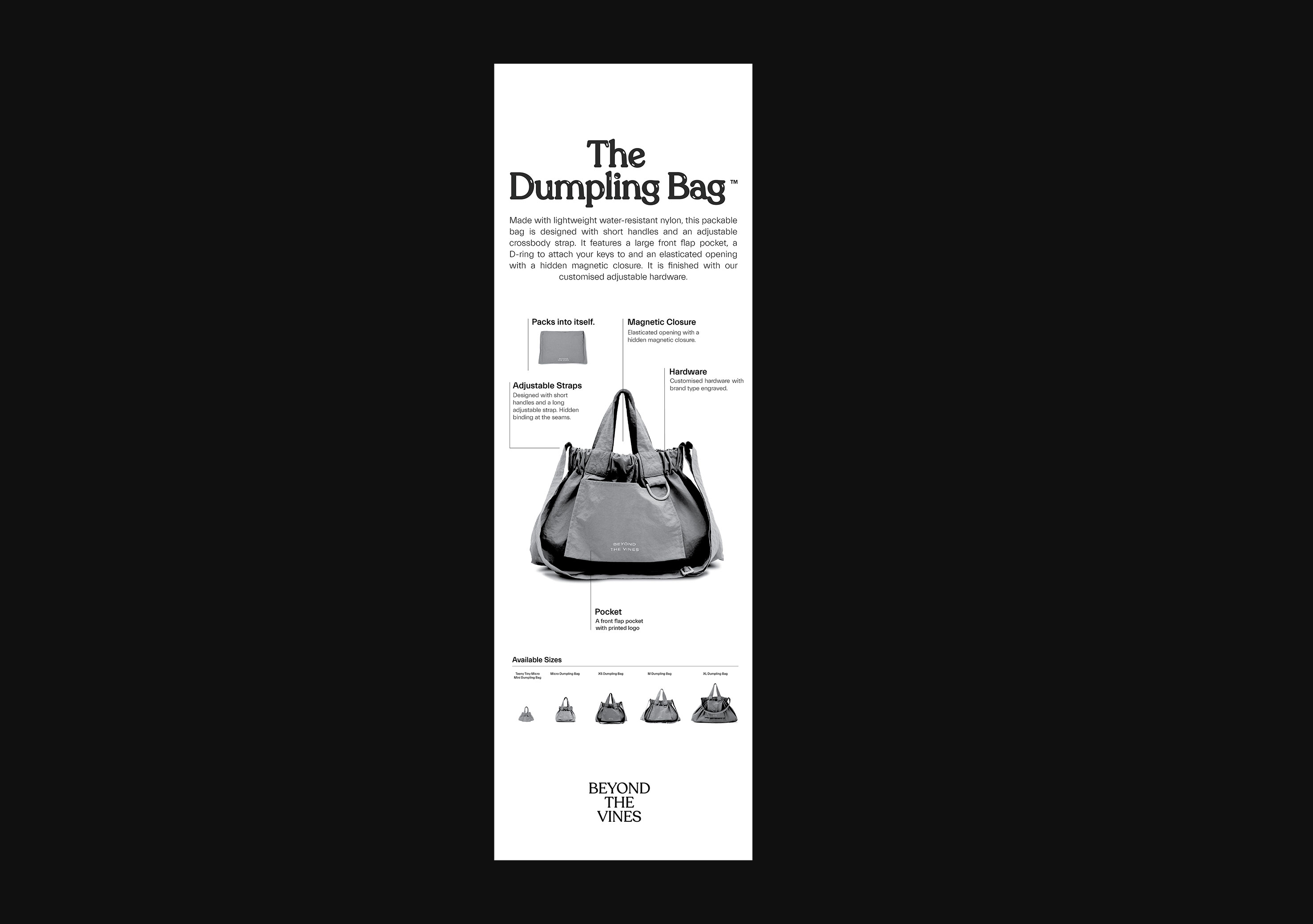
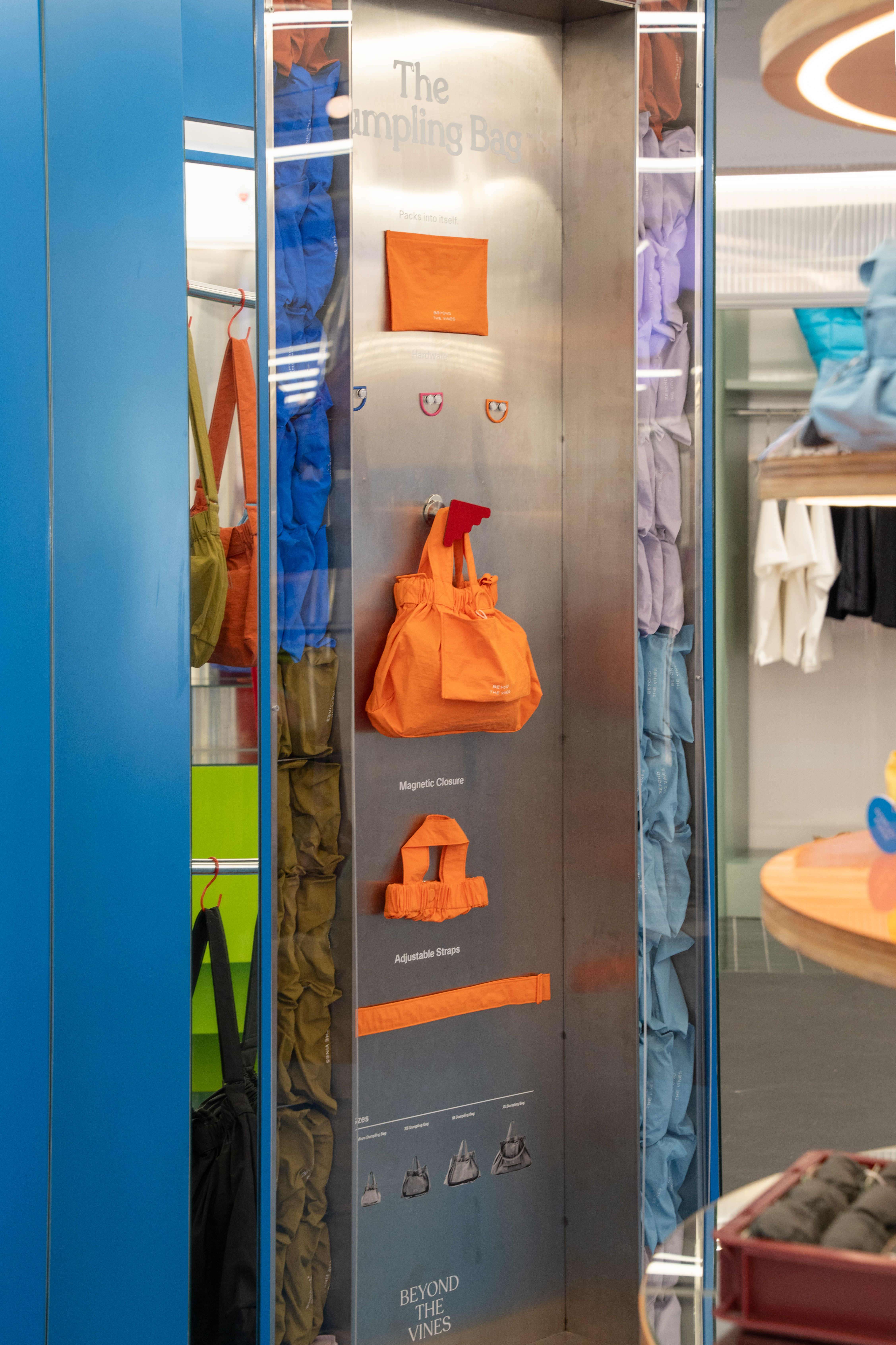
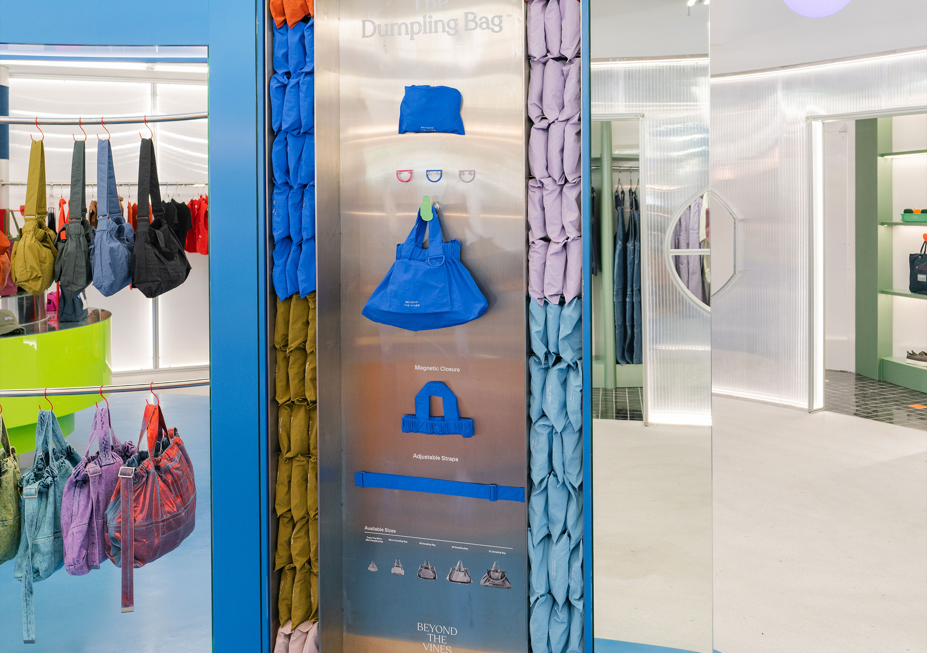
Bag infographic wall in stores.
Store photos not by me.
2024
︎︎︎BTV Seasonal Dumpling Campaign
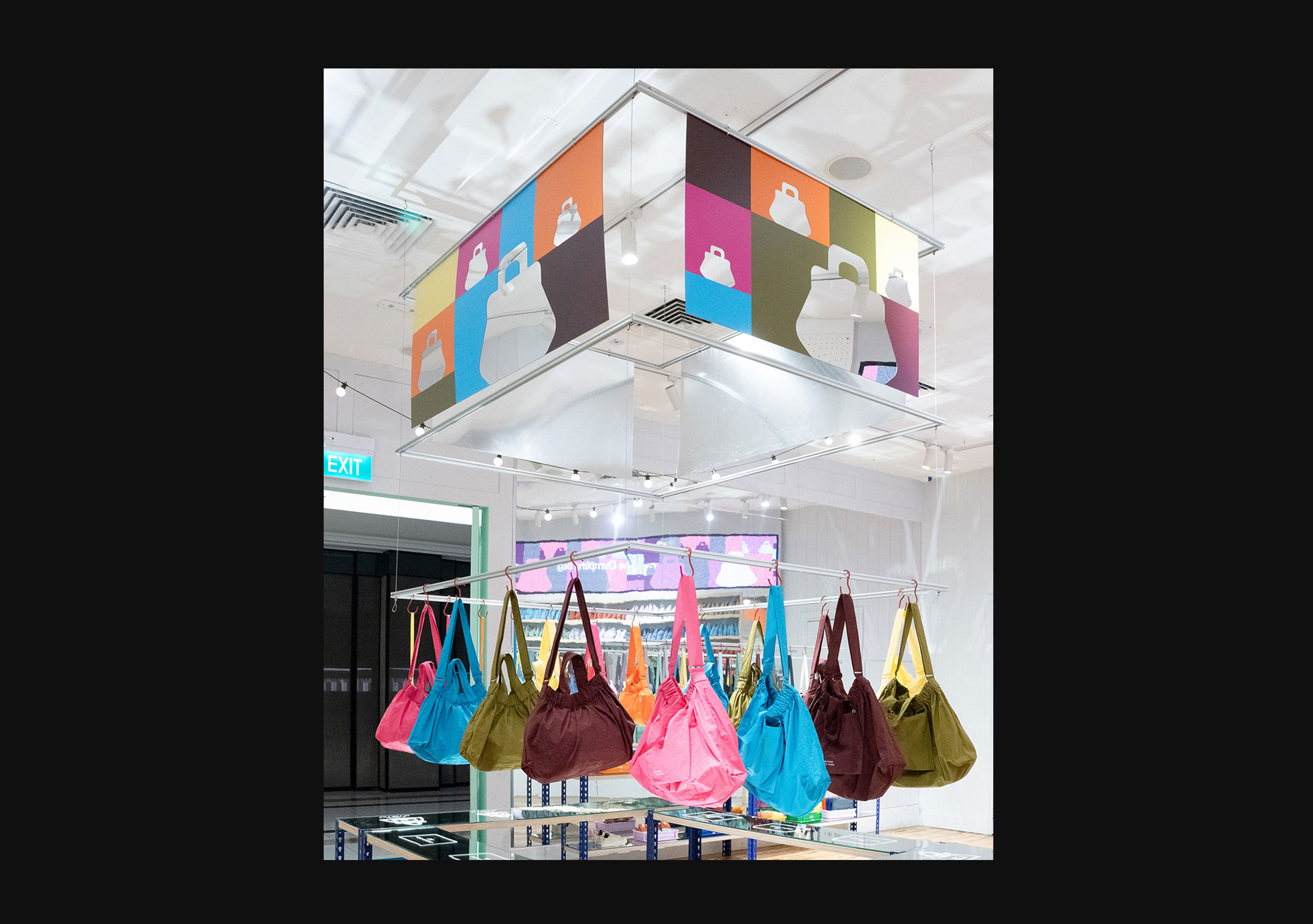
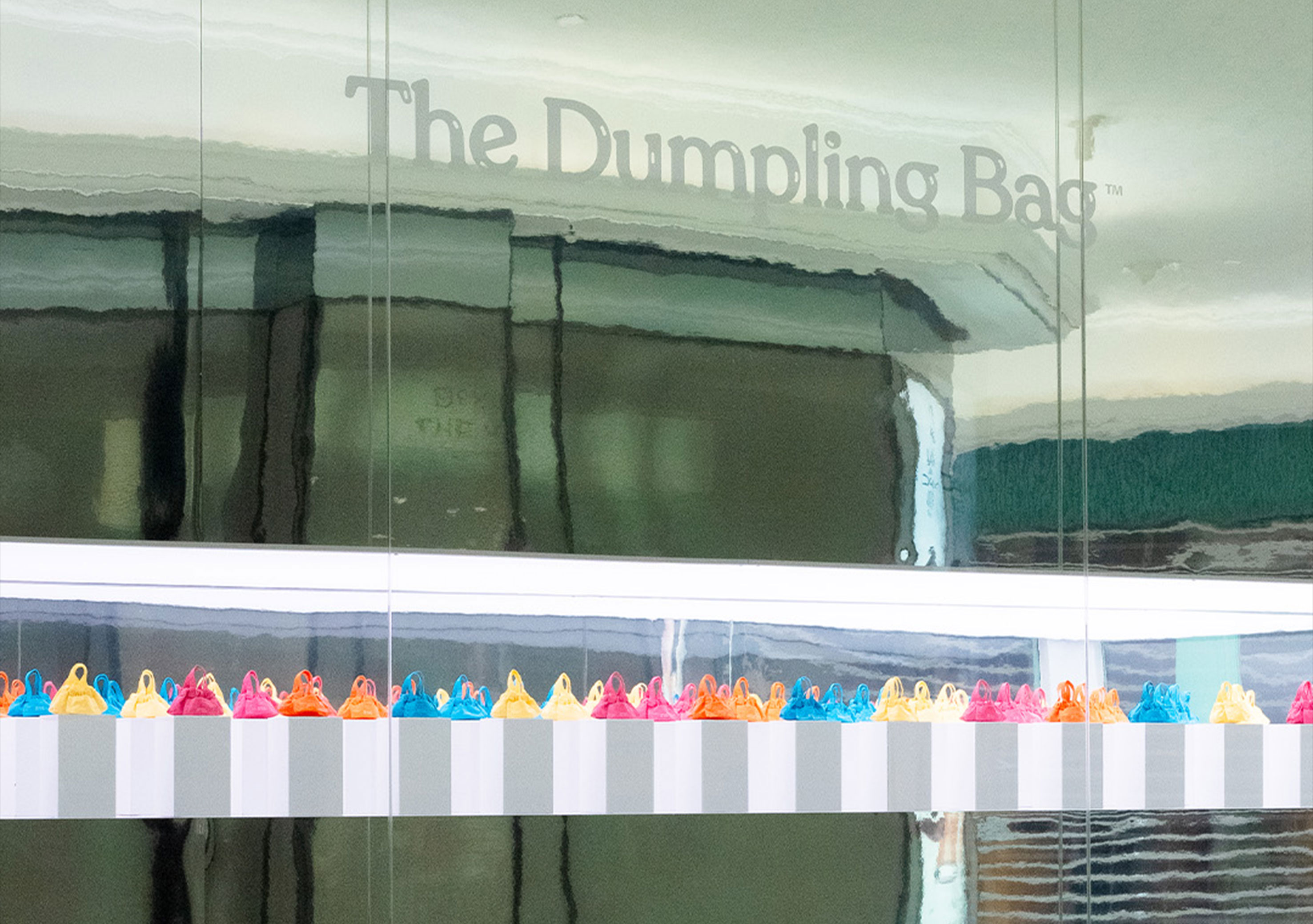
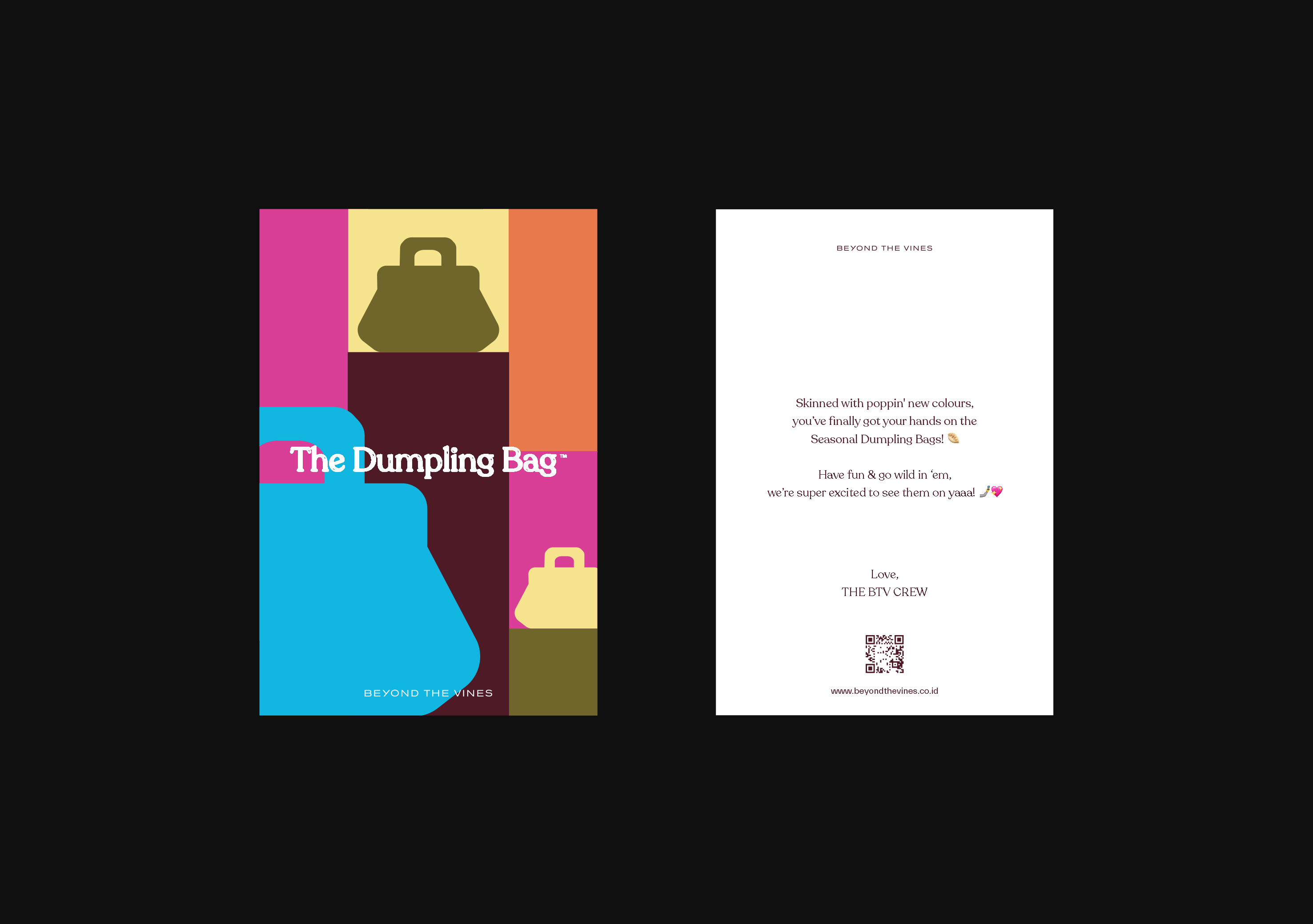
Campaign graphics for seasonal bags applied in stores and marketing collaterals — delivery cards and packaging sleeve.
Assisted in art direction. Store photos not by me.
2024
︎︎︎BTV CentralWorld Bangkok — 2
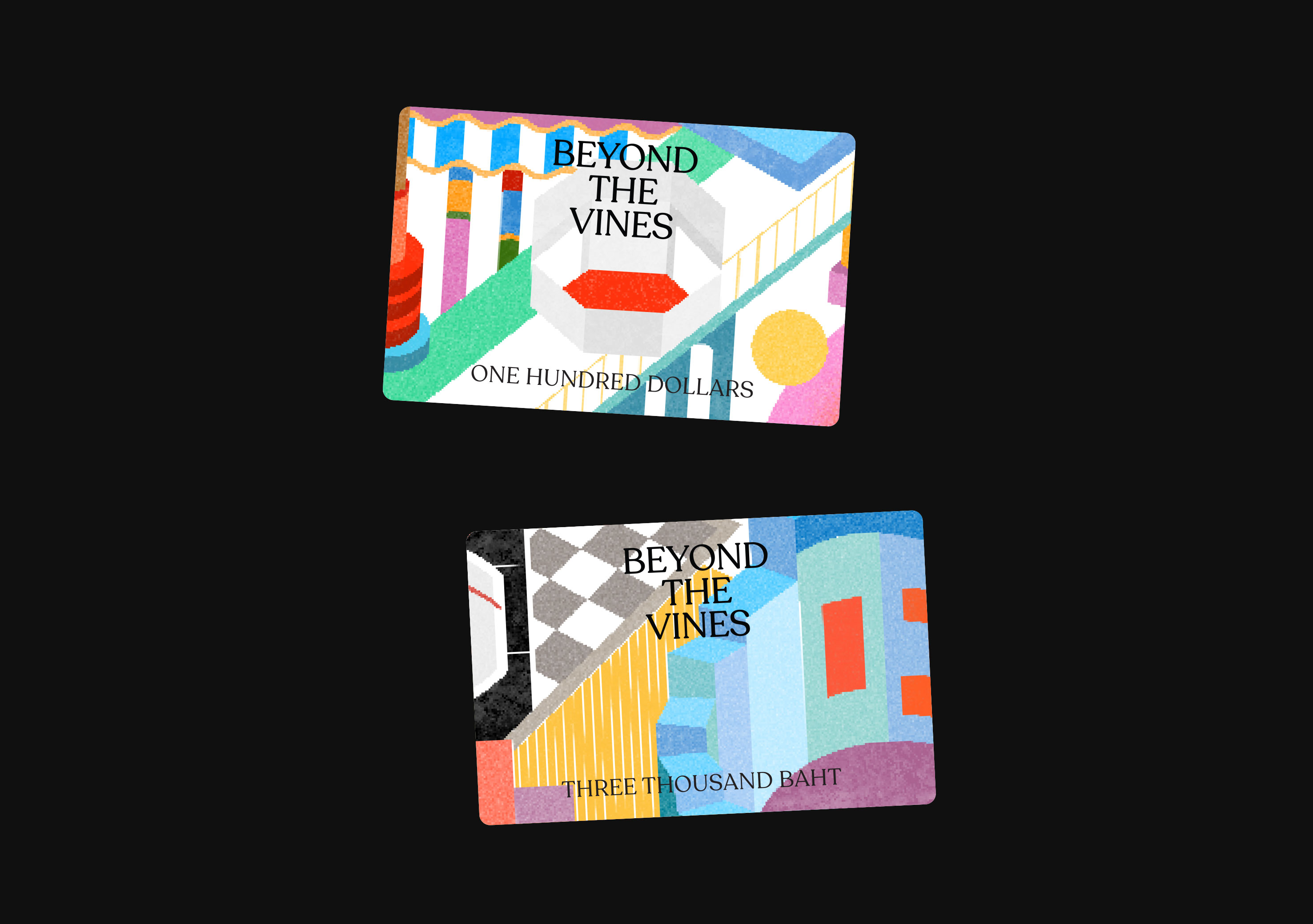
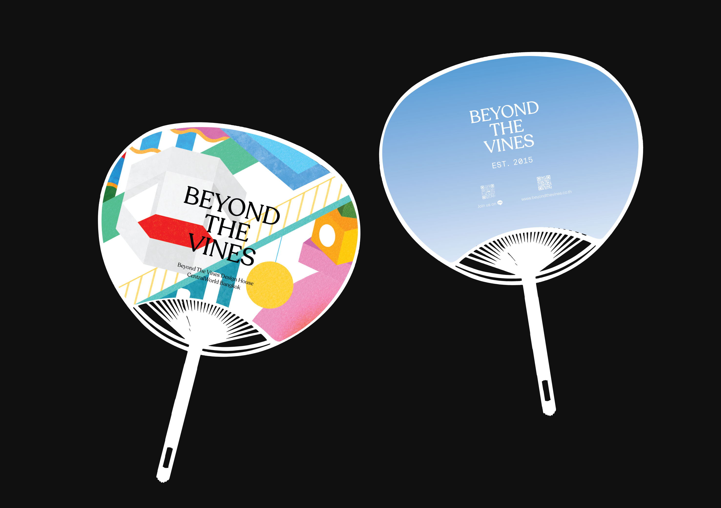
Store launch exclusive merchanise and marketing collaterals.
Art direction not me.
2024
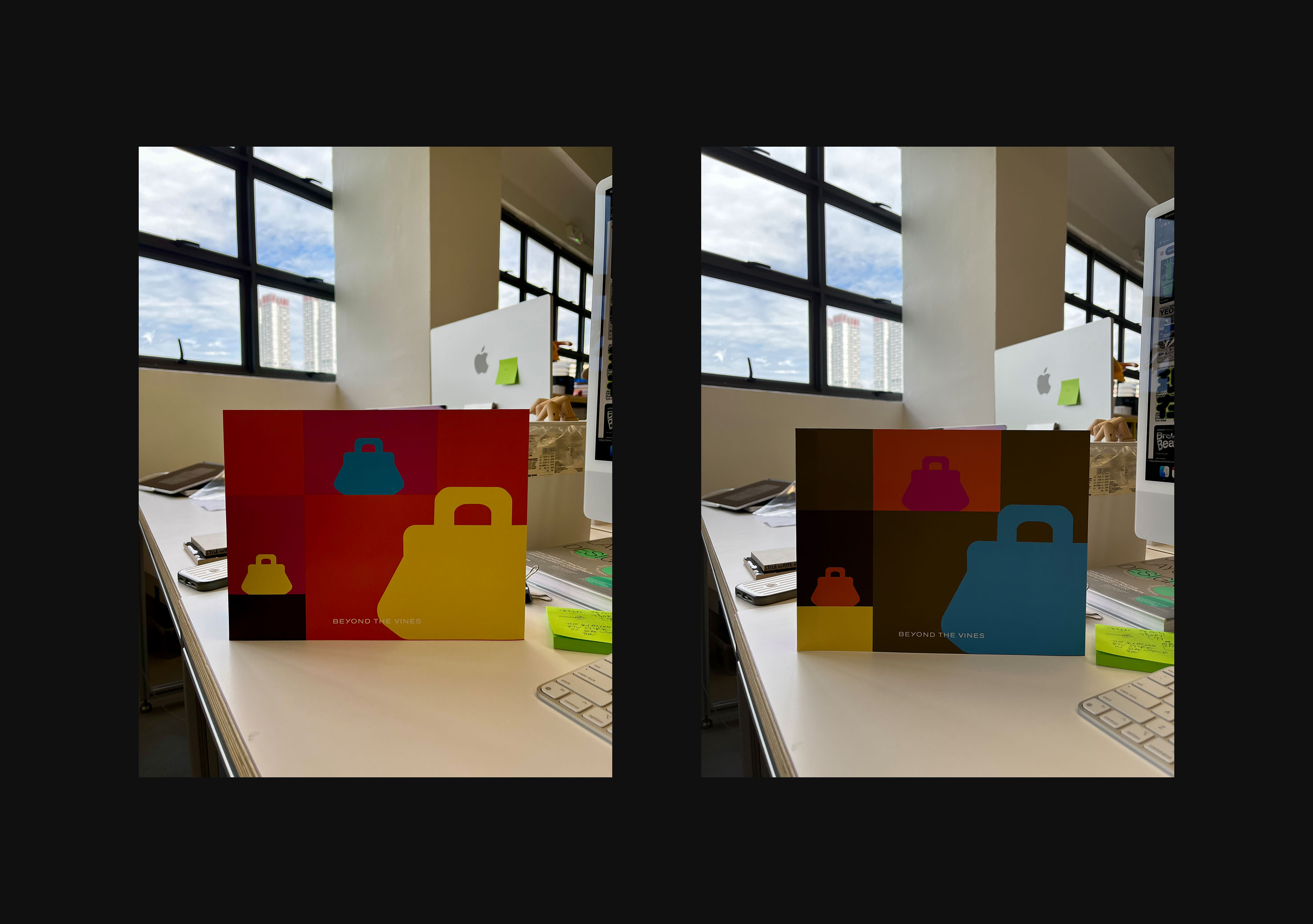
︎︎︎BTV TUK TUK CentralWorld Bangkok
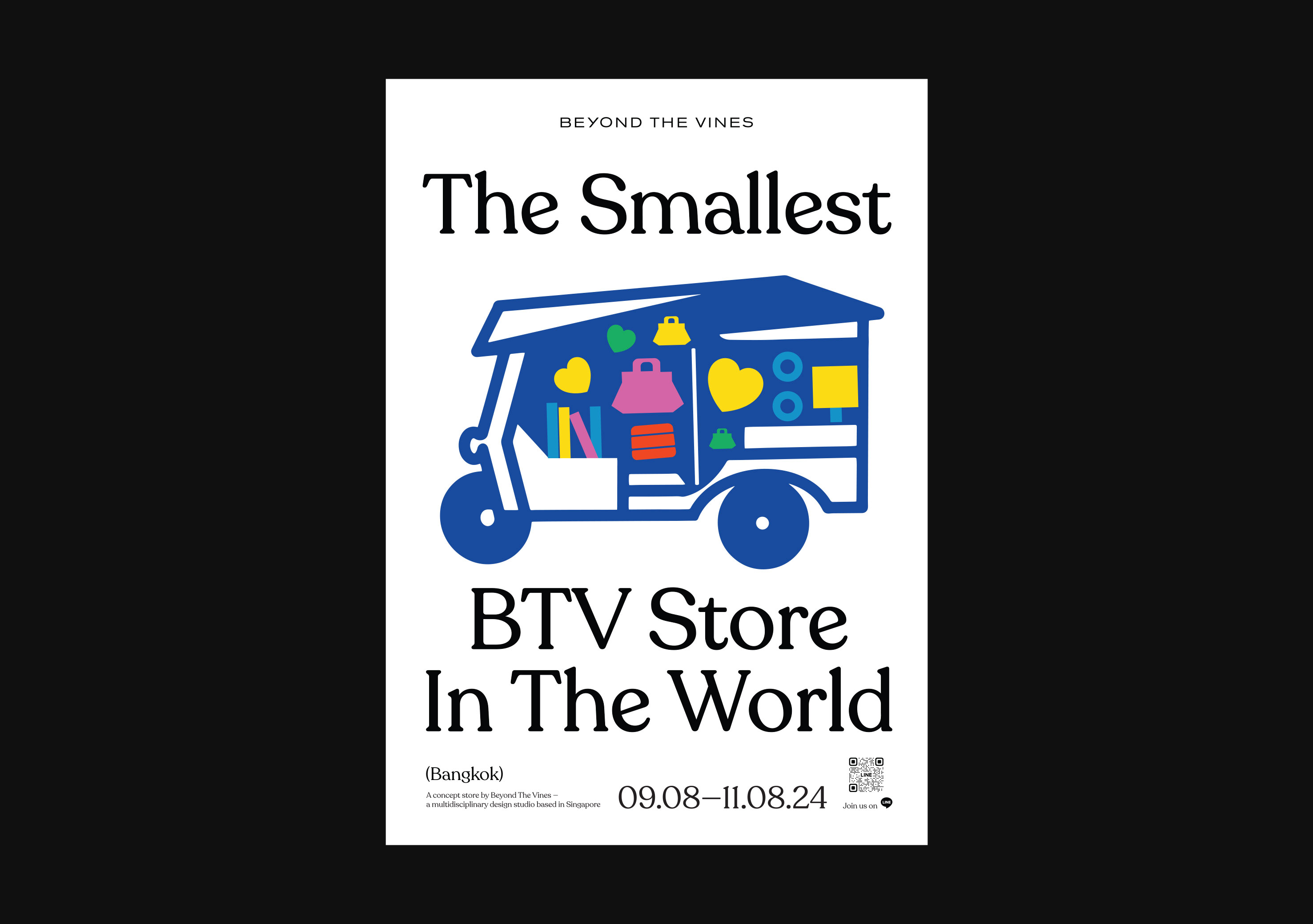
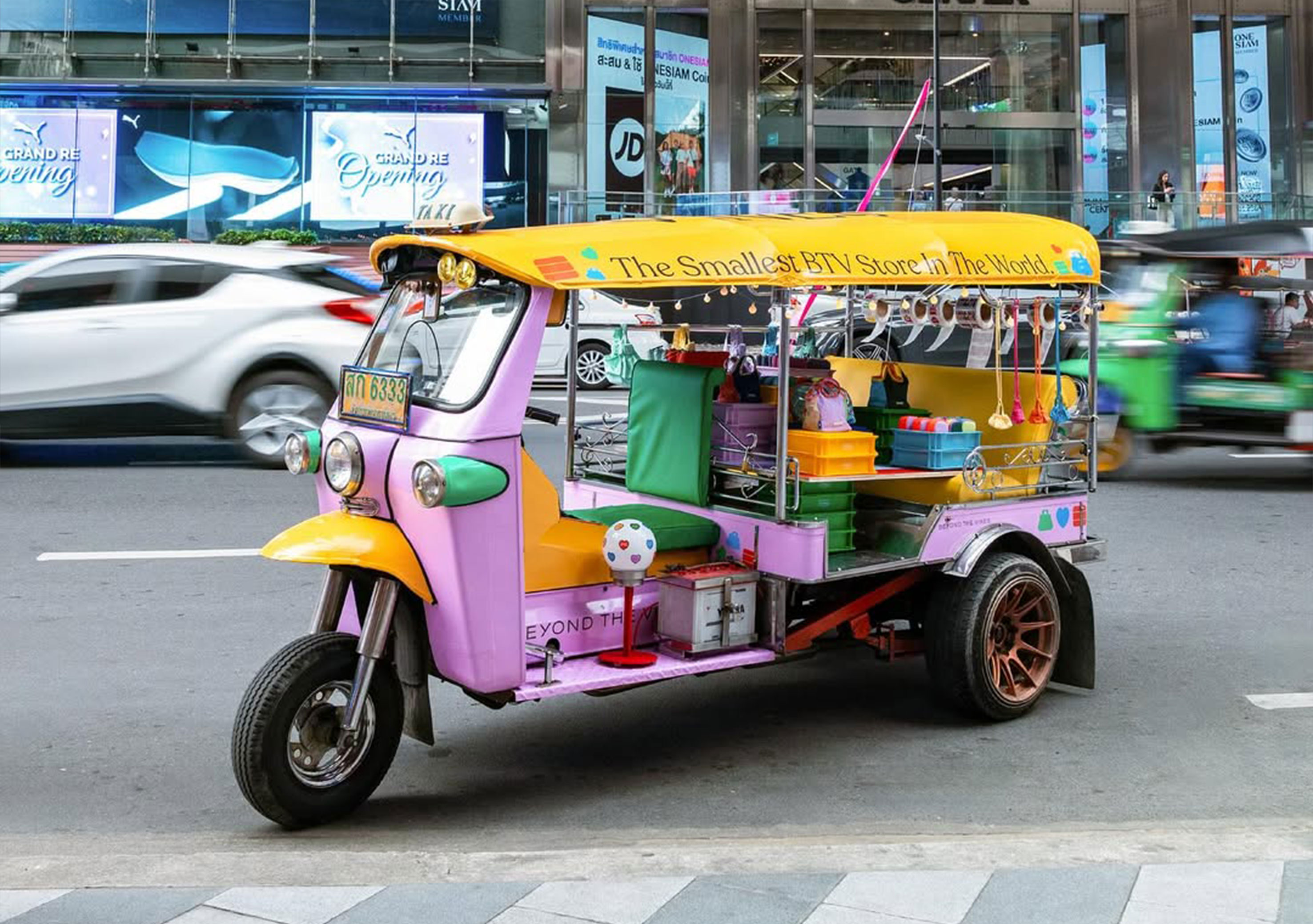
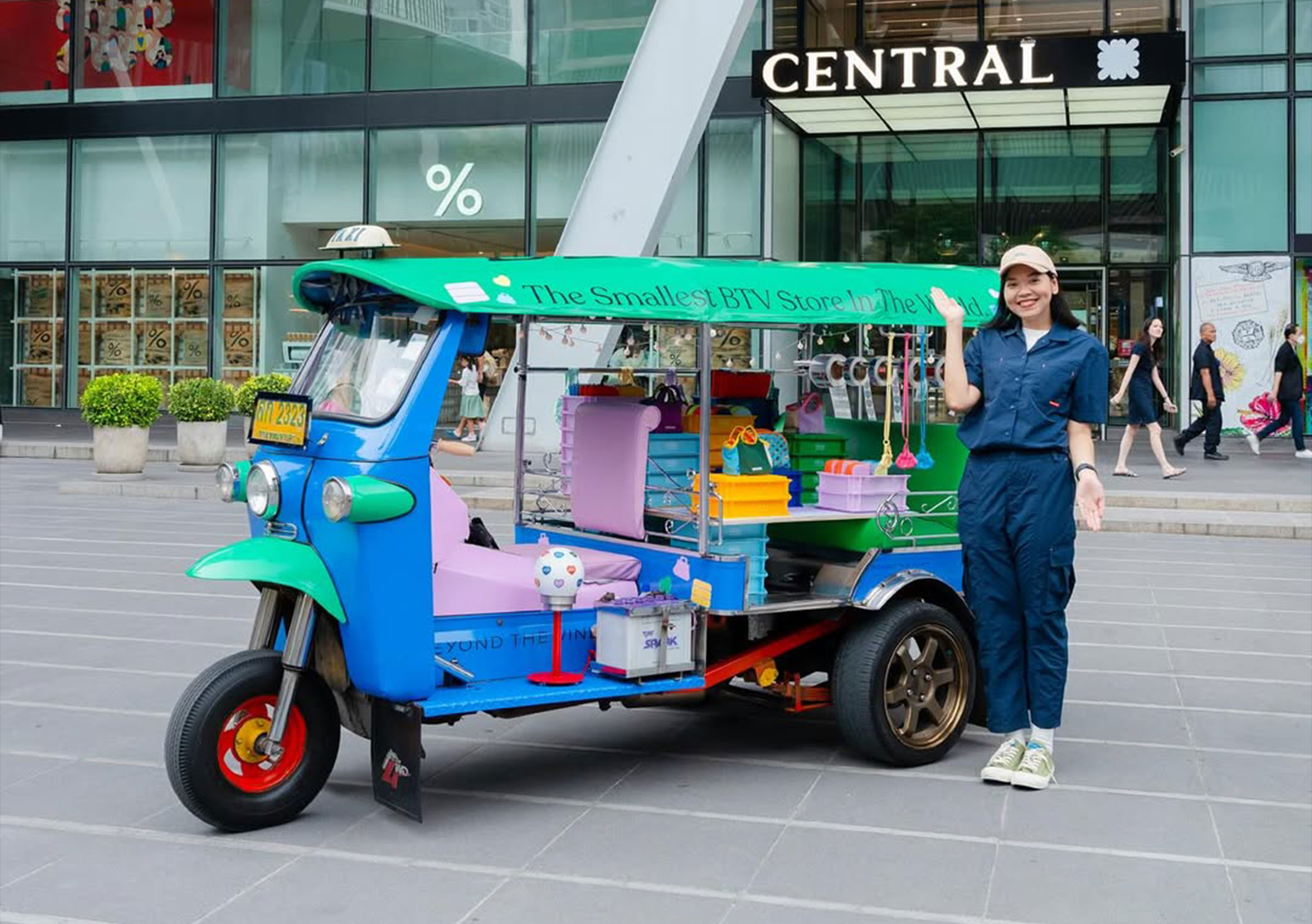
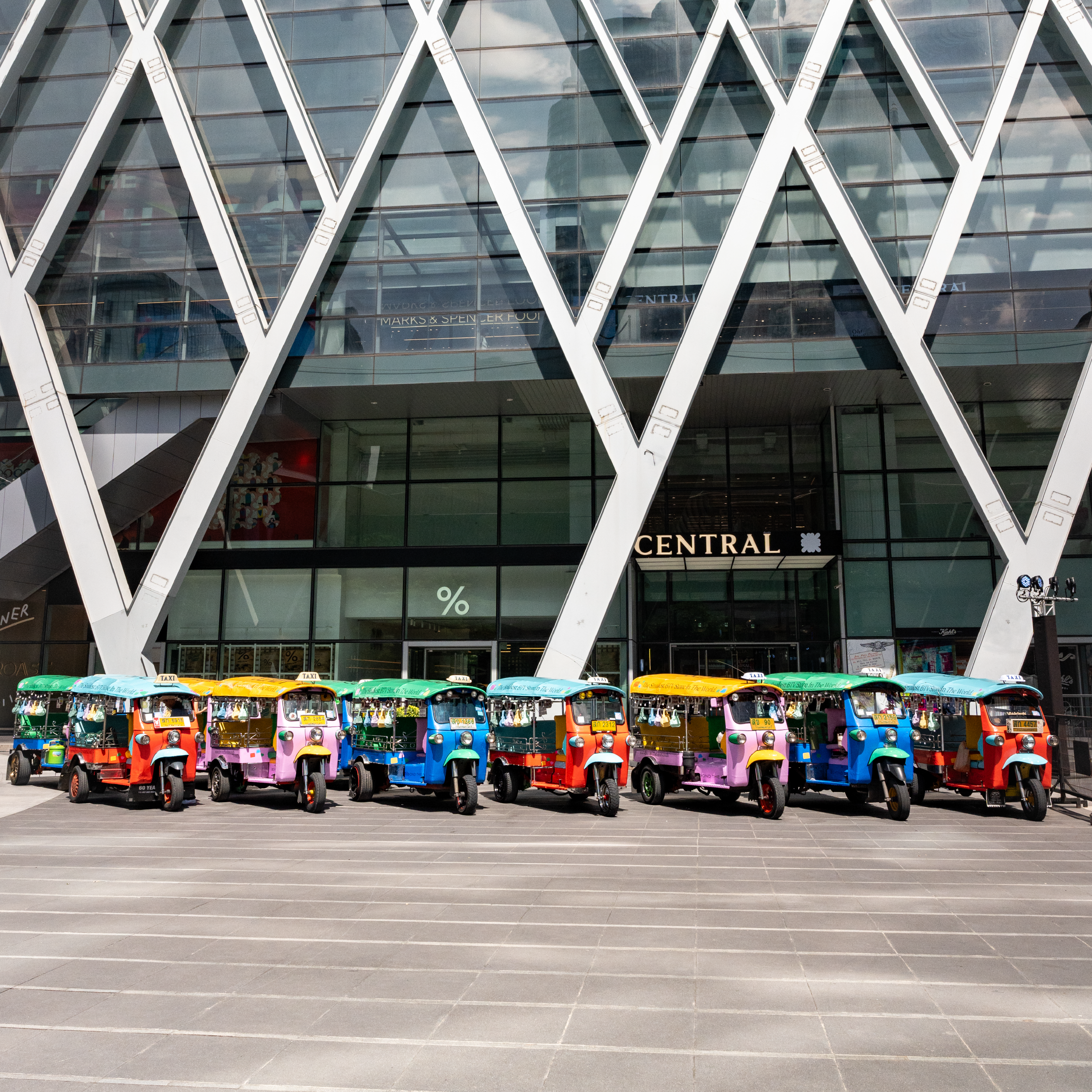
Skinning of a TUKTUK Truck for a Marketing Activation in Bangkok.
and assisted in the design of the invite.
All images do not belong to me.
2024
︎︎︎BTV x Tokyo Shinjuku Pop Up
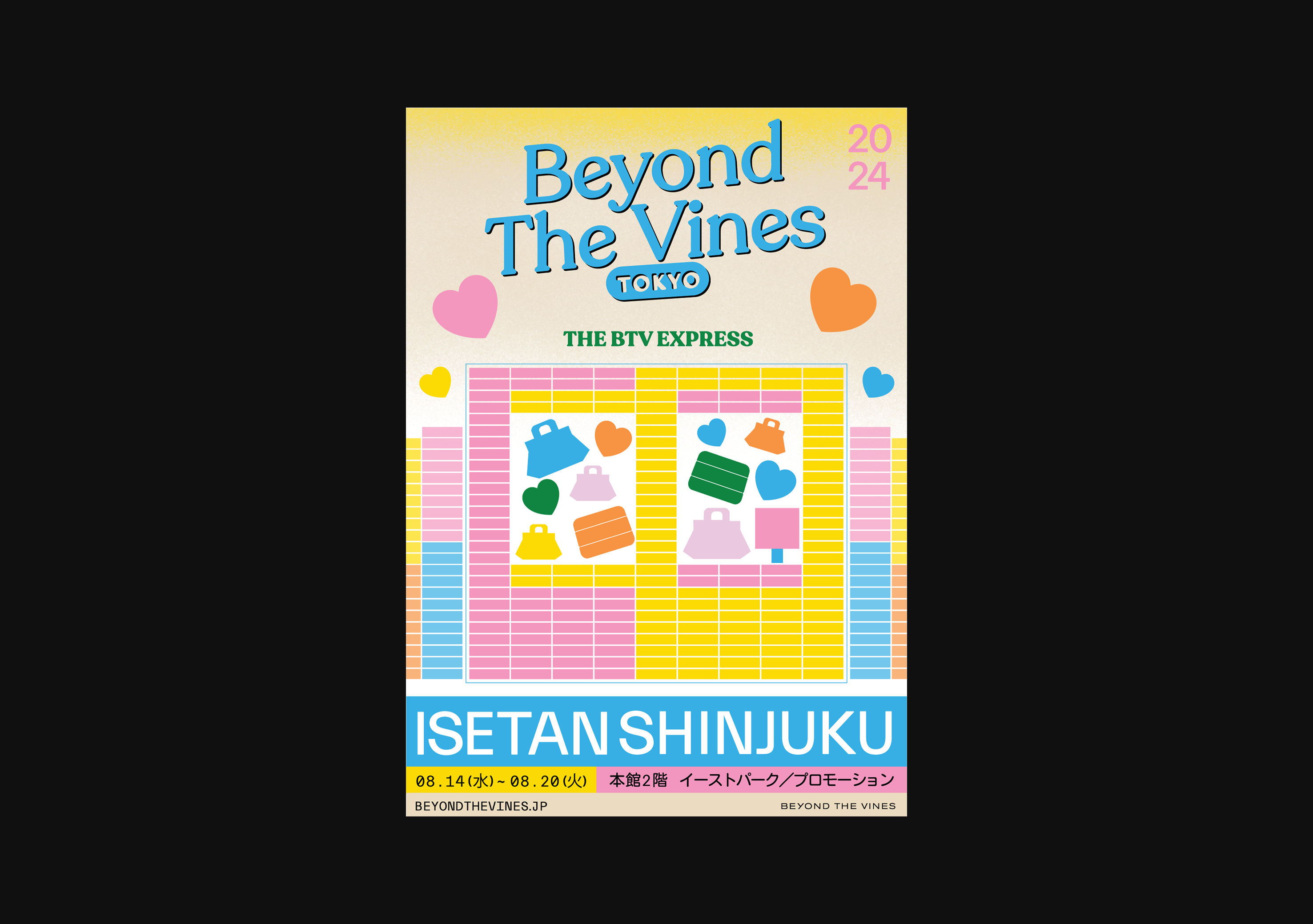
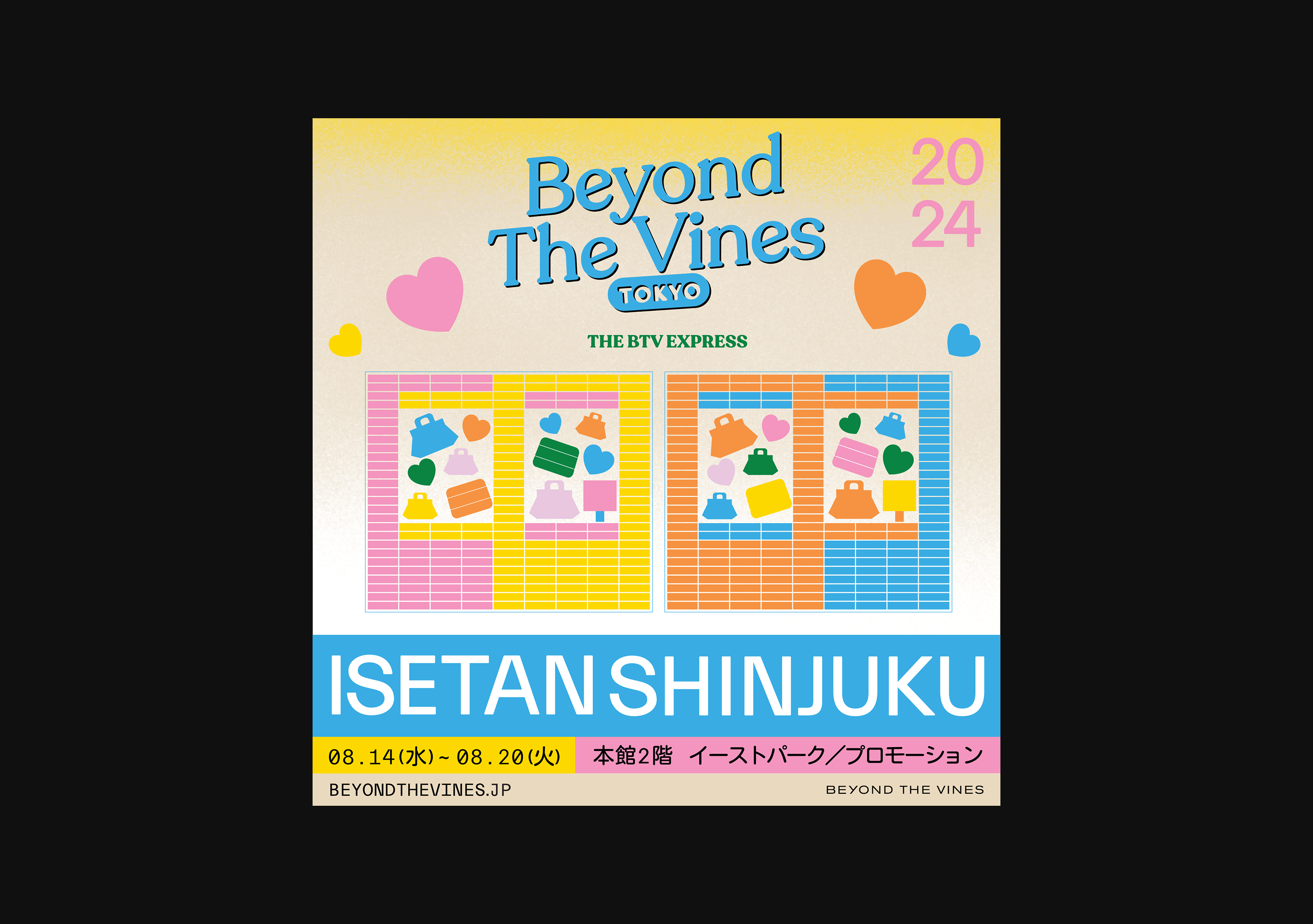

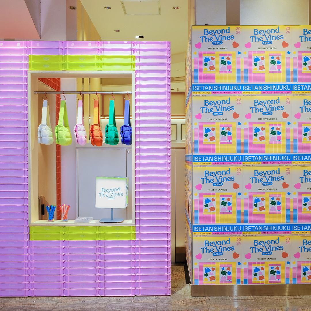
Graphic Design,
Layout
Layout
Key Visual for the launch of the pop up in Isetan Shinjuku. Adapted for mall ads and instagram grid post.
*Layout by me, assisted in illustrations.
Art Direction not me.
All images do not belong to me.
2024
︎︎︎Disney+ Revamp
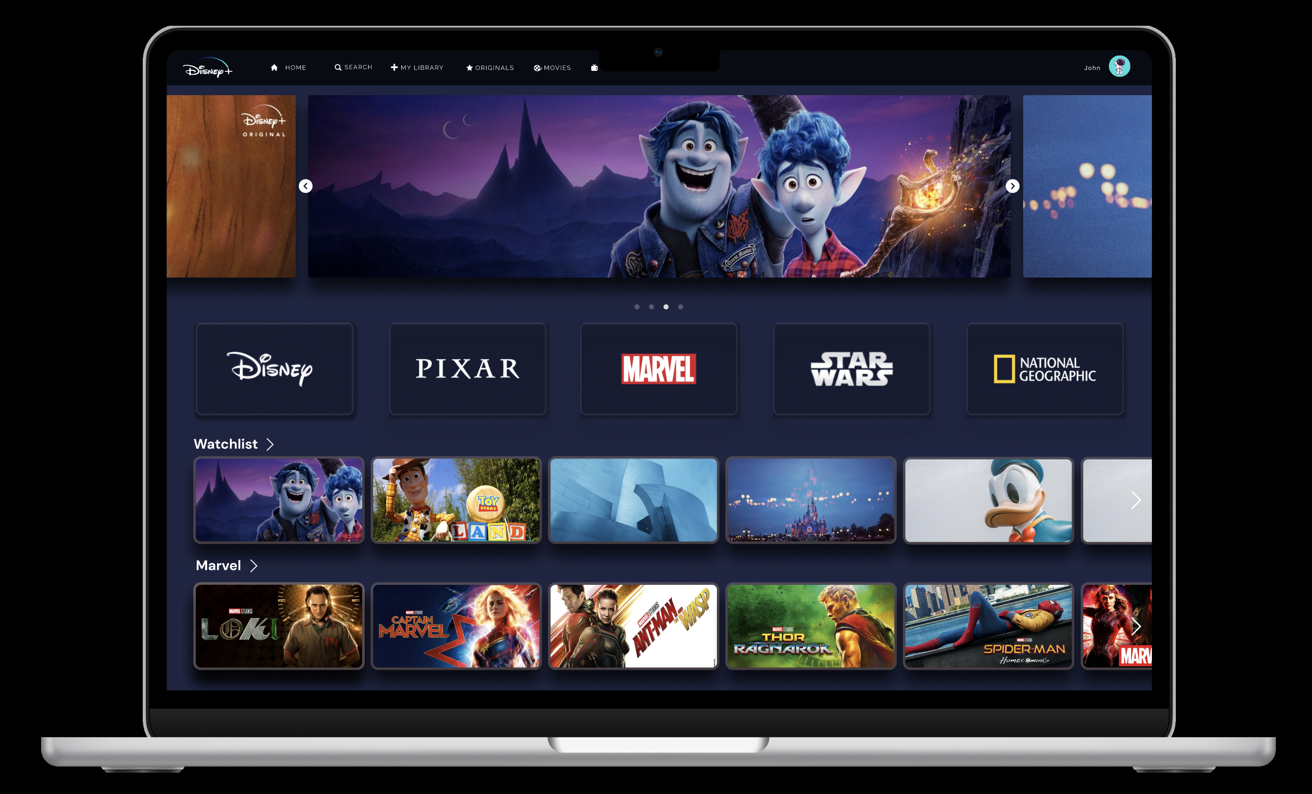
Link to prototype - https://www.figma.com/proto/gARAugWSakYp754et3zO3z/DISNEY--NEW?node-id=157-1401&starting-point-node-id=33%3A27&t=A8SfaFmip7OdFs3p-1
Link to research and findings - https://www.figma.com/proto/0HOZh6TcR7klpQd4NgG8Pn/Design-Case-Study---Interface-Design-for-Disney-?node-id=1-118&p=f&t=DxpSrfbn2Dc0hl0q-1&scaling=scale-down&content-scaling=fixed&page-id=0%3A1
This UI/UX group project was done by a group of 5 people. Our team embarked on a comprehensive redesign of the Disney+ application, focusing on enhancing user experience (UX) and user interface (UI) design. Through extensive research, surveys, and usability testing, we identified key pain points and areas for improvement within the platform. Leveraging these insights, we introduced features such as customisable playlists, streamlined navigation with less confusing icons, and enhanced functionality.
Our project highlights the importance of user-centered design in creating a seamless and enjoyable streaming experience for streaming users, while also showcasing the impact of iterative design and user testing in refining digital products.
2024
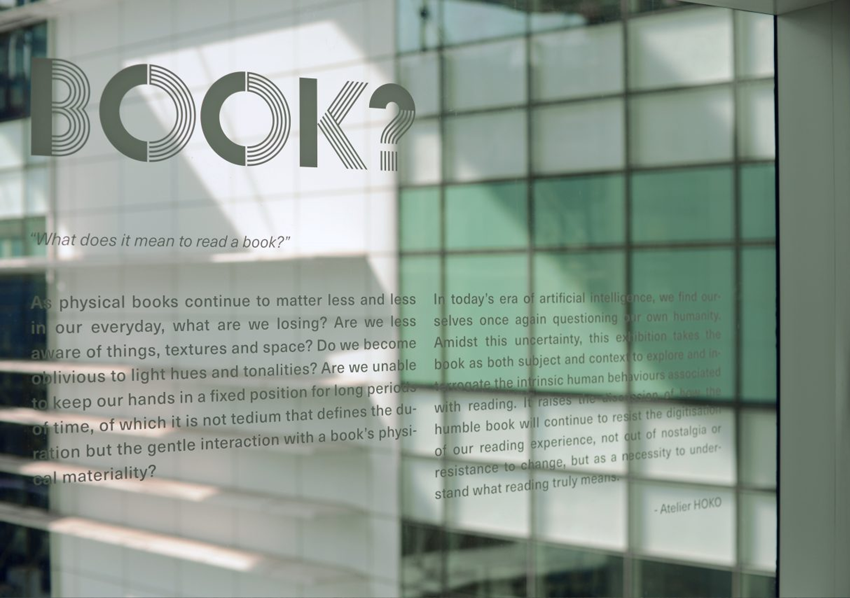
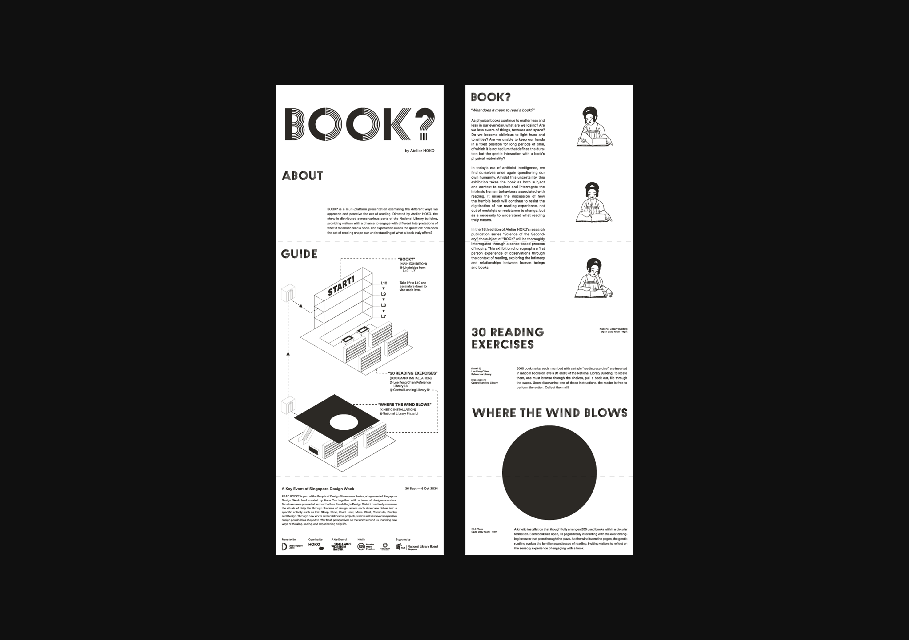
︎︎︎BOOK?


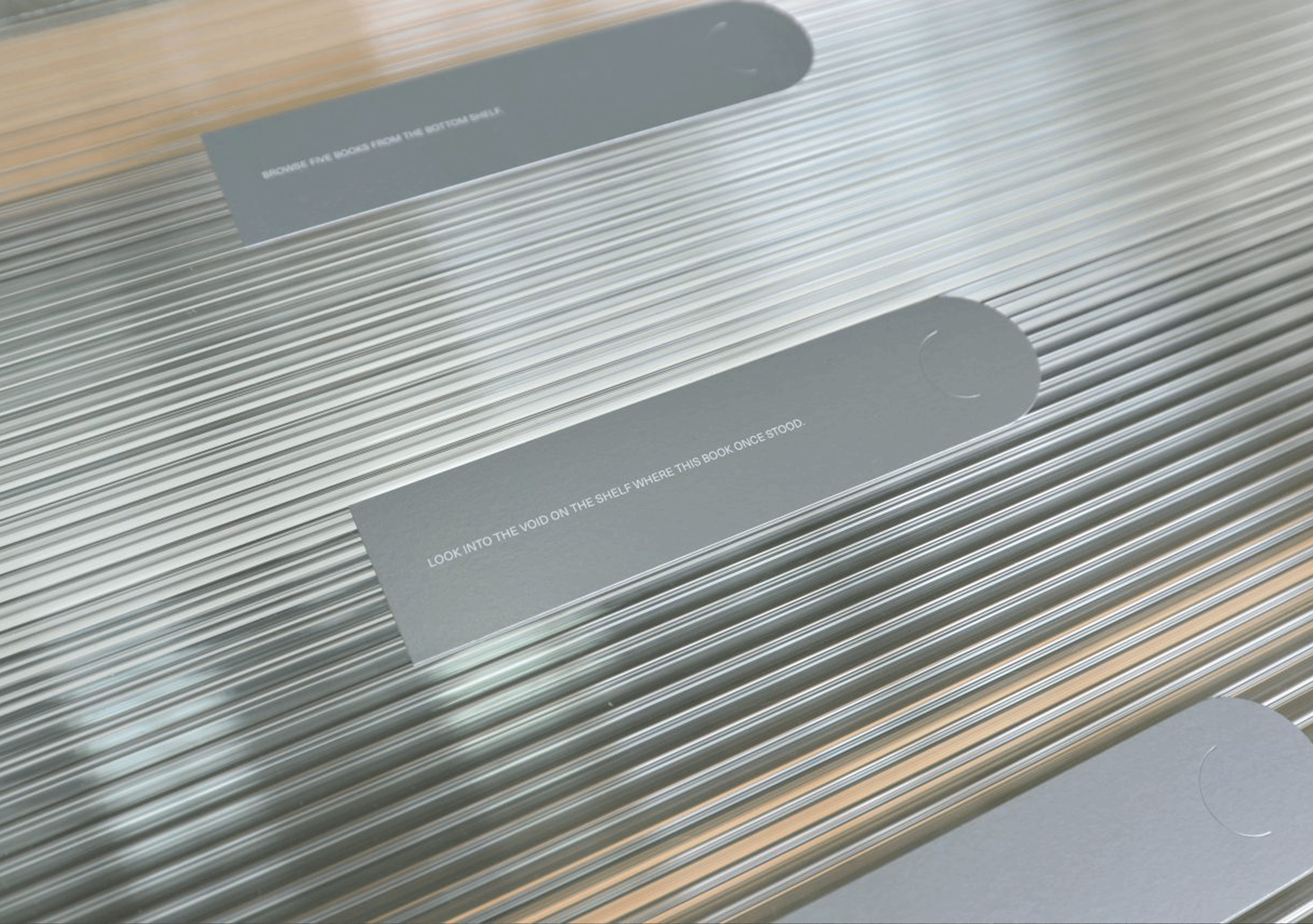
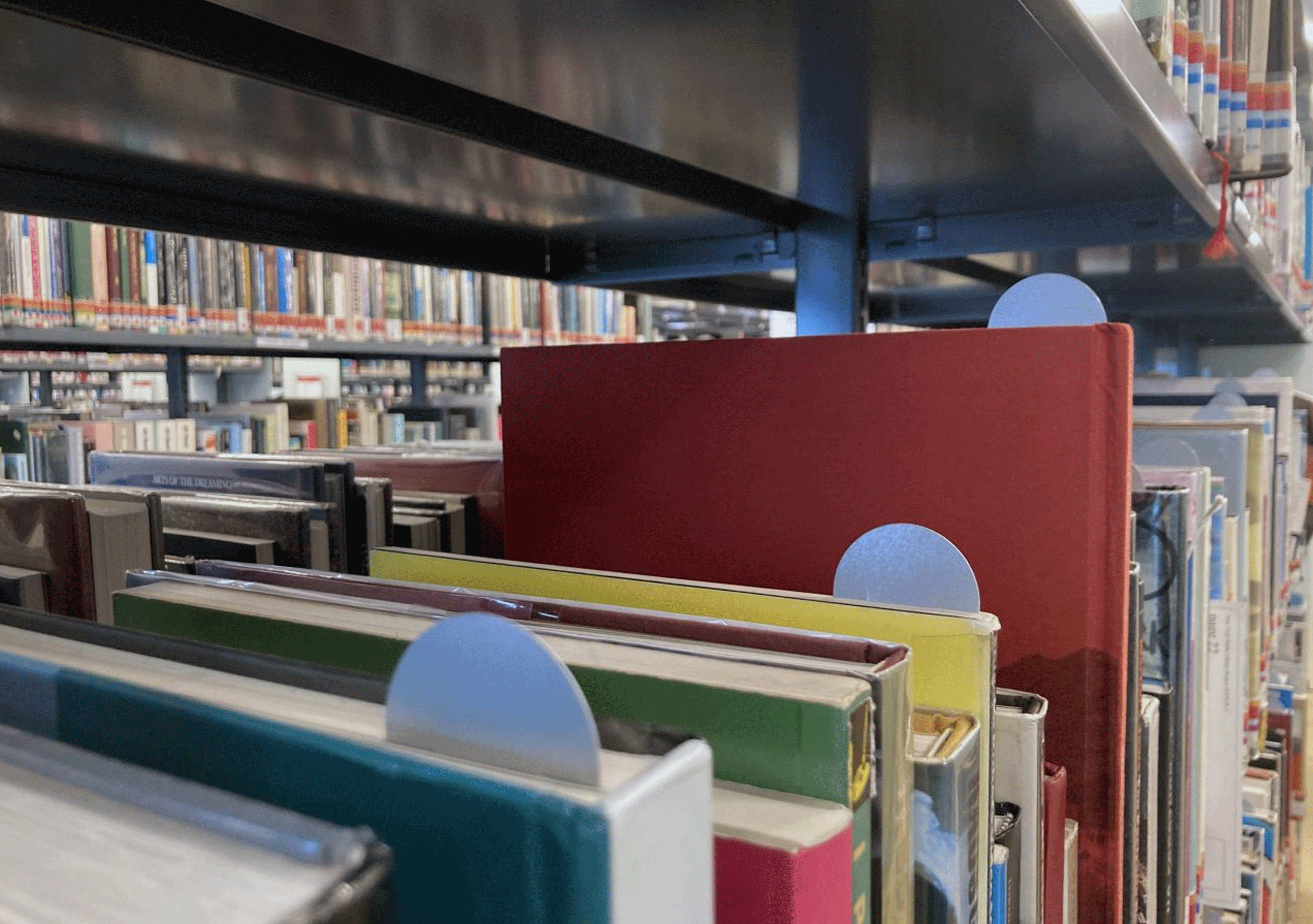
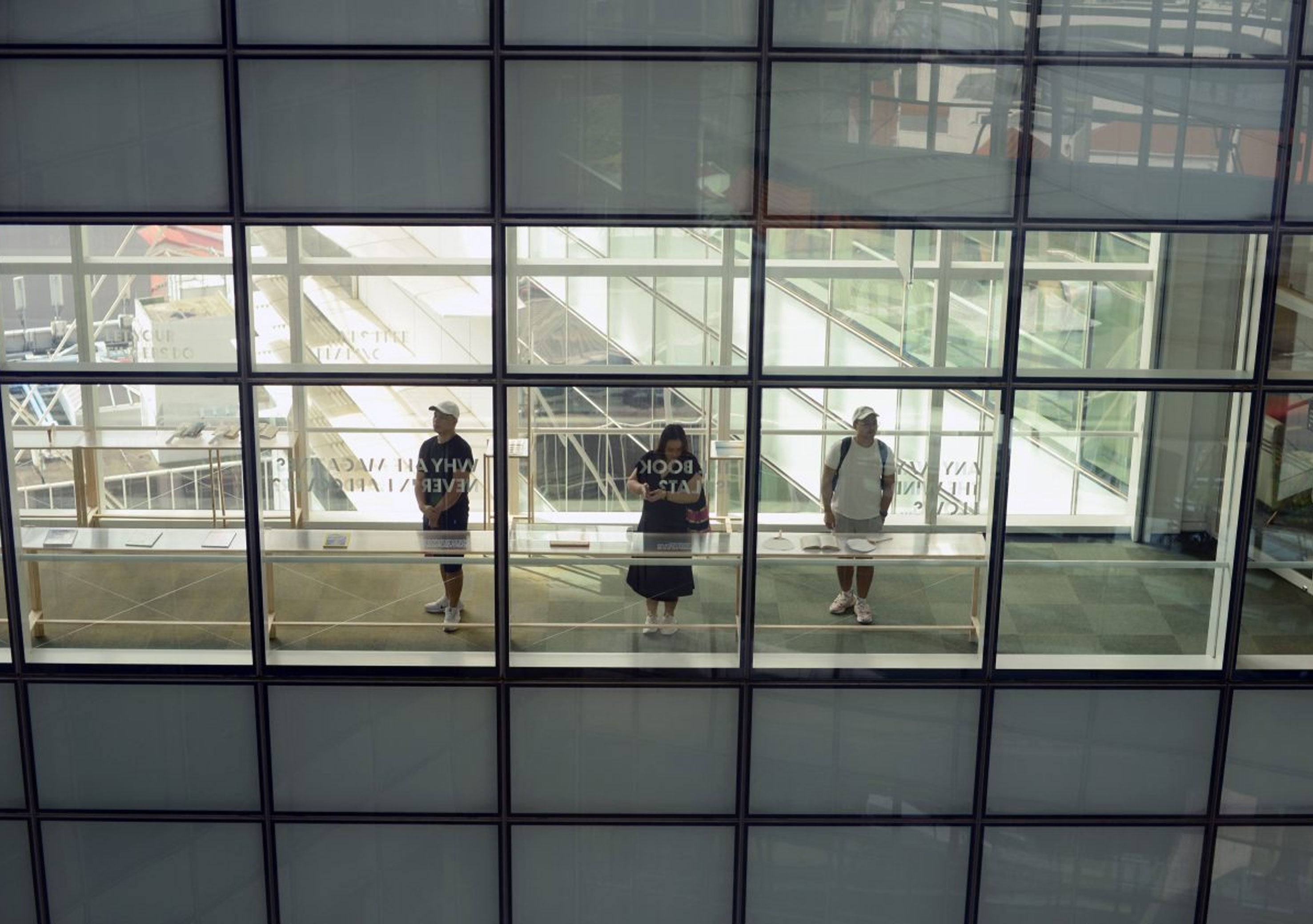
Exhibition Design,
Graphic Design,
Wayfinding
Graphic Design,
Wayfinding
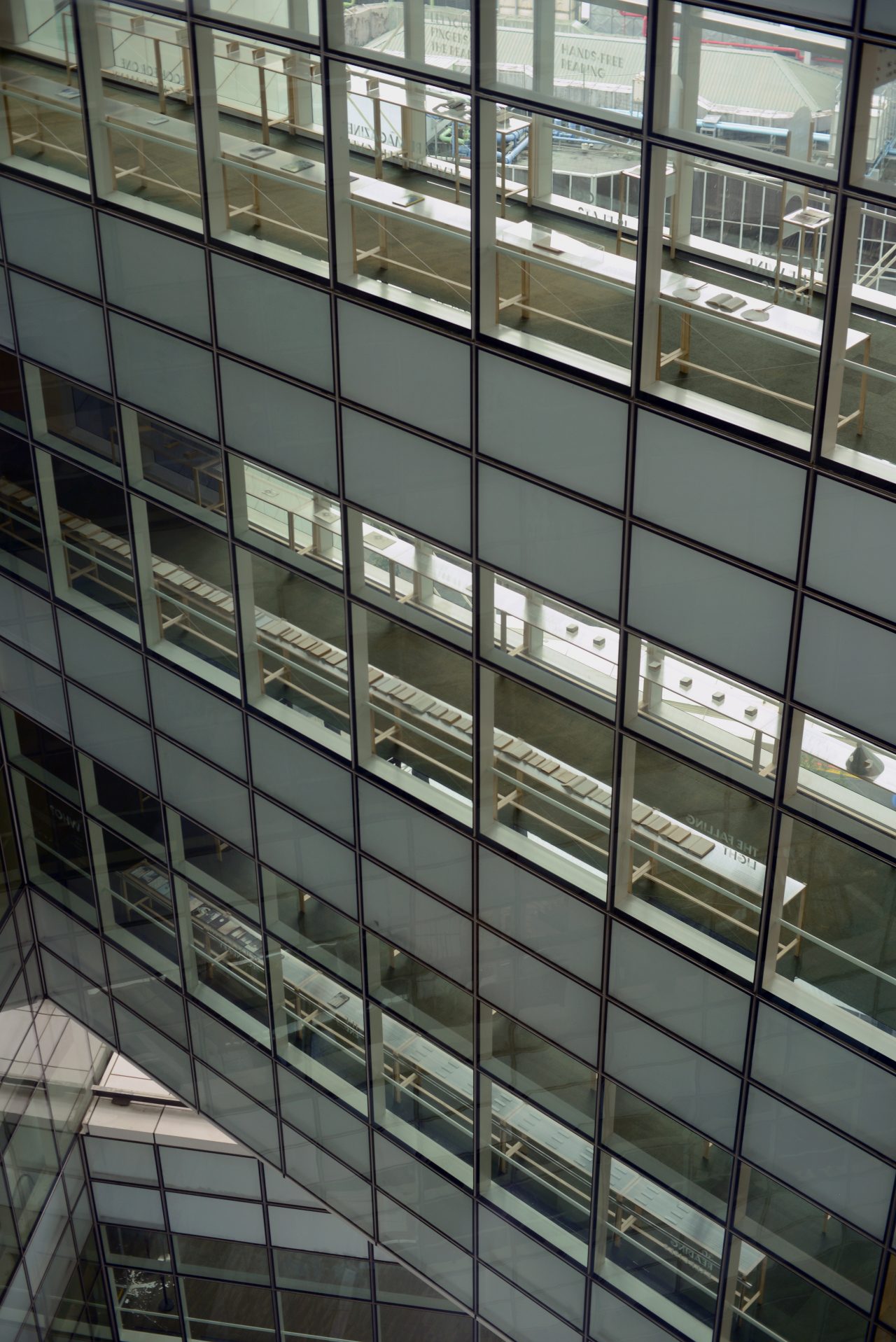
BOOK?
“What does it mean to read a book?”
“As physical books continue to fade away from our everyday, what are we losing? Are we slowly losing a certain sensibility towards things, textures and space? Do we become less sensitive to light hues and tonalities? Are we unable to keep our hands in certain fixed position for long periods of time, of which it is not tedium that defines the duration but the gentle interaction with the book’s physical materiality….
In today’s era of artificial intelligence, we find ourselves once again questioning our own humanity. Amidst this uncertainty, this exhibition has chosen the book as both subject and context to explore and interrogate the intrinsic human behaviours associated with reading. It raises the discussion of how the humble book will continue to resist the digitisation of our reading experience, not out of nostalgia or resistance to change, but as a necessity to understand what reading truly means.
Exhibited in National Library Building, Singapore
‘BOOK?’ is presented across 5 levels of the National Library Building during the Singapore
Design Week.”
Text from Atelier Hoko.
Graphic Design of this exhibition (bookmarks, pamphlet, signages and sticker vinyls of the exhibition was executed by me along with Atelier Hoko)
More information about the exhibition can be found here - https://atelierhoko.com/book/ and @atelierhoko on instagram. Images are all not mine!
2024
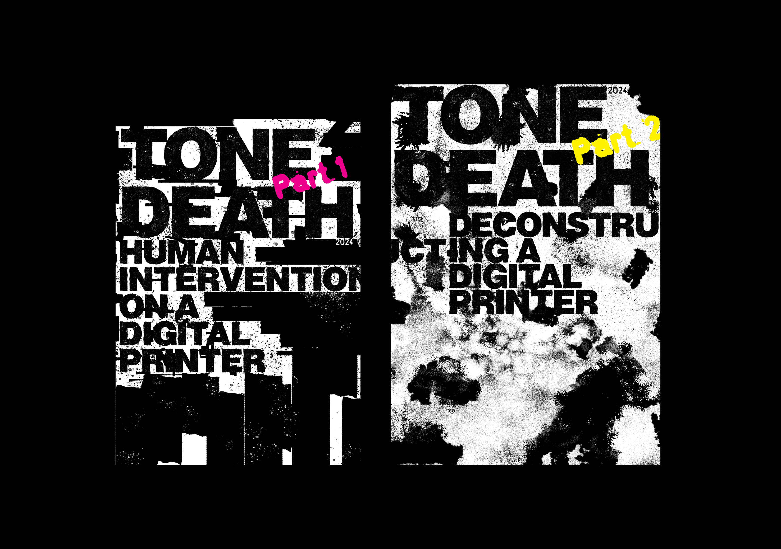
︎︎︎Tone Death
Final Year Thesis
Experimental,
Visual Research
Experimental,
Visual Research
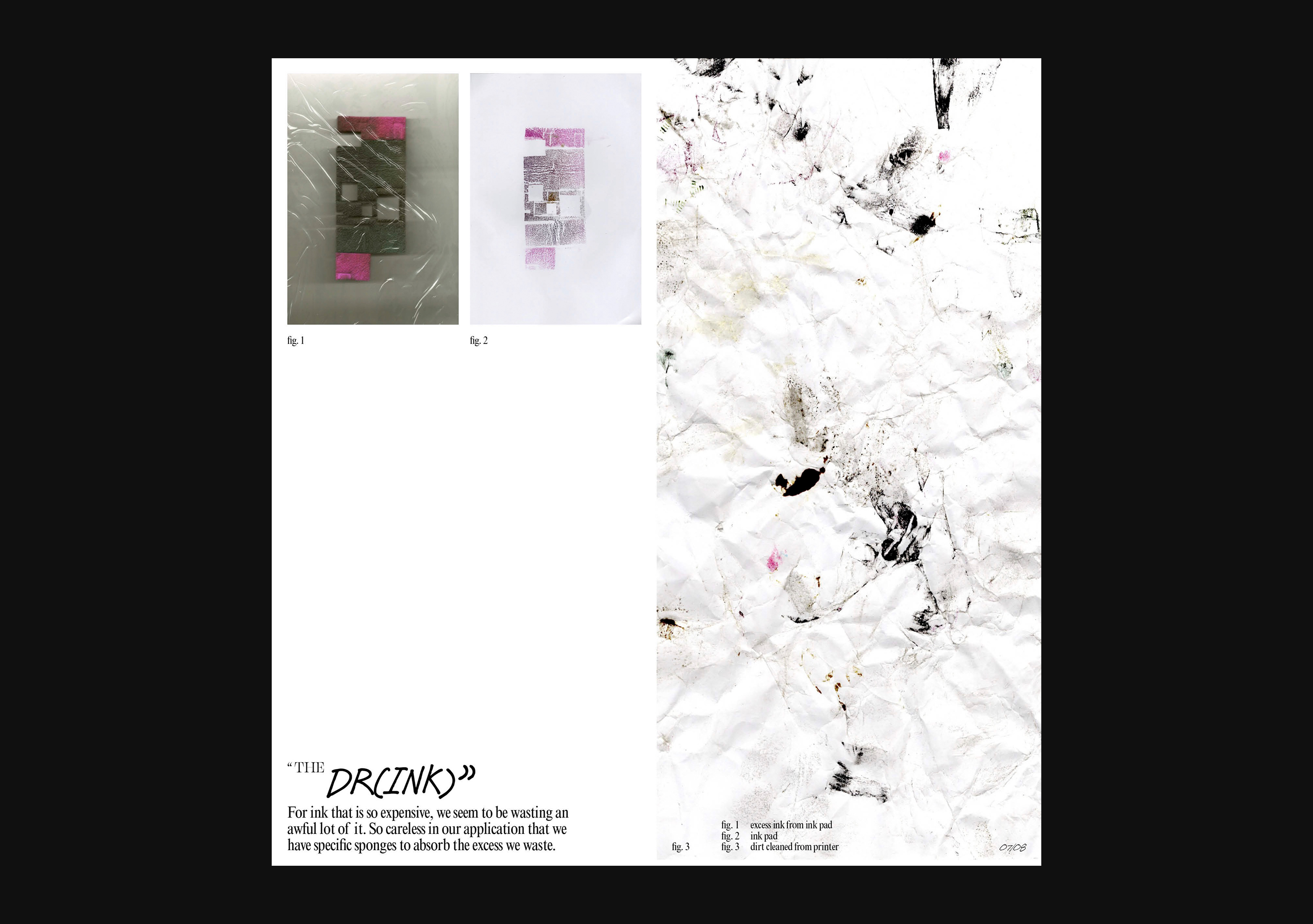
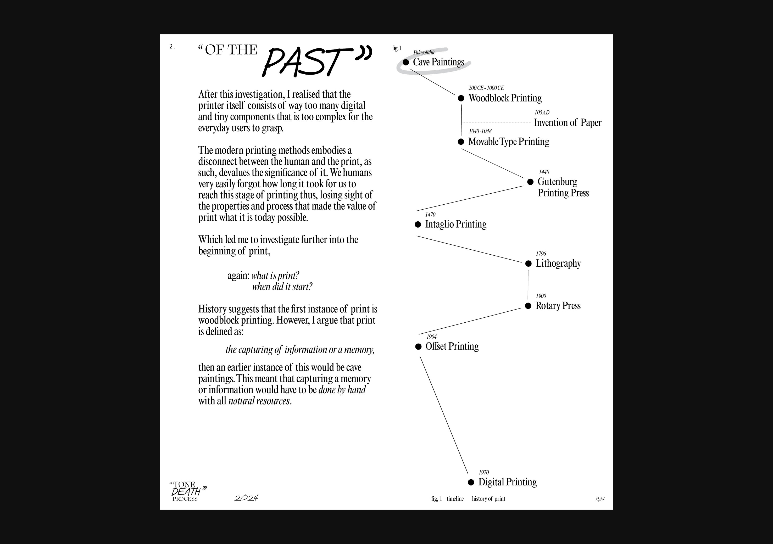
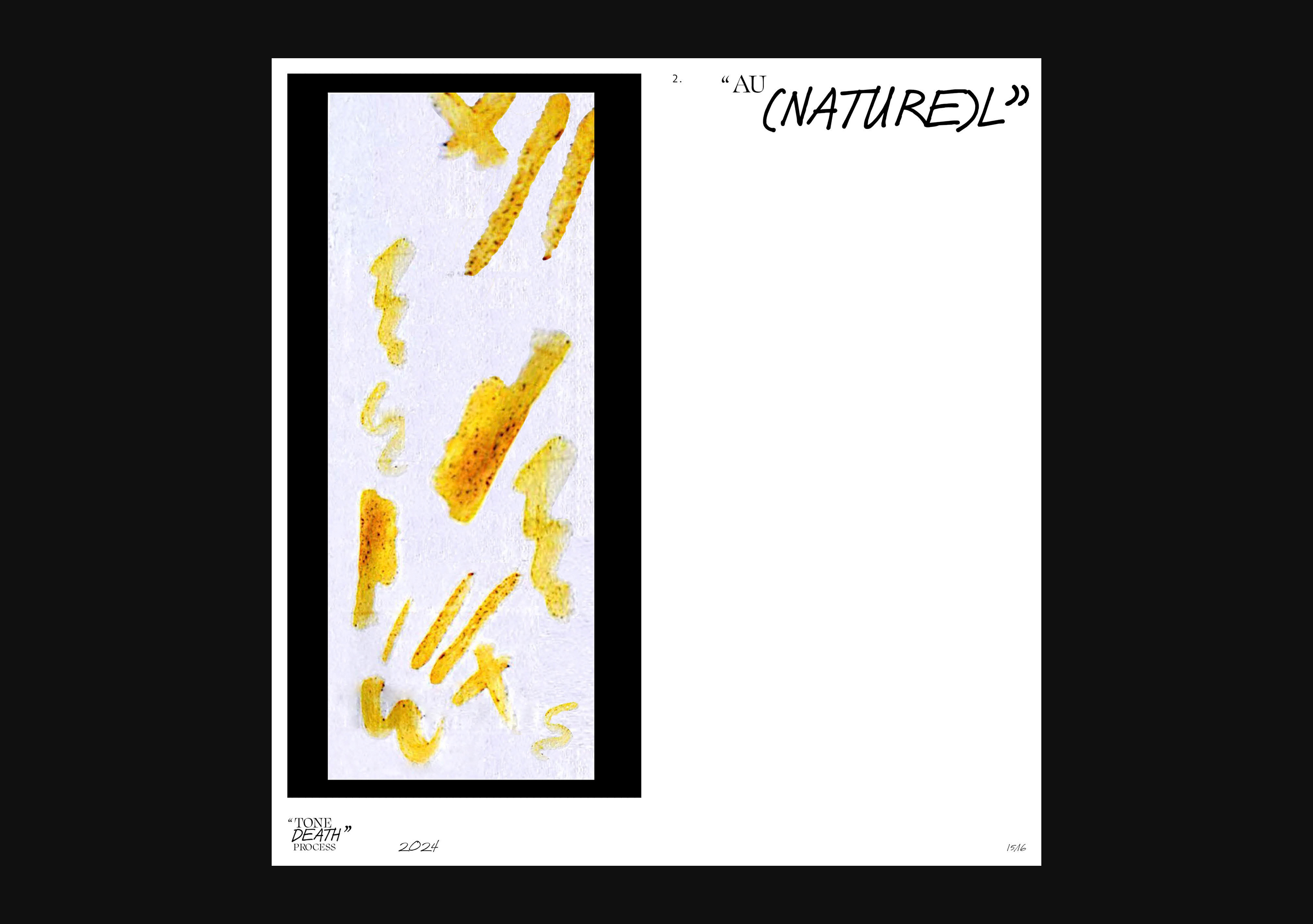
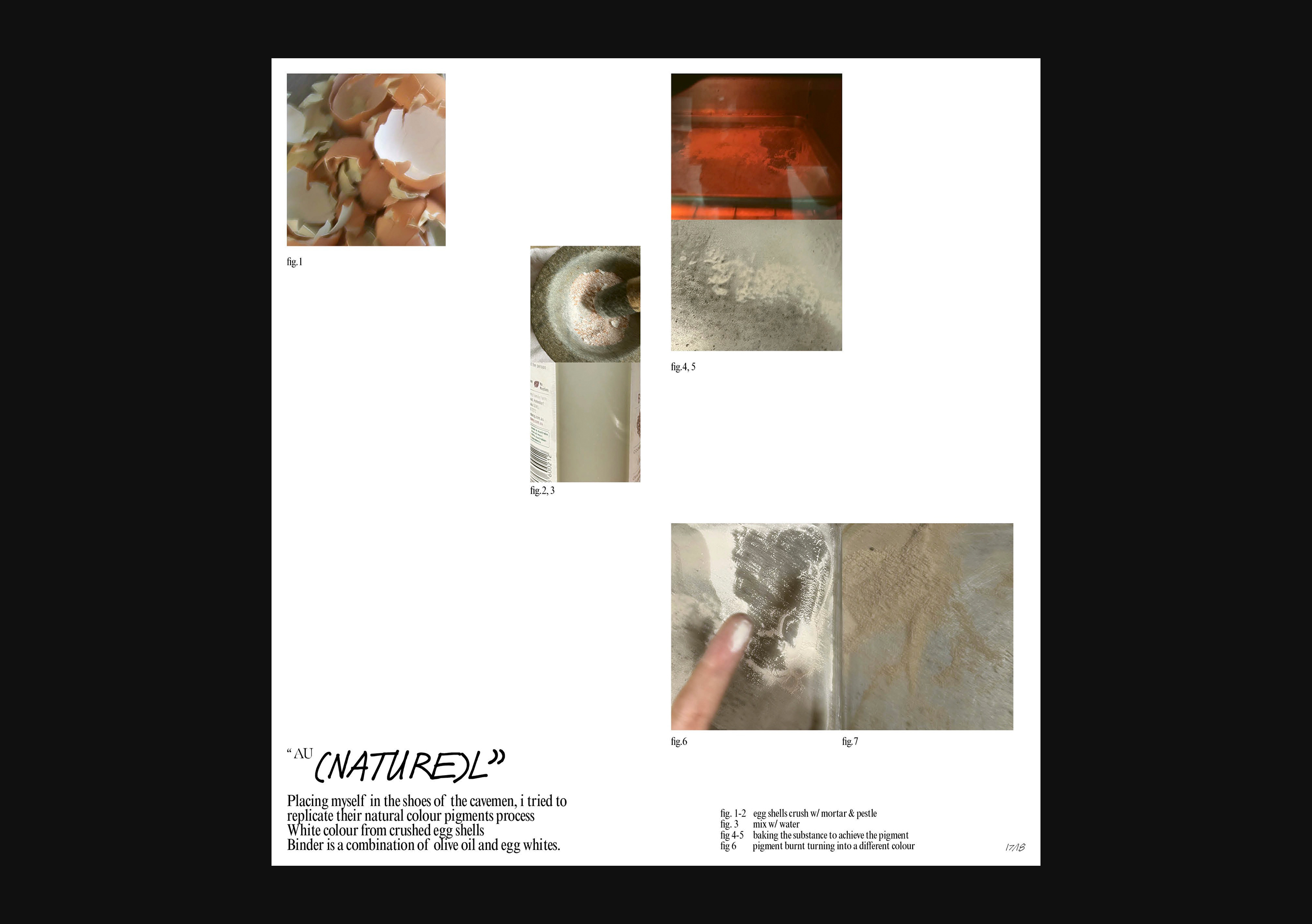
Tone Death challenges the conventional boundaries of post-production in graphic design by prompting us to reconsider the overlooked intricacies of our marking tools, particularly the digital printer.
Motivated to narrow the divide between human element and the tangible outputs produced by digital printers, this endeavour aims to rediscover the imperfections and human elements overshadowed by technology. Seeking to reveal the disconnect we inadvertently retain regarding the tangible outputs we create using tools as ubiquitous as a digital printer.
Tone Death is a three part project, stay tuned for more.


Part 1
176 x 250 mm
Exposed stitched,
Experimental,
Visual research
176 x 250 mm
Exposed stitched,
Experimental,
Visual research
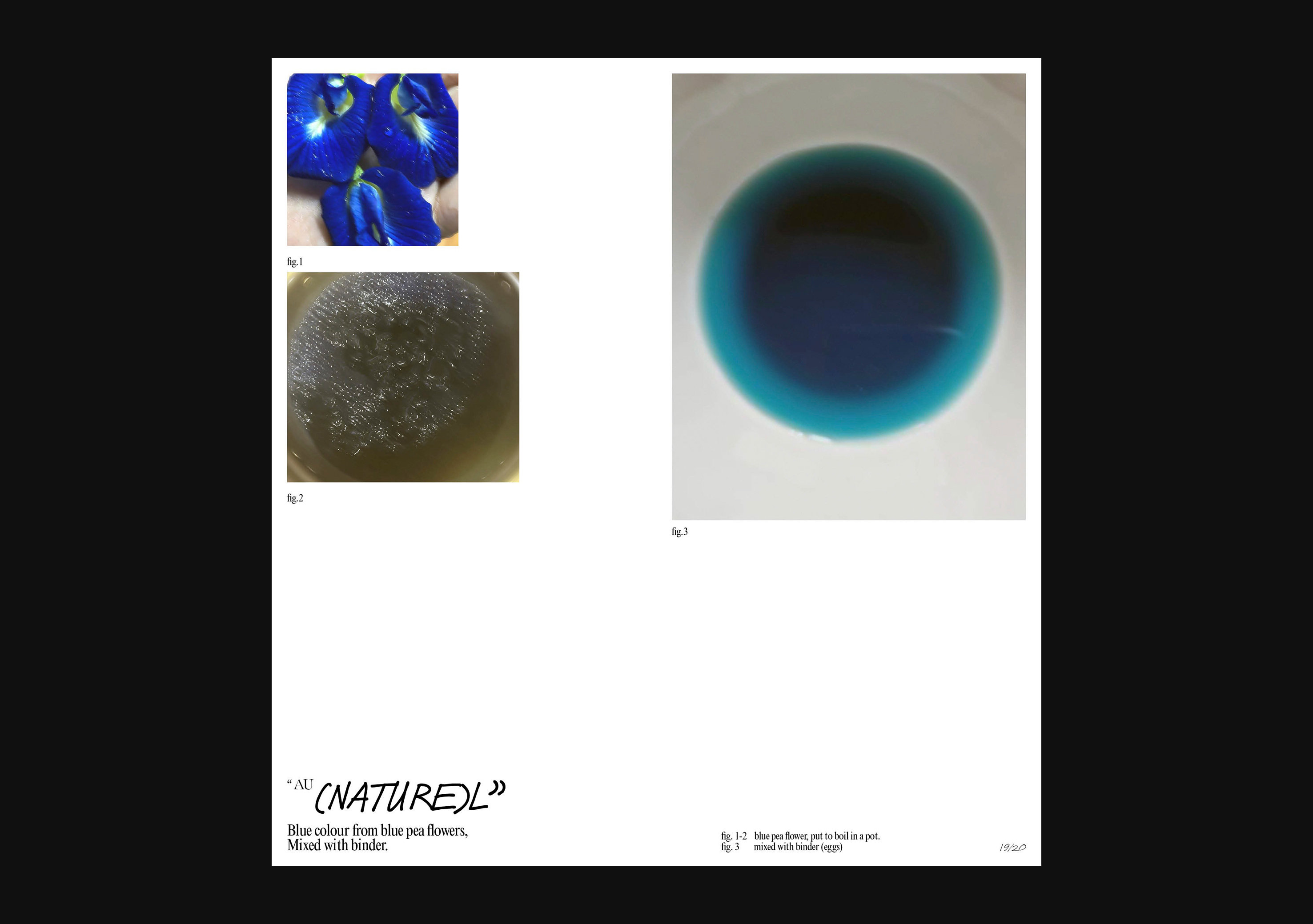
Part 1 of Tone Death is where the mundane process of printing is transformed into an experimental endeavour through the deliberate interruption of print jobs with verbs such as, tear, pull and fold. By introducing subtle human interventions into the mechanical precision of the printer, we’re pushing the technical abilities of the digital printer while still getting it to work right. Each interruption has added layers of depth and complexity to the print process, challenging conventional norms of perfection.


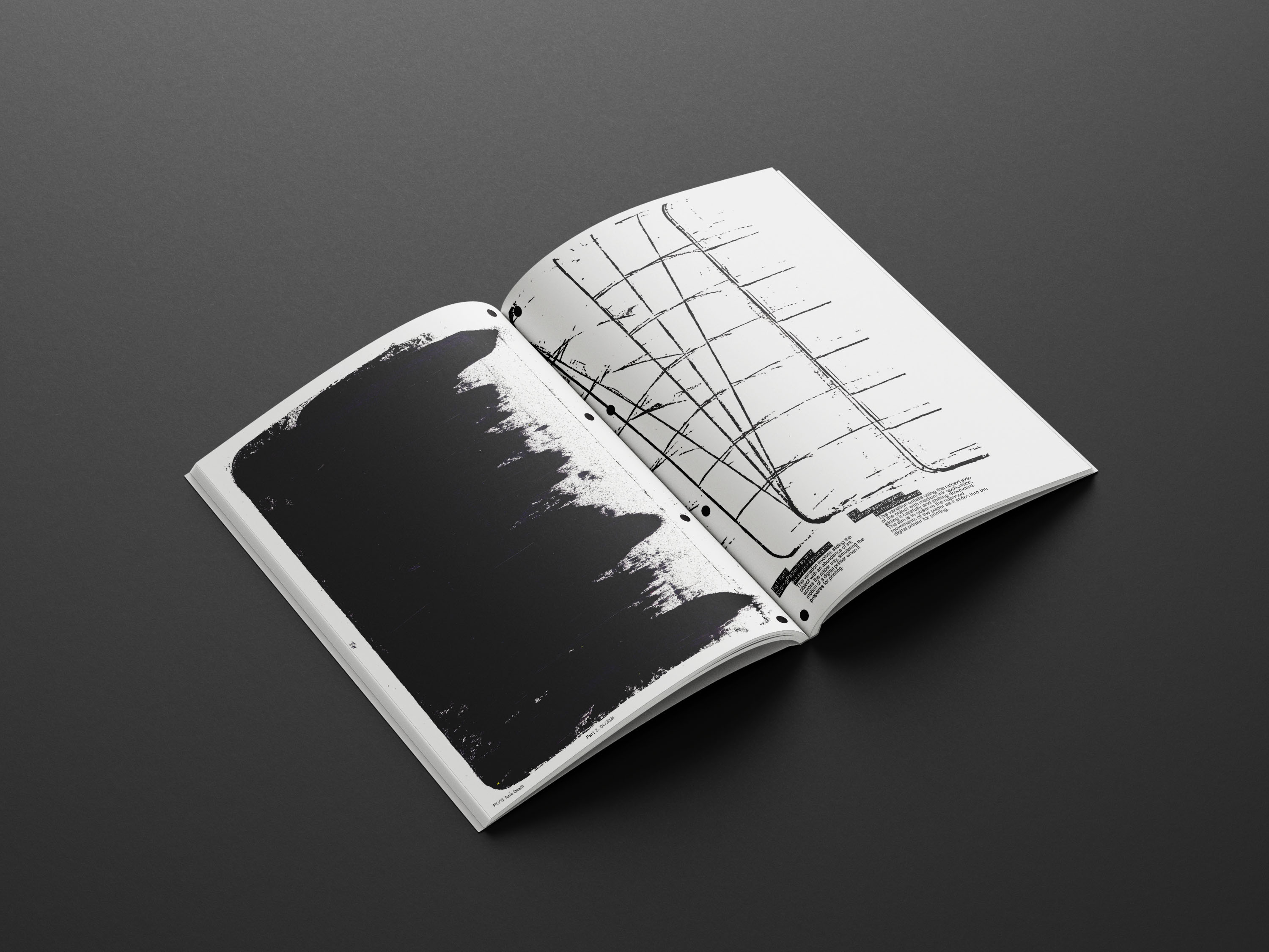

Part 2
210 x 297 mm
Exposed stitched,
Experimental,
Visual research
210 x 297 mm
Exposed stitched,
Experimental,
Visual research
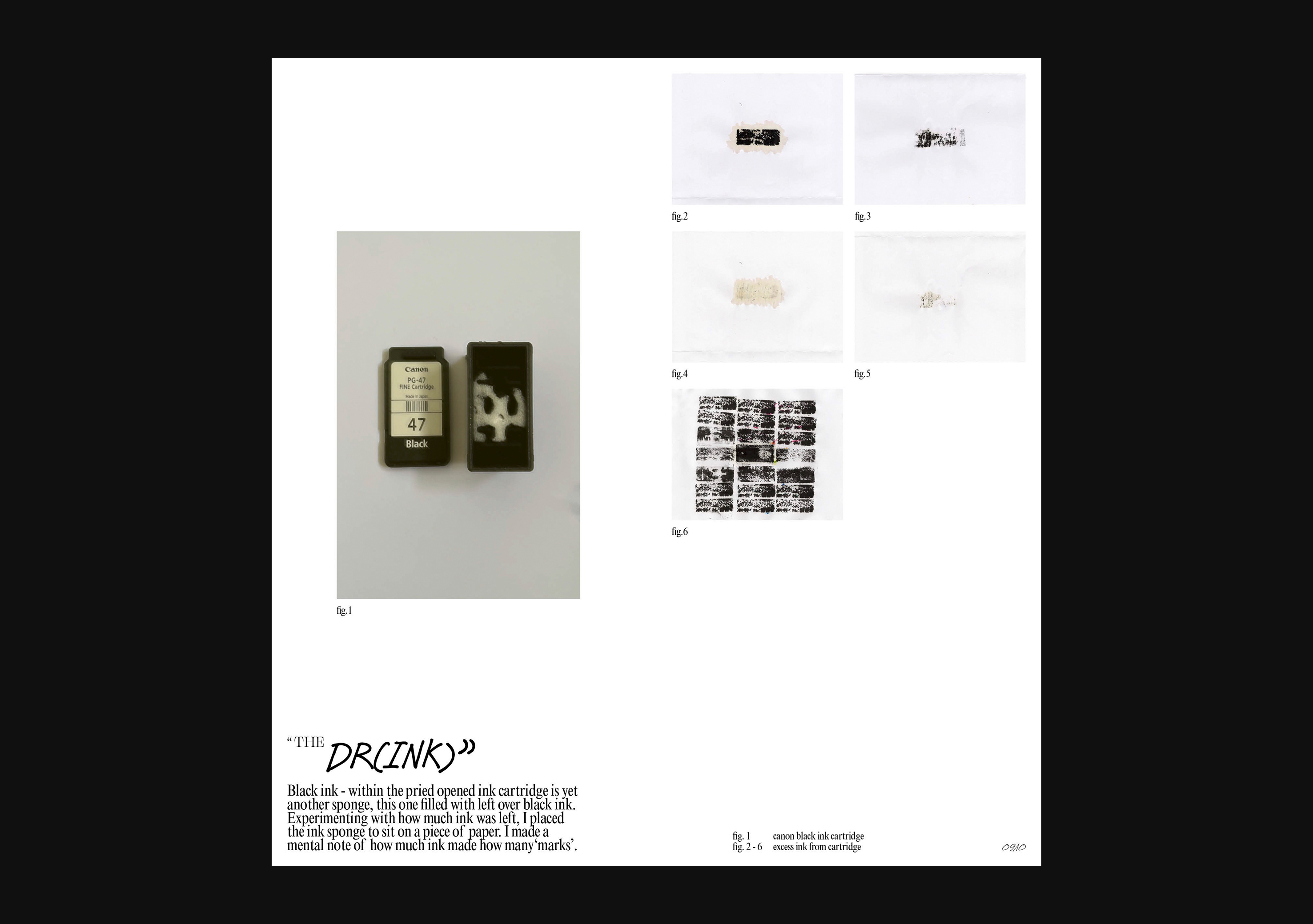
In Part 2 of Tone Death, the printer is physically taken apart to conduct experiments on specific parts, emphasising the importance of reexamining the familiar. This process redefines the boundaries of the printer components and asserts control over the output. Just like in Part 1, key printer components are selected, and corresponding verbs depicting their actions are documented in the zine.
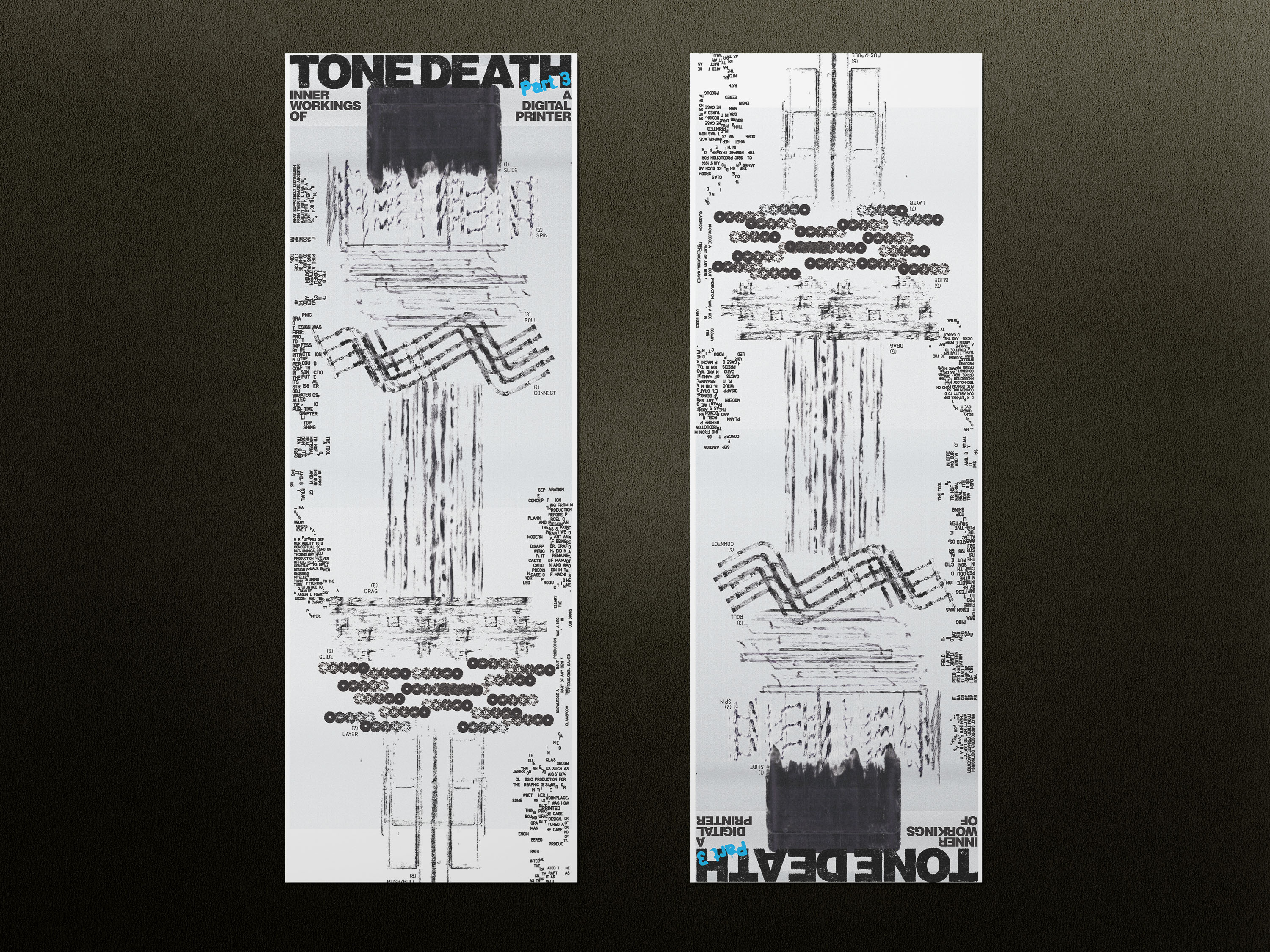
Part 3
600 x 1800 mm
Experimental,
Visual research,
Poster
600 x 1800 mm
Experimental,
Visual research,
Poster
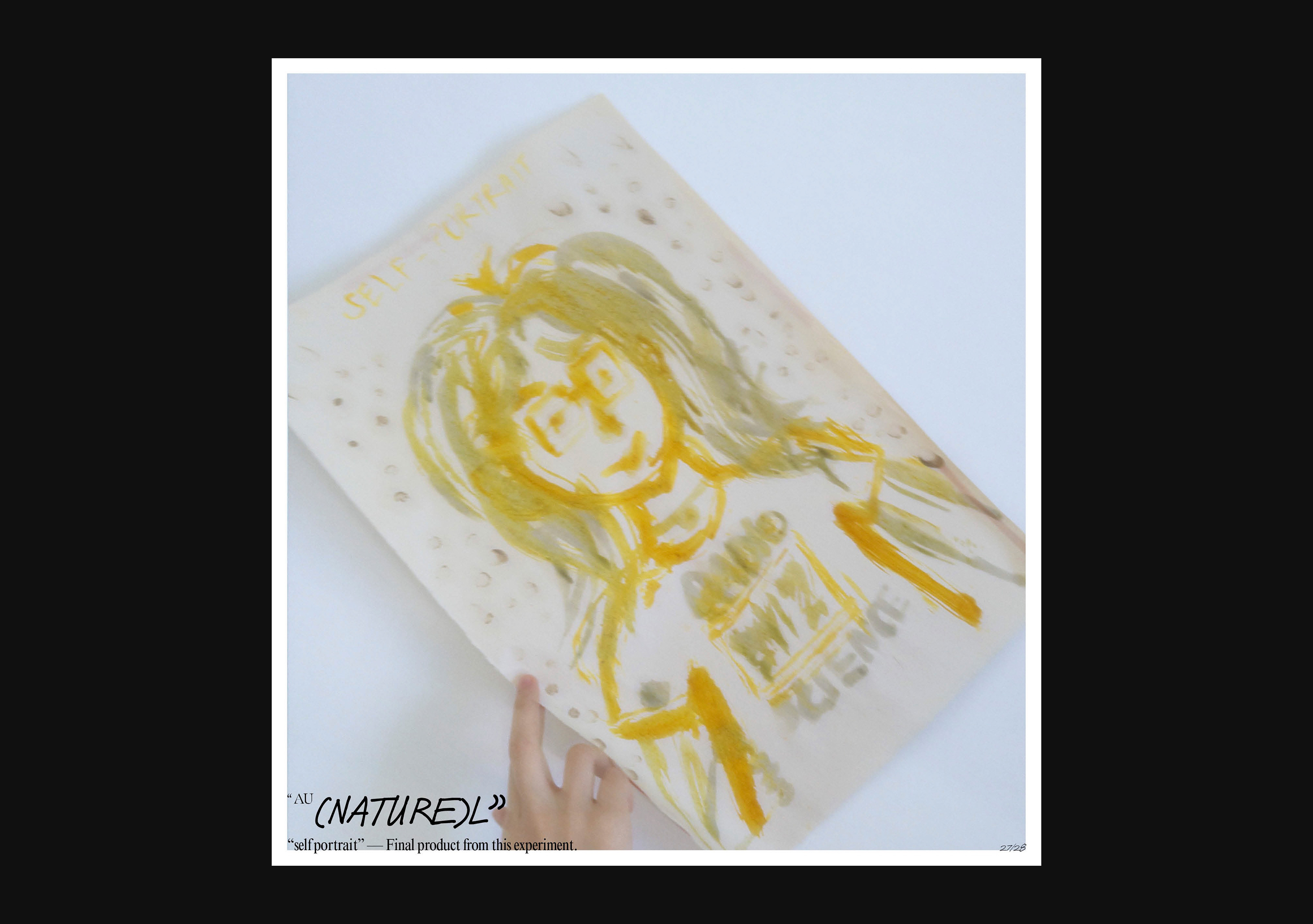
Part 3 features; Inner Workings of a Digital Printer is a combination of 8 chosen marks from each part of the print process. And when placed together, it becomes a representation of an entire print job in a digital printer that is unnoticed and invisible.
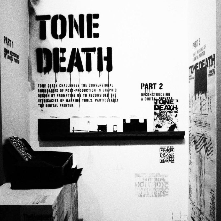
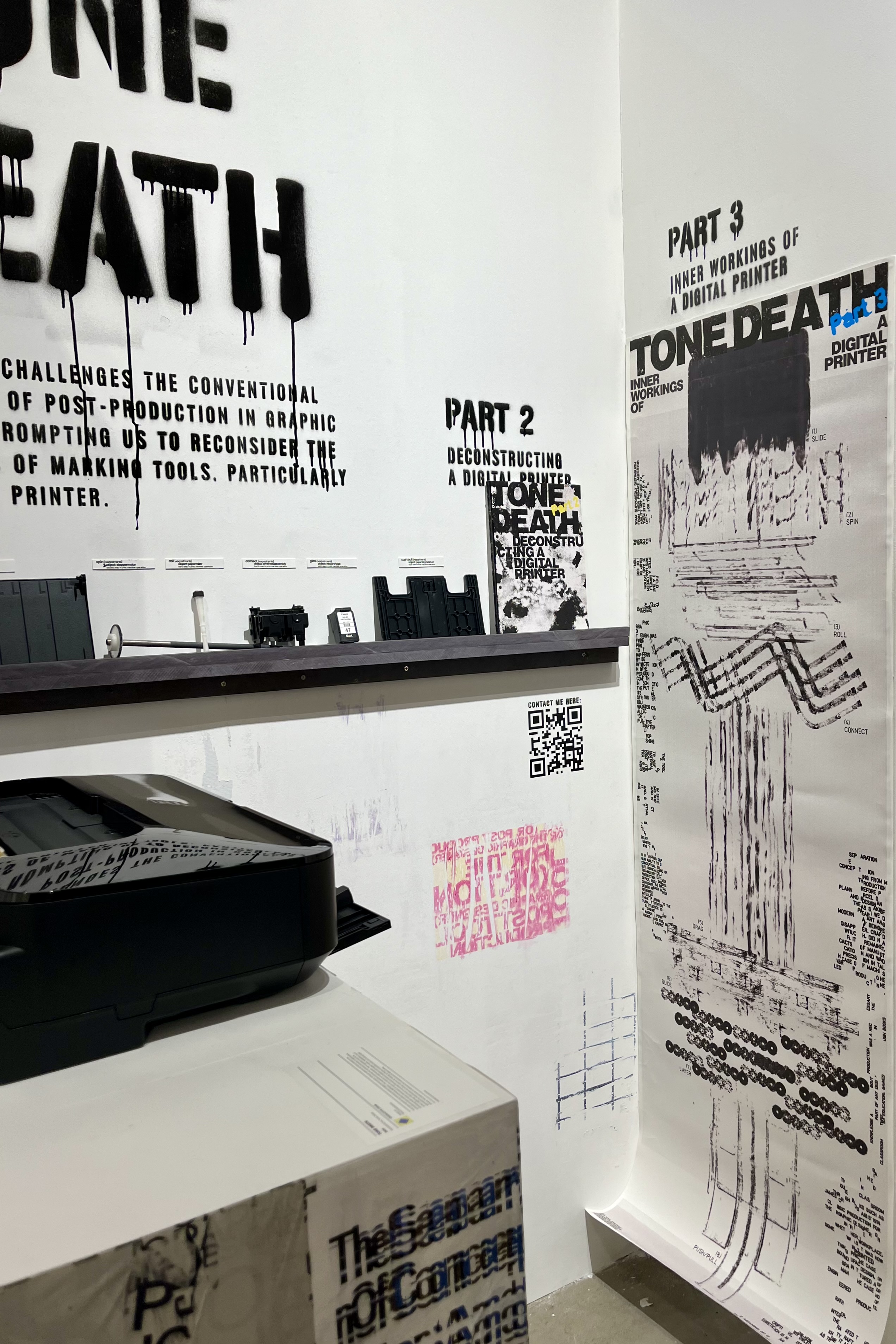


Exhibition
Tone Death turned into an exhibition for my final year graduation show at Artspace @Helutrans.
2023
︎︎︎Tone Death (Research)


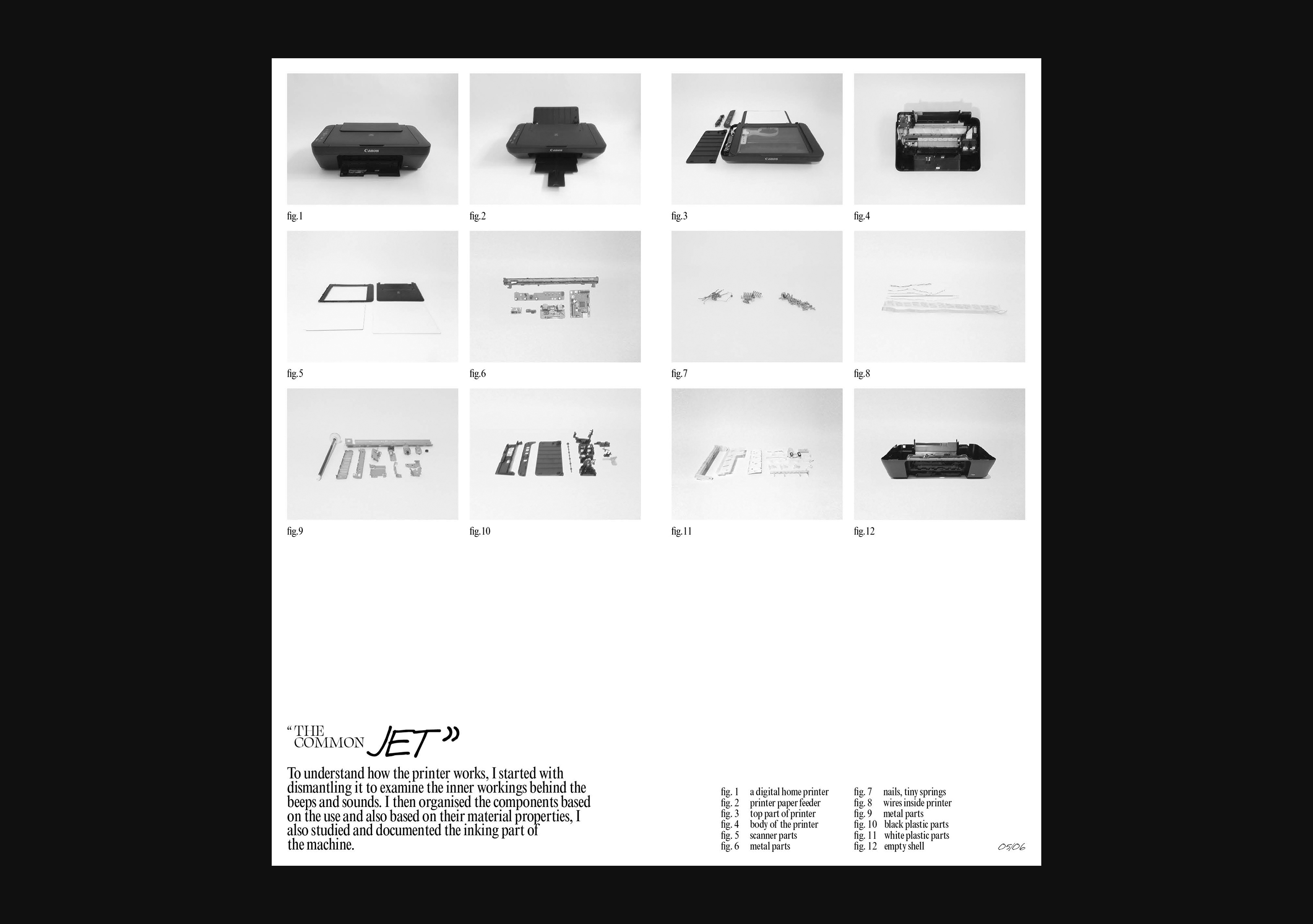


Research, Documentation
Precedent research documented and conducted for Tone Death.
2023
︎︎︎Title Sequence — Severance
Video,
Motion Graphics
Motion Graphics
2023
︎︎︎Flux

Illustration,
Abstract
Abstract
2023
︎︎︎Breathing Easy
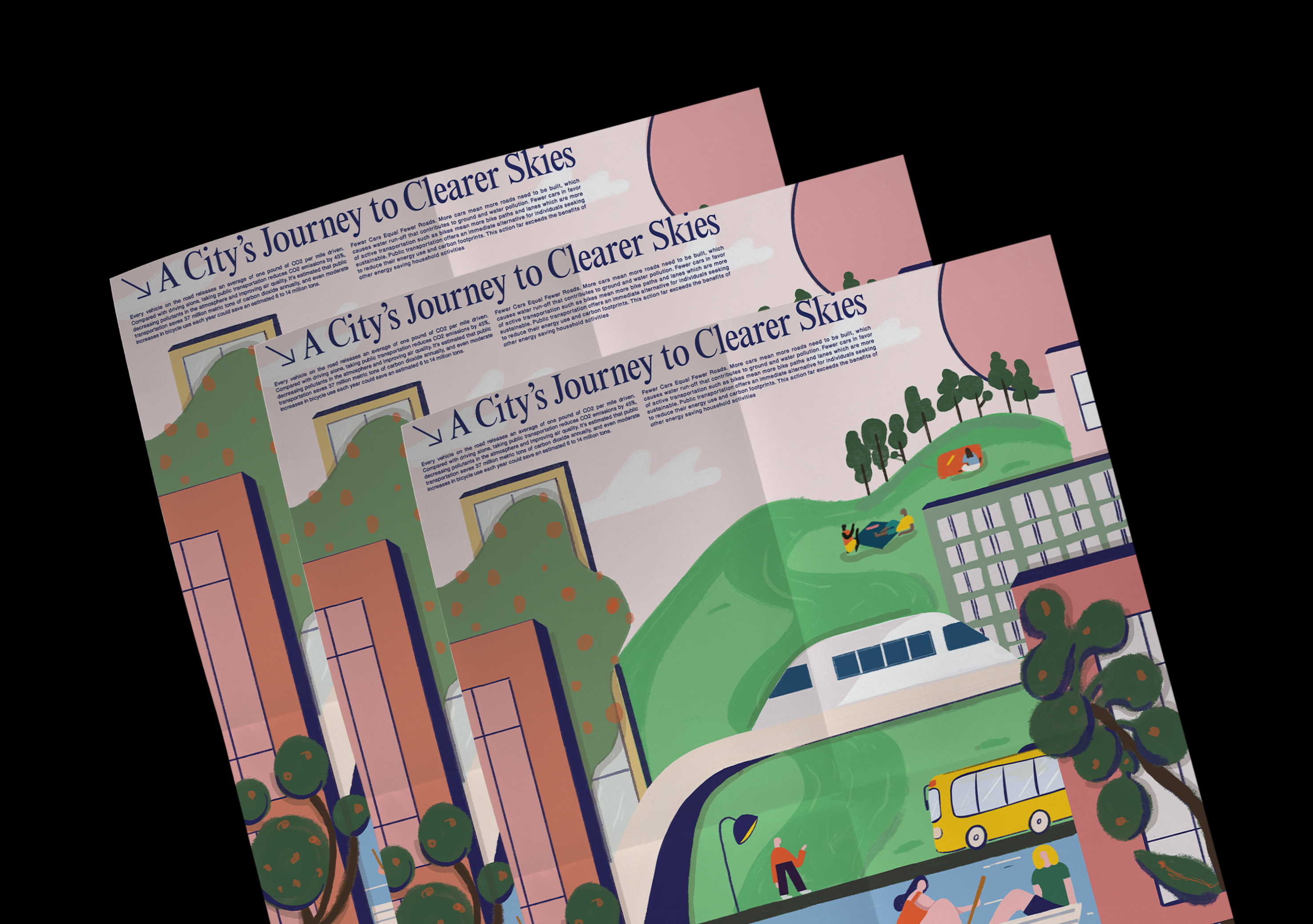
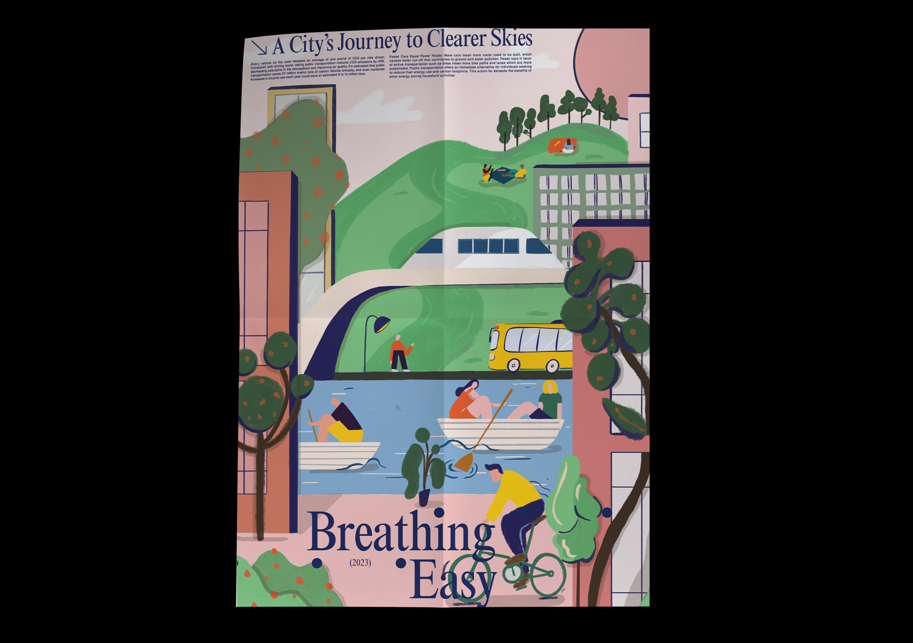
297 x 420 mm
Poster, illustration
Poster, illustration
Introducing a dynamic sustainability poster that dares to reimagine our urban landscape as a verdant oasis, free from the shackles of pollution. This vibrant creation is a testament to the power of greener transportation initiatives in shaping a brighter future for our city.
With every stroke, a vivid picture emerges of a city bustling with life, where eco-friendly modes of transportation reign supreme. From electric buses humming along tree-lined streets to cyclists weaving through green corridors and water taxis, the poster envisions a cityscape teeming with vitality and sustainability.
This illustration aims to ignite our imagination and inspire change as we pave the way towards a greener, cleaner urban utopia
2023
︎︎︎Timeless Fashion
2023
︎︎︎Motion Sketch
Video,
Motion Graphics
Motion Graphics
Motion Sketch #1
Kinectic Typography
Video,
Motion Graphics
Motion Graphics
Motion Sketch #2
Illusion and Depth
Video,
Motion Graphics
Motion Graphics
Motion Sketch #3
2023
︎︎︎Cooking Class
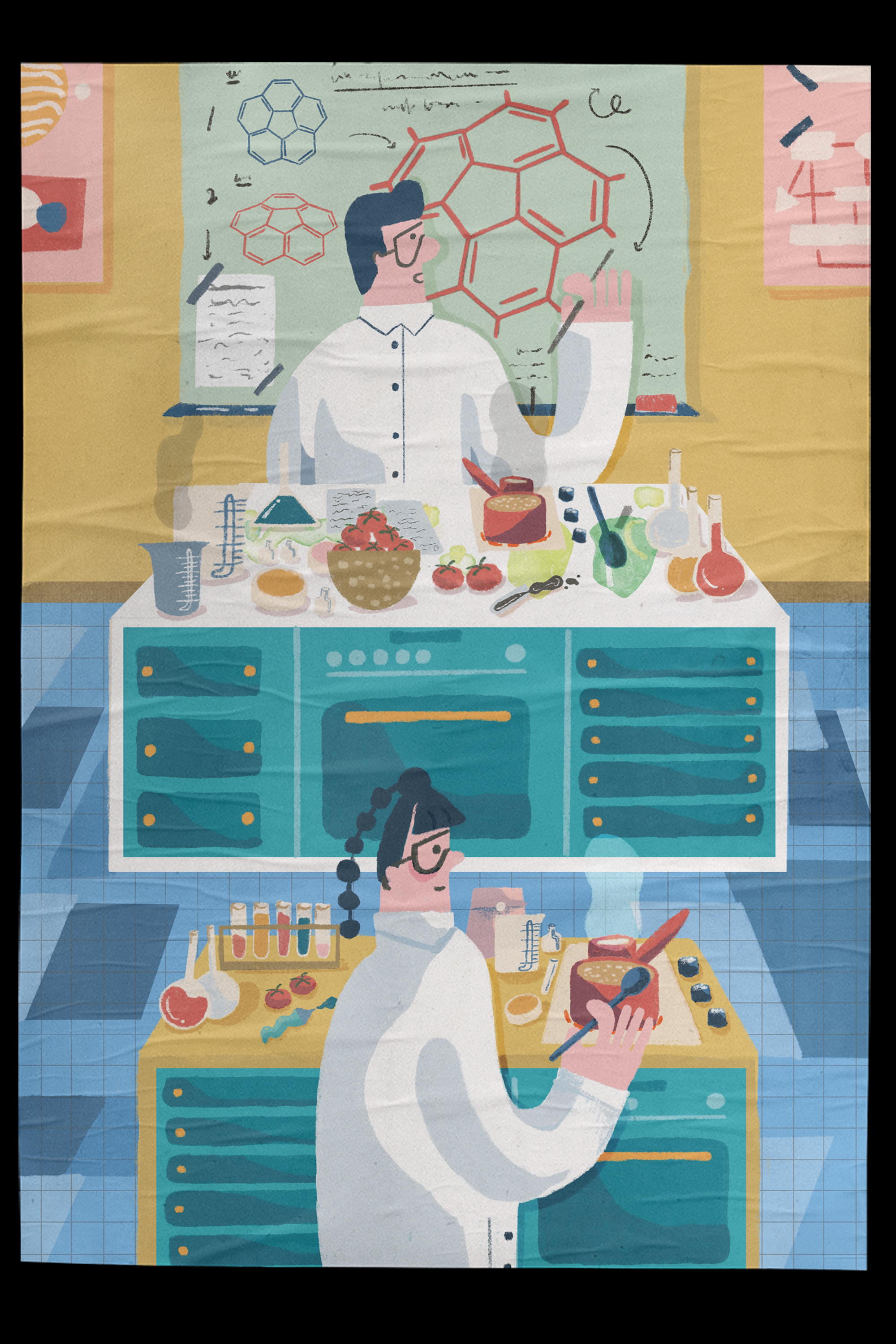
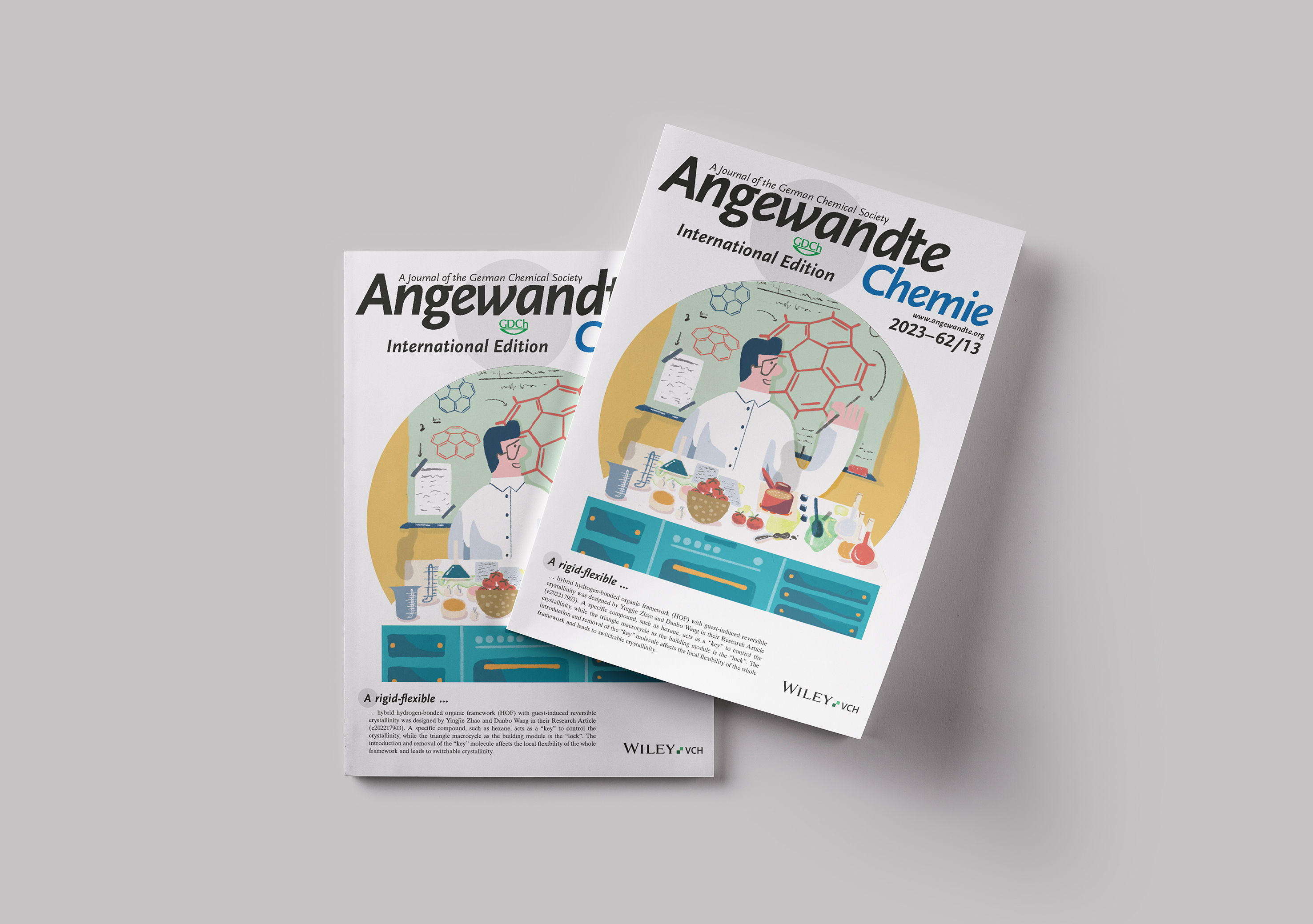
210 x 297 mm
Editorial, Illustration
Editorial, Illustration
An ADM & CCEB Collaboration created for Angewandte Chemie Journal
Awarded 2nd place by ADM and CCEB
This latest illustration is an exploration of the connection between chemistry and cooking. Using a mix of vibrant colors and intricate details, I created an artwork that showcases the beauty and complexity of the chemical reactions that take place in the kitchen. From the sizzle of oil in a frying pan to the bubbling of a boiling pot, I have sought to capture the essence of the culinary arts through the lens of chemistry.
At the heart of this artwork is the idea that cooking is not simply a matter of following a recipe or following a set of instructions, but rather a creative and scientific process that involves experimentation, exploration and discovery. Whether it’s the careful mixing of ingredients to create the perfect sauce, or the precise measurement of temperature to achieve the ideal texture, cooking is a complex and fascinating process that draws on a range of scientific principles.
*Full illustration shown in 2nd pic
2023
︎︎︎plishplash SPARK AR filter

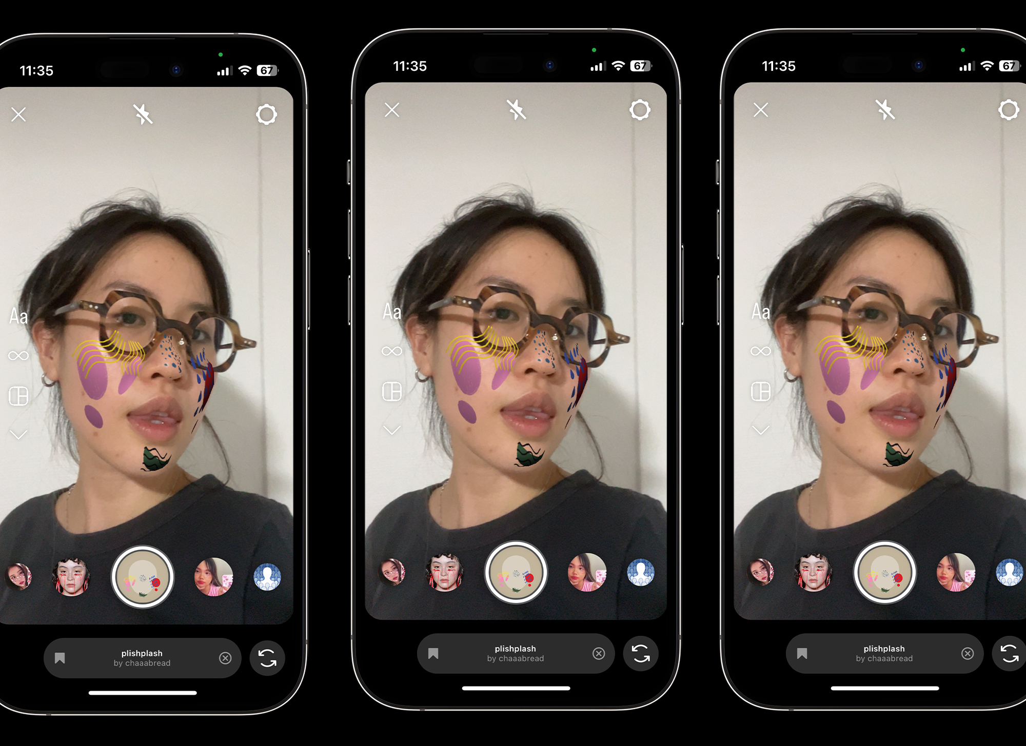
Illustration,
Spark Ar,
Face Filter
Spark Ar,
Face Filter
Who Am I?.... TRULY. Enter the whimsical realm of my mind ‘plishplash’~~ with this playful face filter I crafted using SPARK AR. Designed to mirror the colorful chaos within, this filter is a visual embodiment of my inner self—a bubbling mosaic of thoughts and emotions.
As you explore its irregular patterns and dynamic shifts, you'll glimpse the delightful unpredictability that defines my creative spirit. Rediscovering the exuberant landscape of my imagination, every line and shape reveals a new facet of who I am.
2022
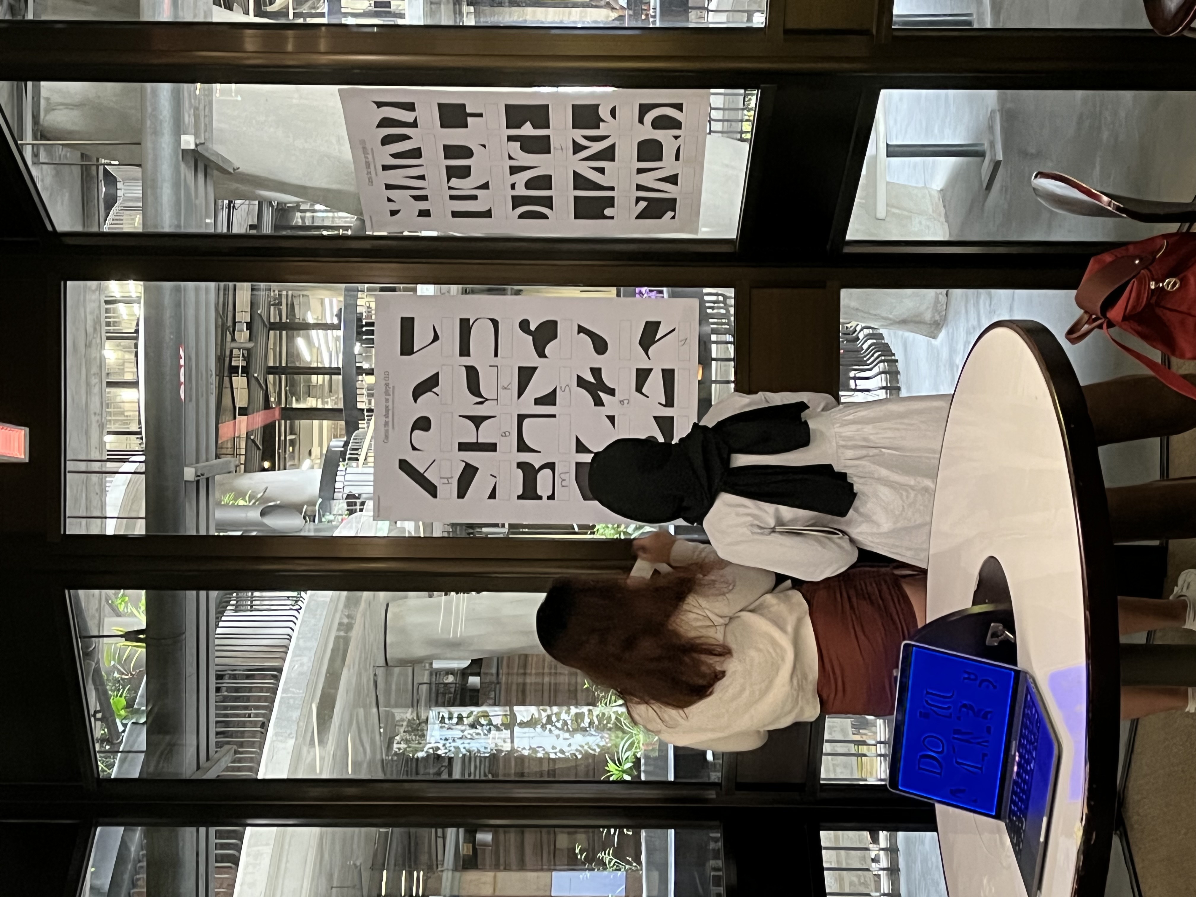
︎︎︎Kayette Typeface


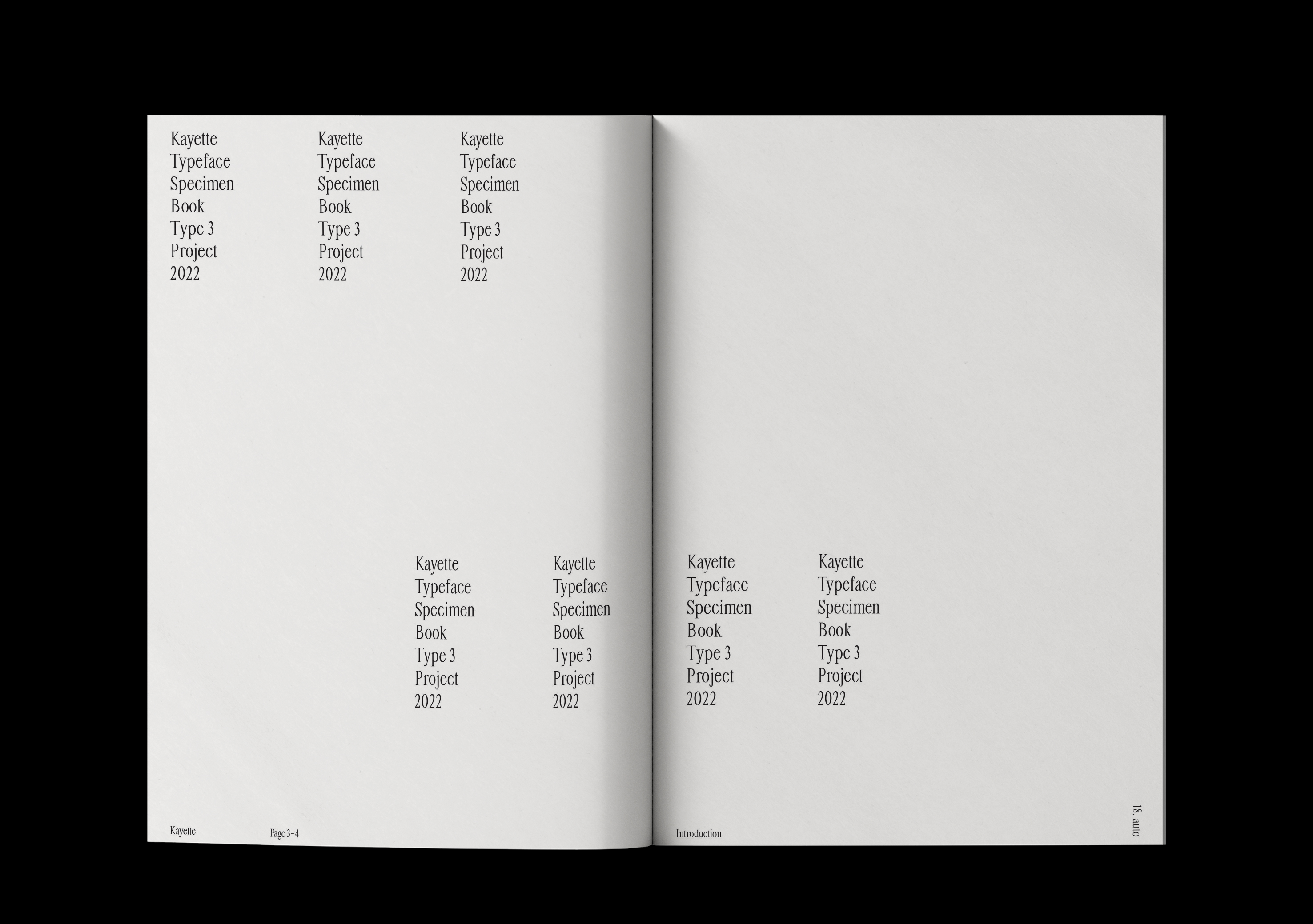


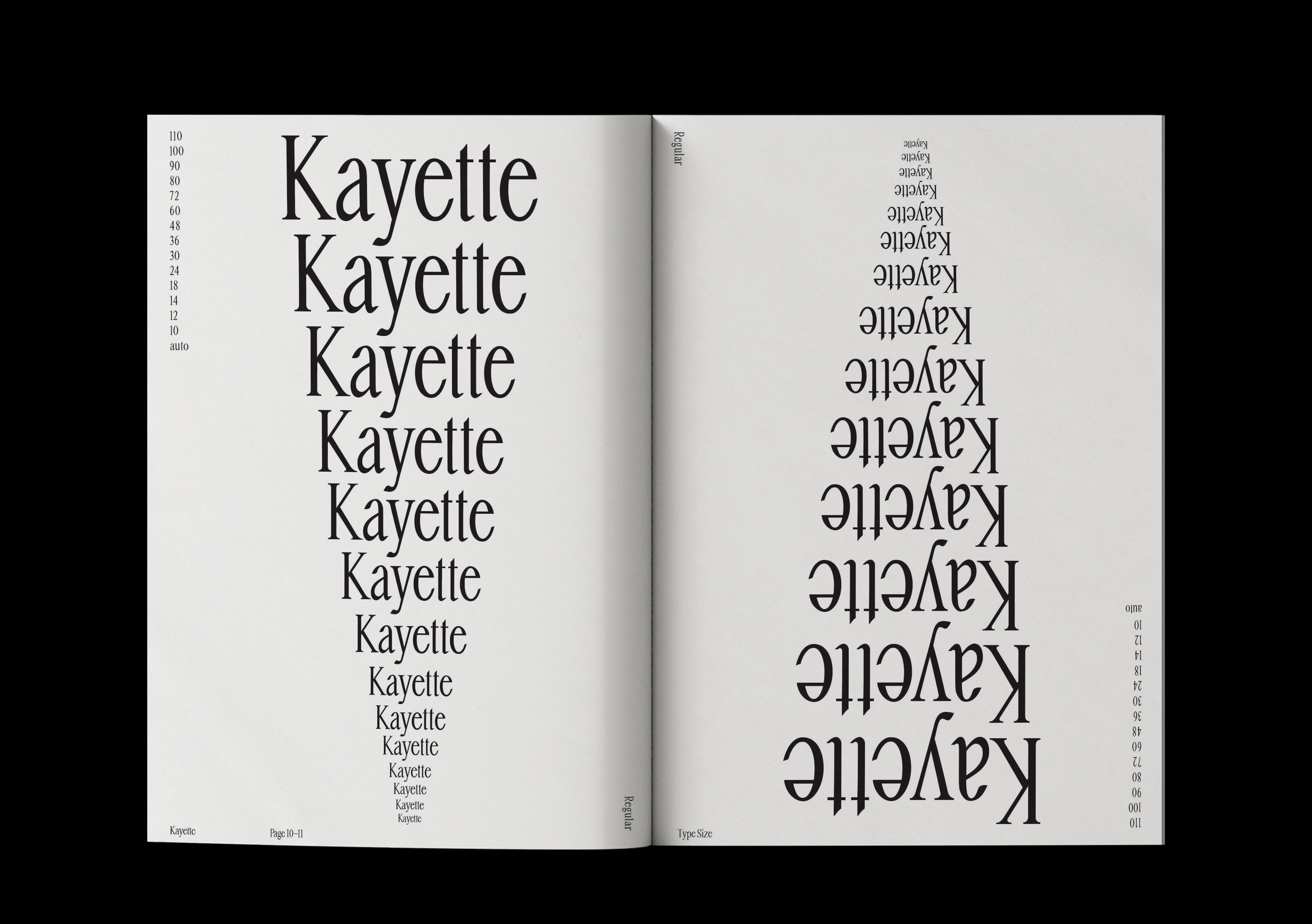
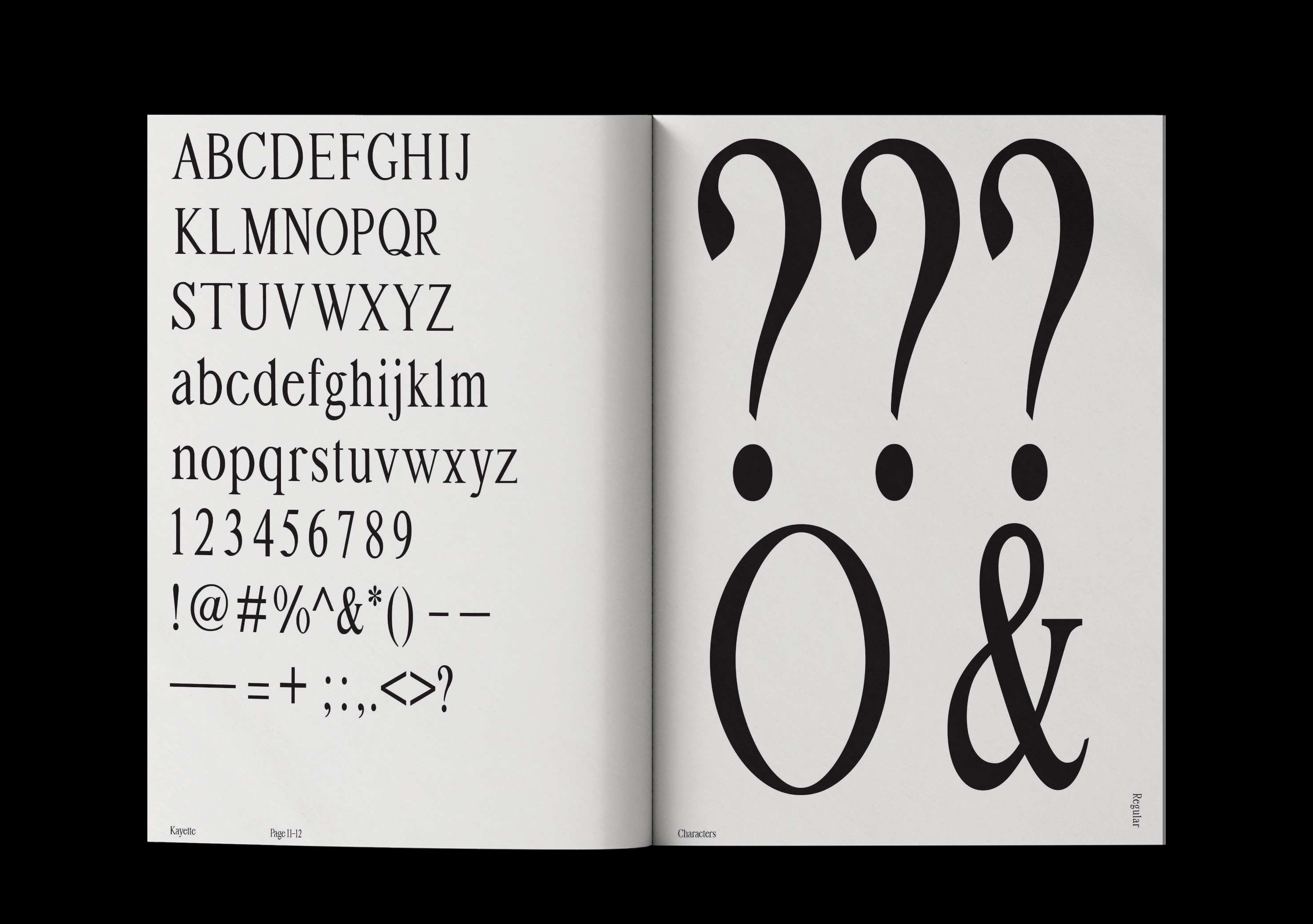


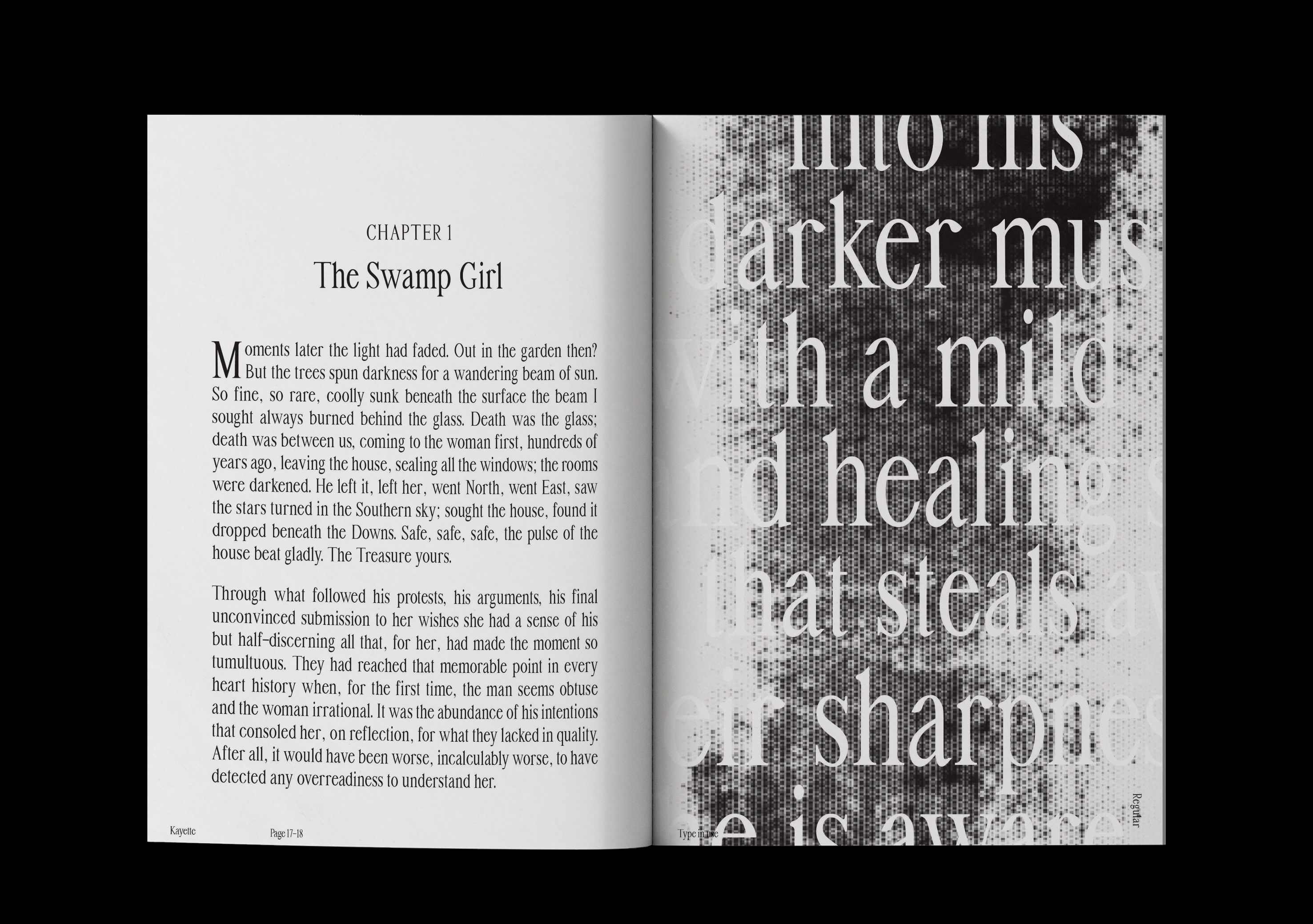
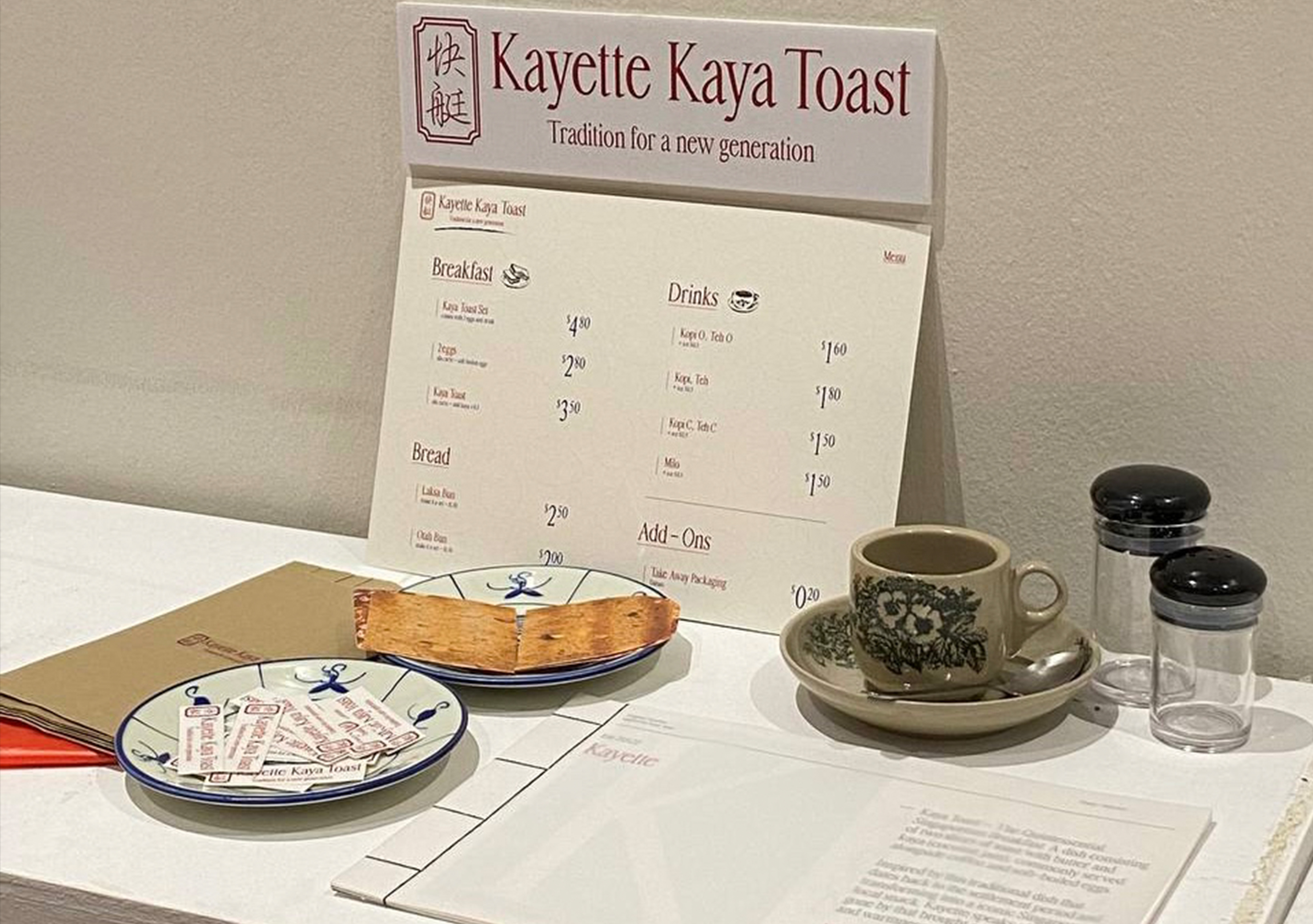
297 x 210 mm
Printed, Japanese bind
Printed, Japanese bind
Introducing Typeface Kayette, a deliciously inspired font born from the aromatic allure of Ya Kun's Kaya Toast Set A! Just like the perfect pairing of kaya and toast, this font captures the essence of indulgence and tradition, infusing every character with the irresistible charm of Singapore's beloved breakfast staple.
Typeface Kayette whispers of the tantalizing aroma of toasted bread and the creamy sweetness of kaya jam, inviting you to savour every letter as if it were a bite of perfection. It's more than just a font; it's a culinary adventure transformed into typographic delight, ready to add a touch of Singaporean flavour to your designs.
2022
︎︎︎Over(fam)iliar
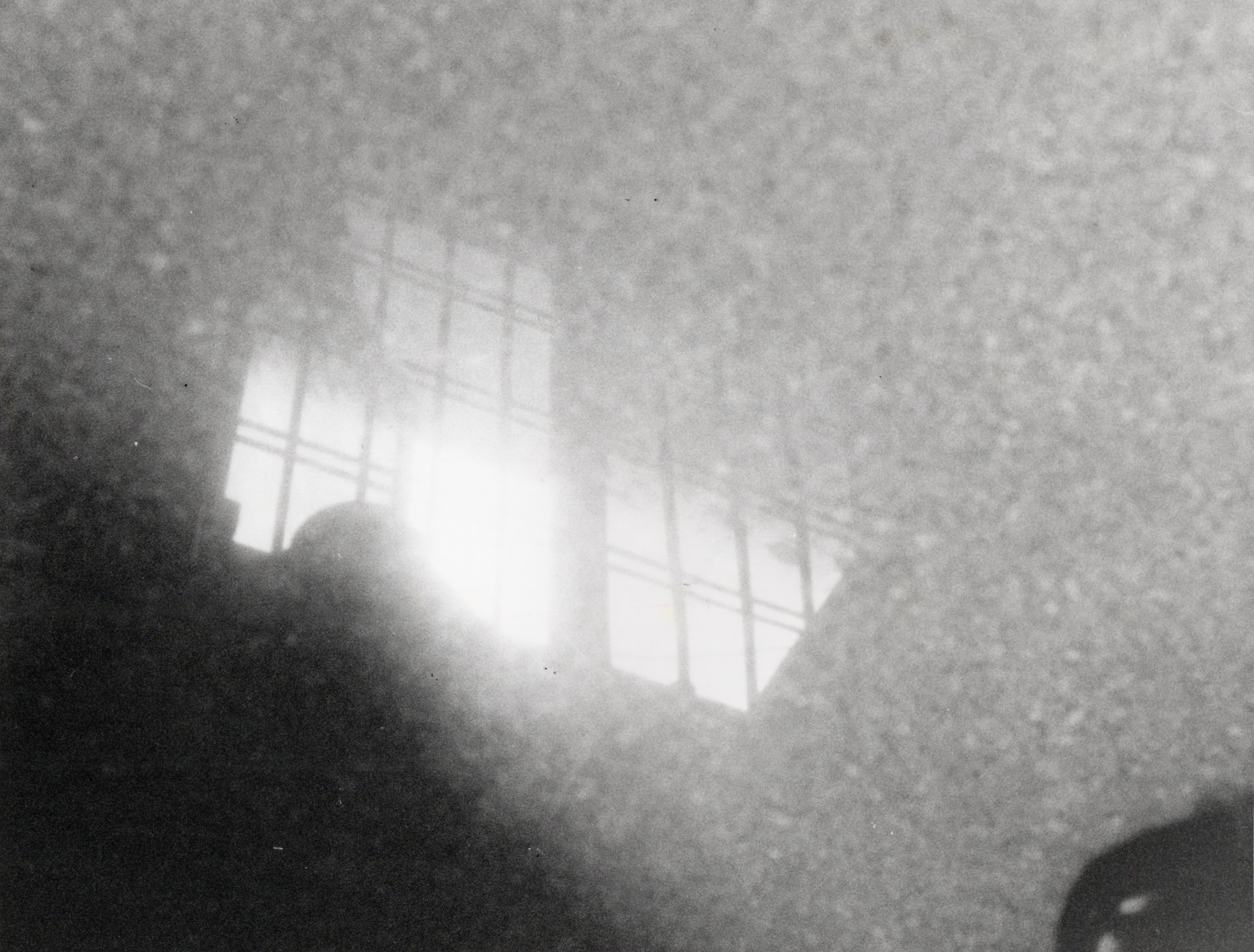
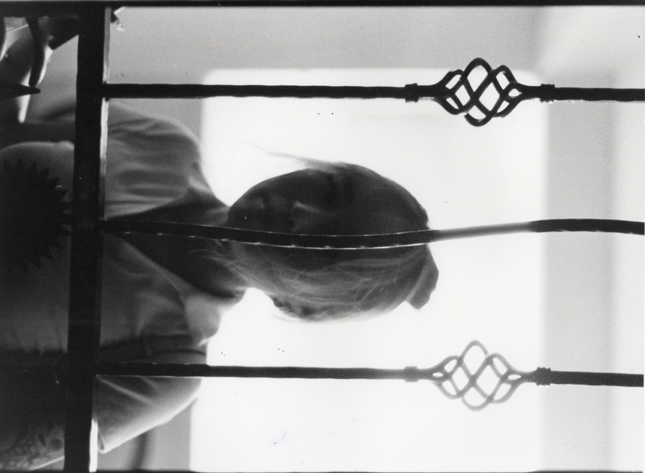
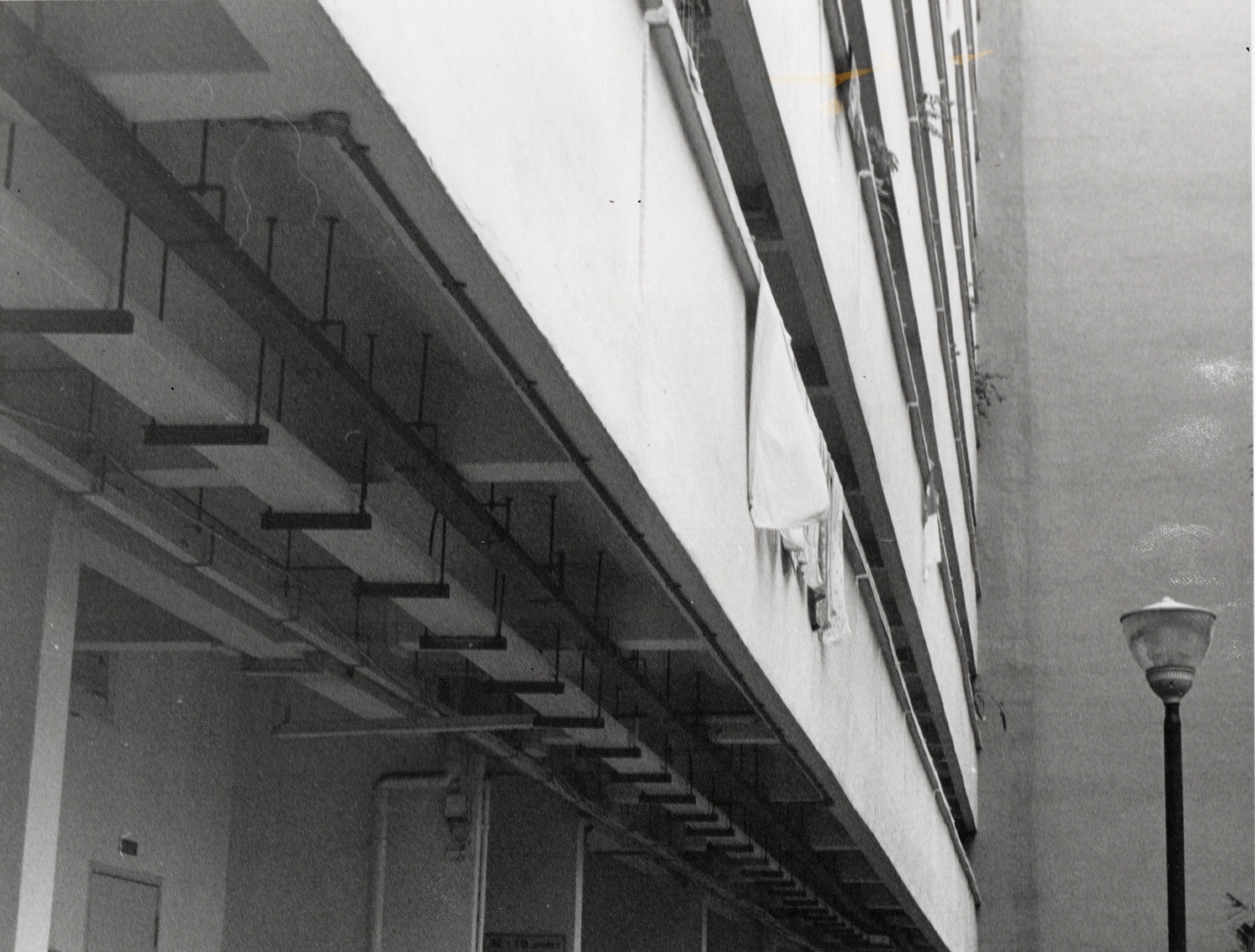

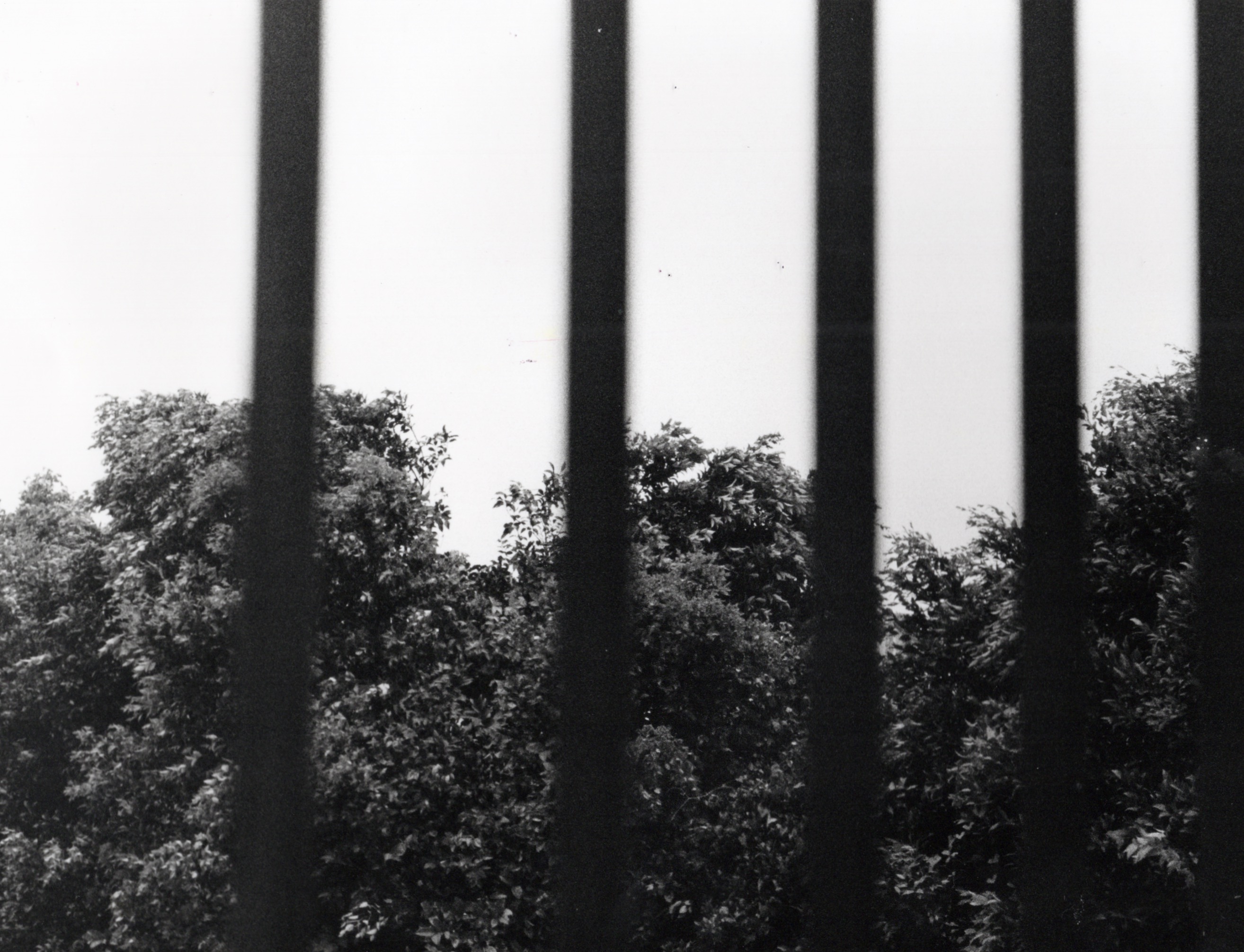
297 x 210 mm
35 mm film,
black and white film
35 mm film,
black and white film
all shot and developed by moi.
2022
︎︎︎(Re)interpretations


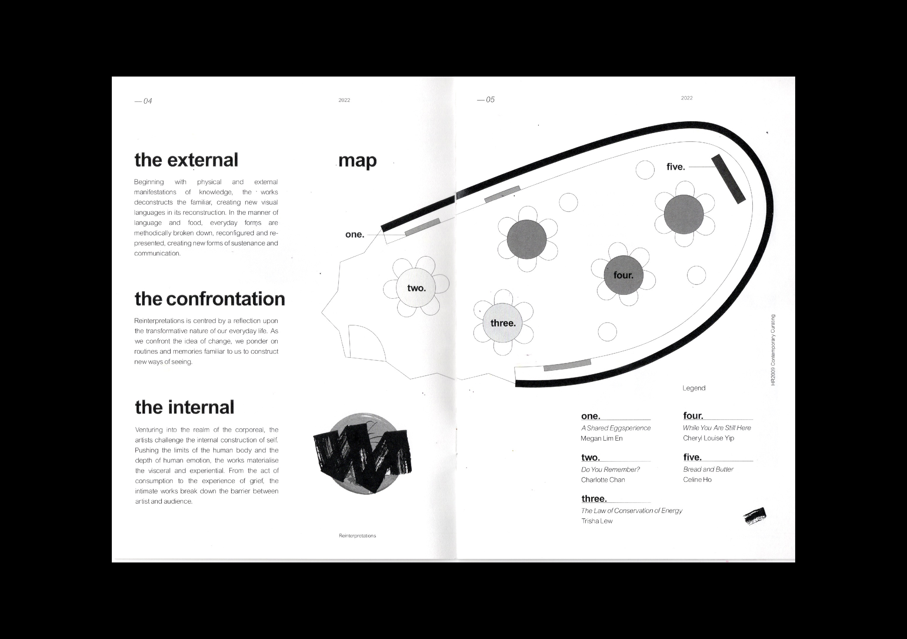


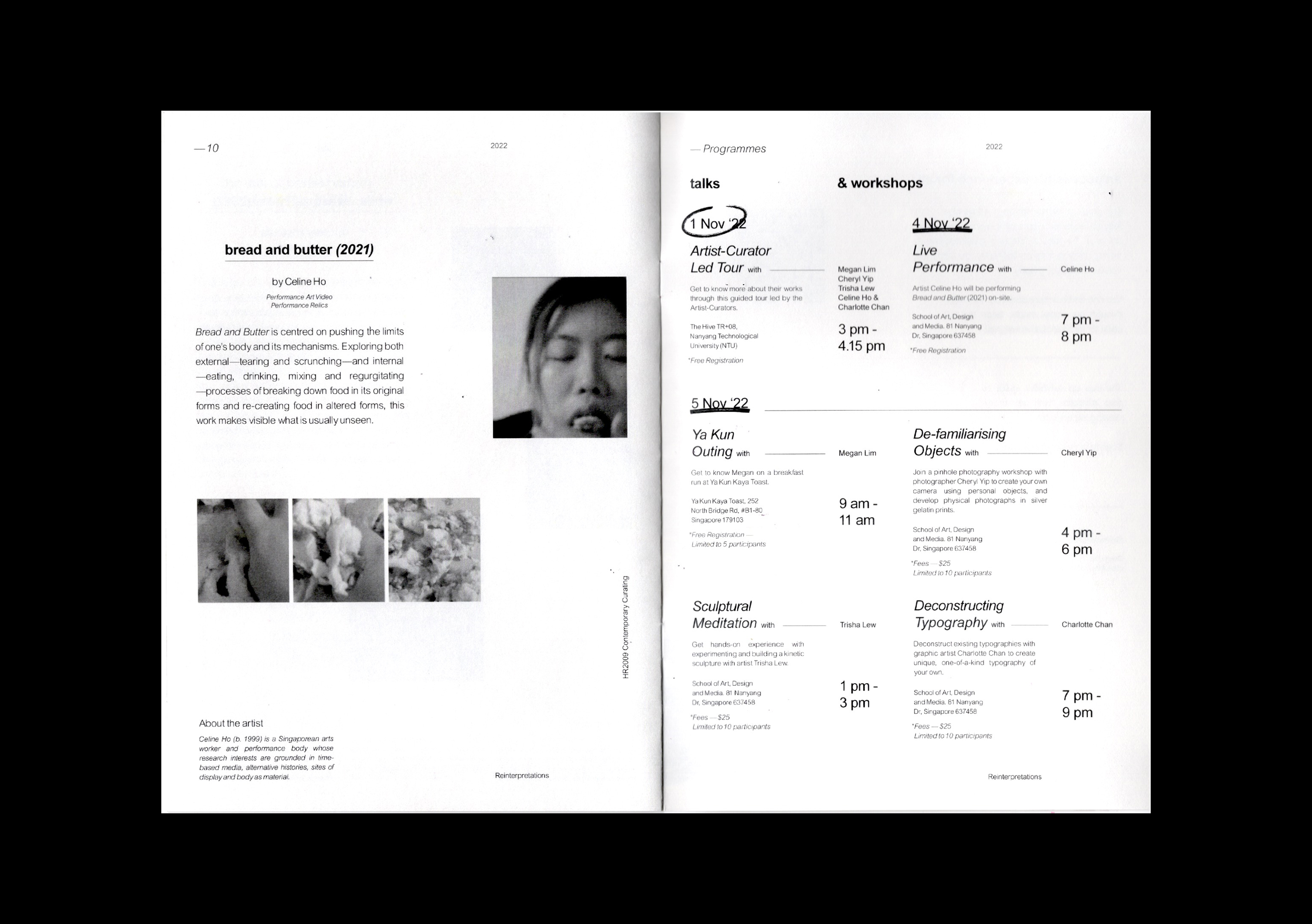
148 x 210 mm
Zine, Saddle-Stitched
Curation
Zine, Saddle-Stitched
Curation
A booklet showcasing five multi-disciplinary works by student artists for an Art History module on contemporary curating at NTU. Through the lens of deconstruction and reconstruction, these artists challenge established norms by reinterpreting shared routines and memories that resonate universally.
Featured on page 7 is 'do you remember?' (2022), my contribution to this exhibition. It's an exploration of the familiar through typography deconstructed into shapes. How much of our memories are retained? Can we reconstruct and recall these familiar shapes?
This booklet provides insights and abstracts on all exhibited works for the assignment, collaboratively created with another student. (*pages 7-12 were done by me).
2022
︎︎︎Be My Guest
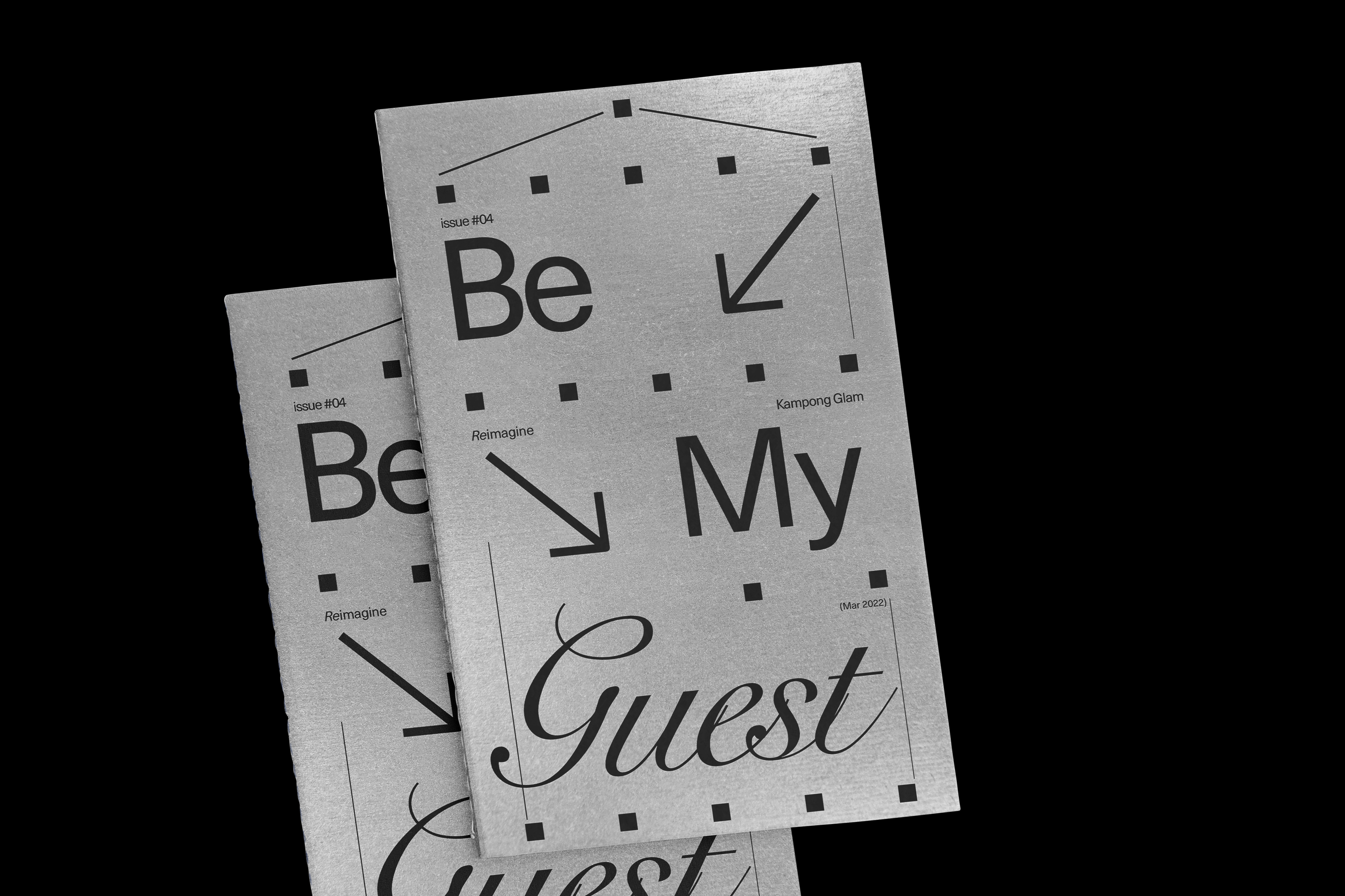

120 x 200 mm
Editorial,
Saddle-Stitched
Editorial,
Saddle-Stitched
A captivating publication that invites you to explore the vibrant world of hotels nestled within the cultural site of Kampong Glam, Singapore. Inspired by the architectural essence of the cross-section shophouses that define this historic district, our cover page design serves as a visual ode to the structural beauty that shapes the area's identity.
2022
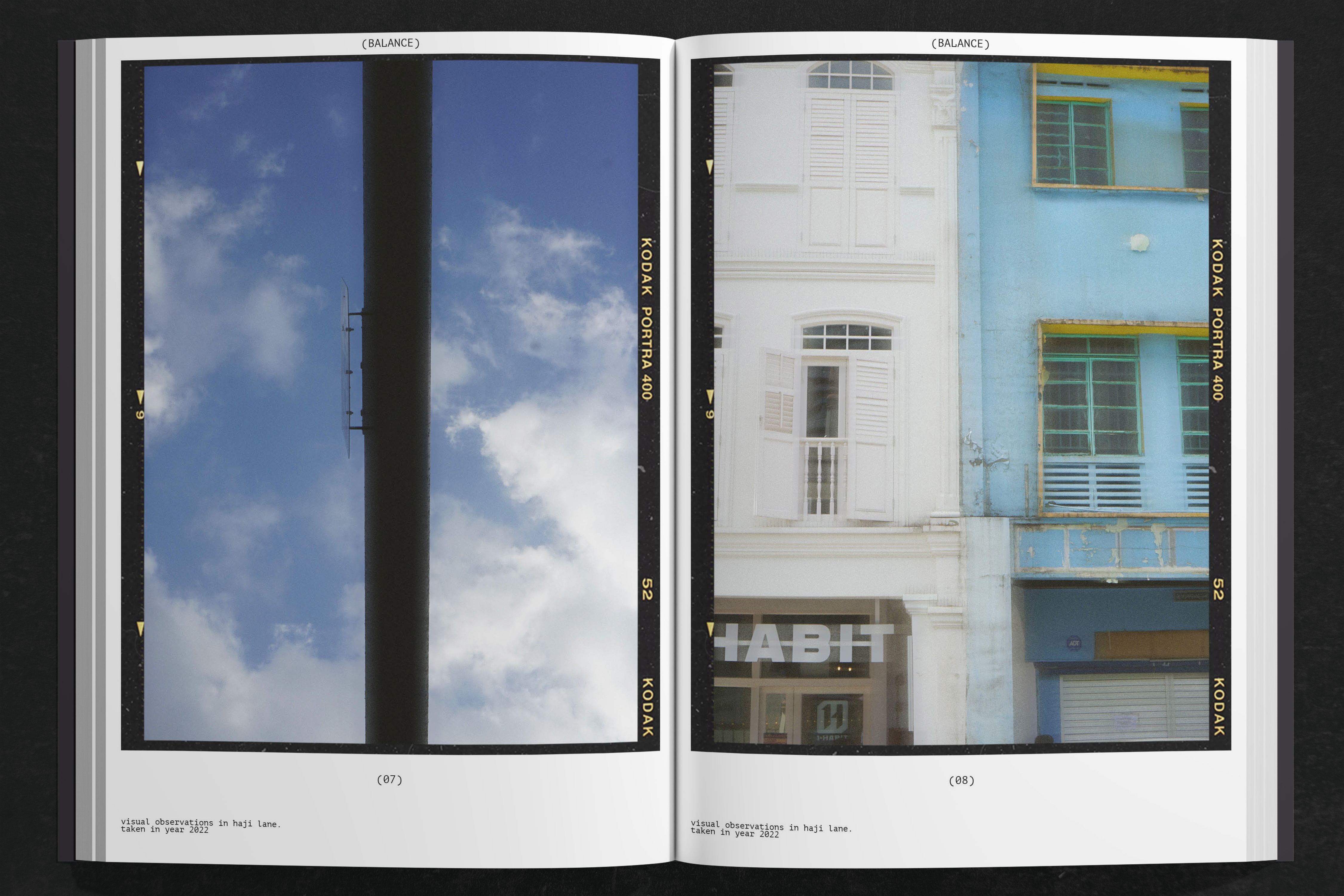
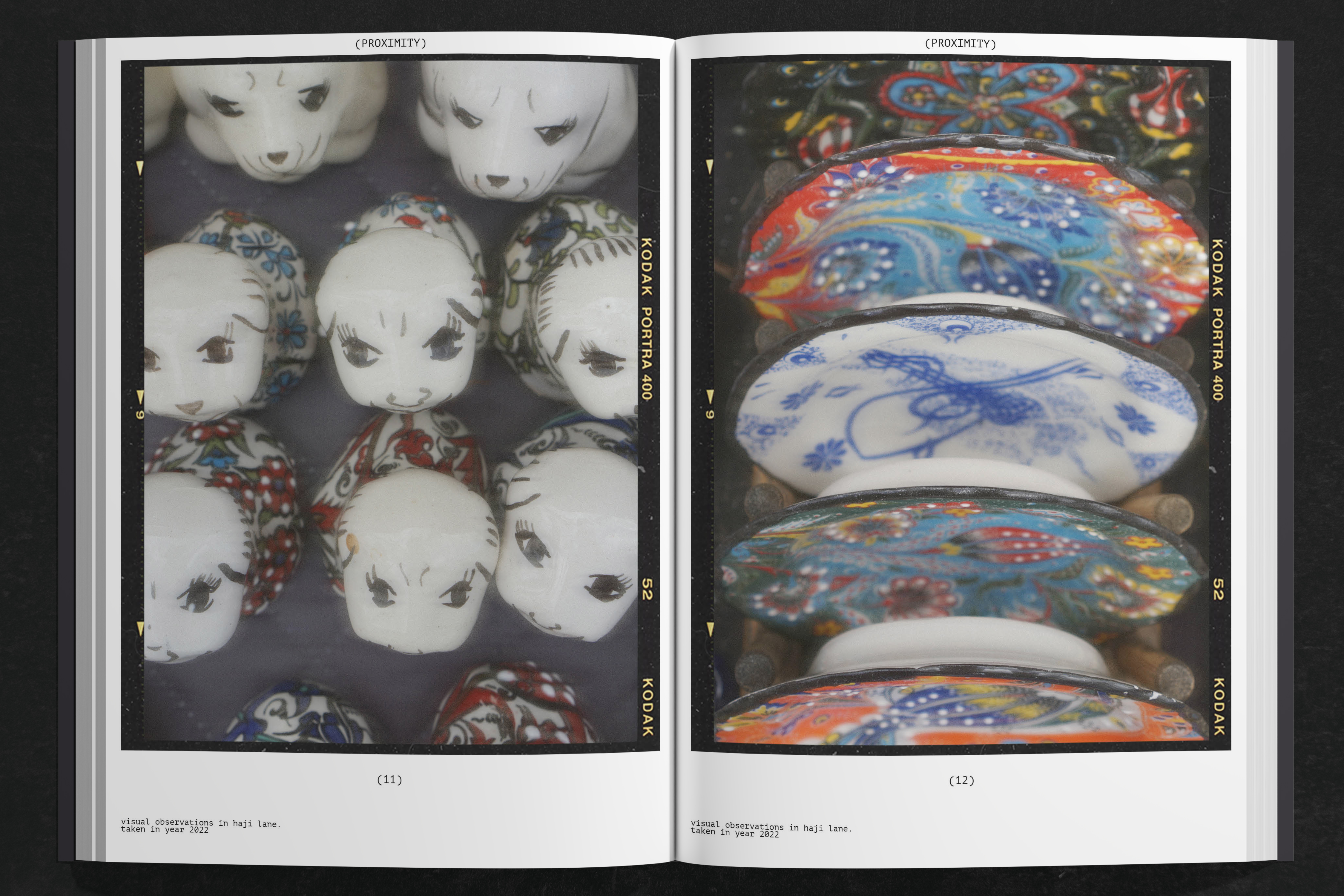
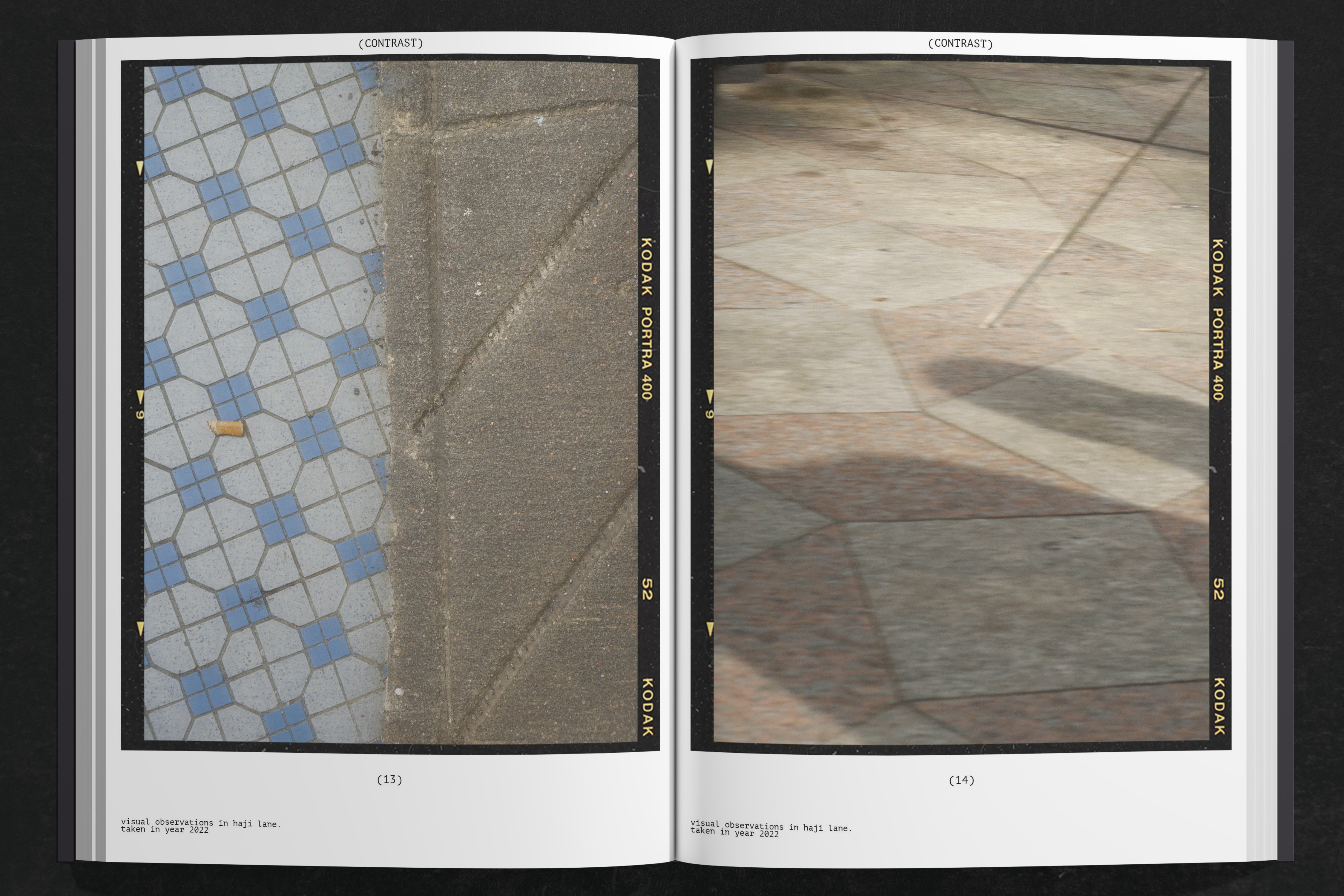
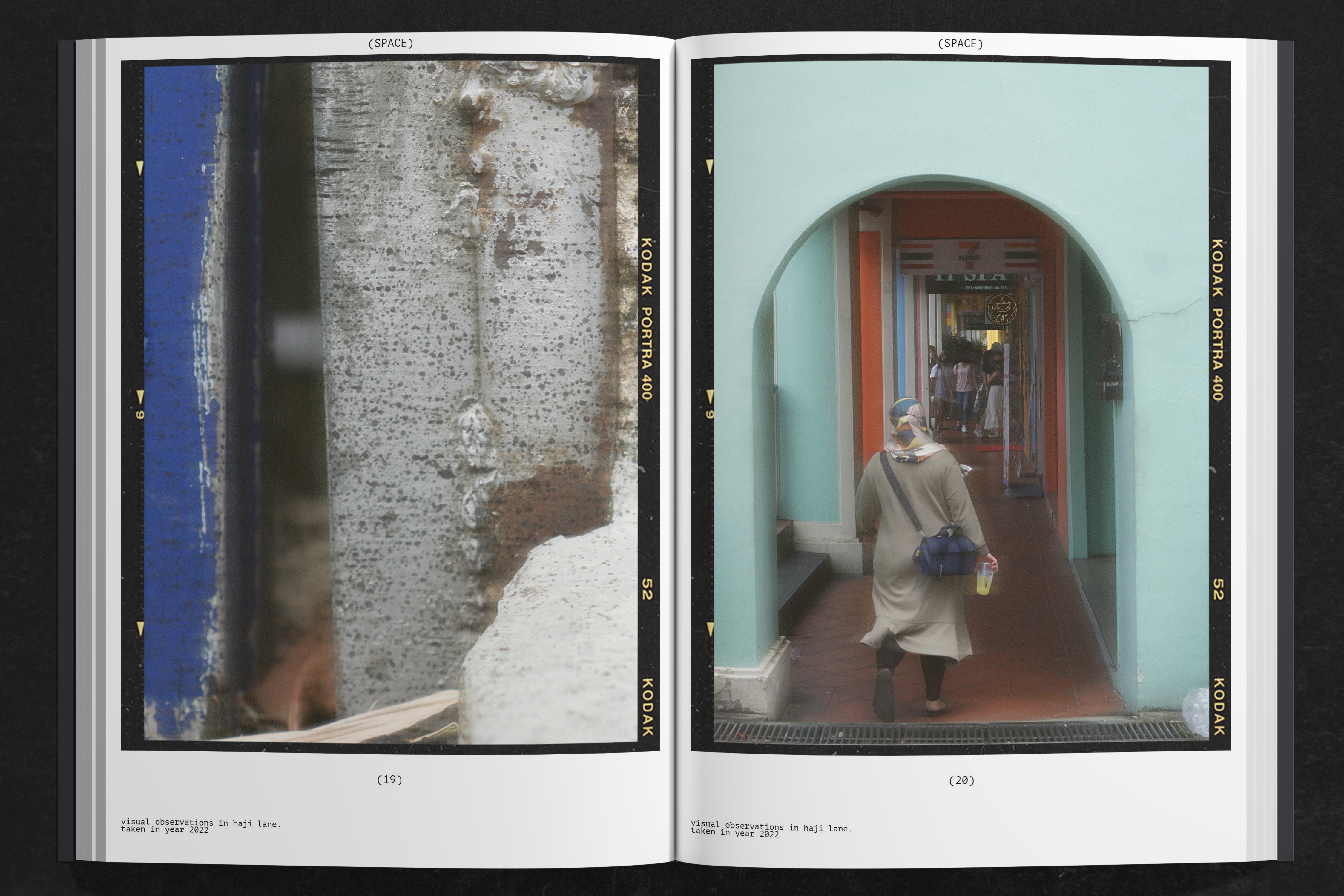
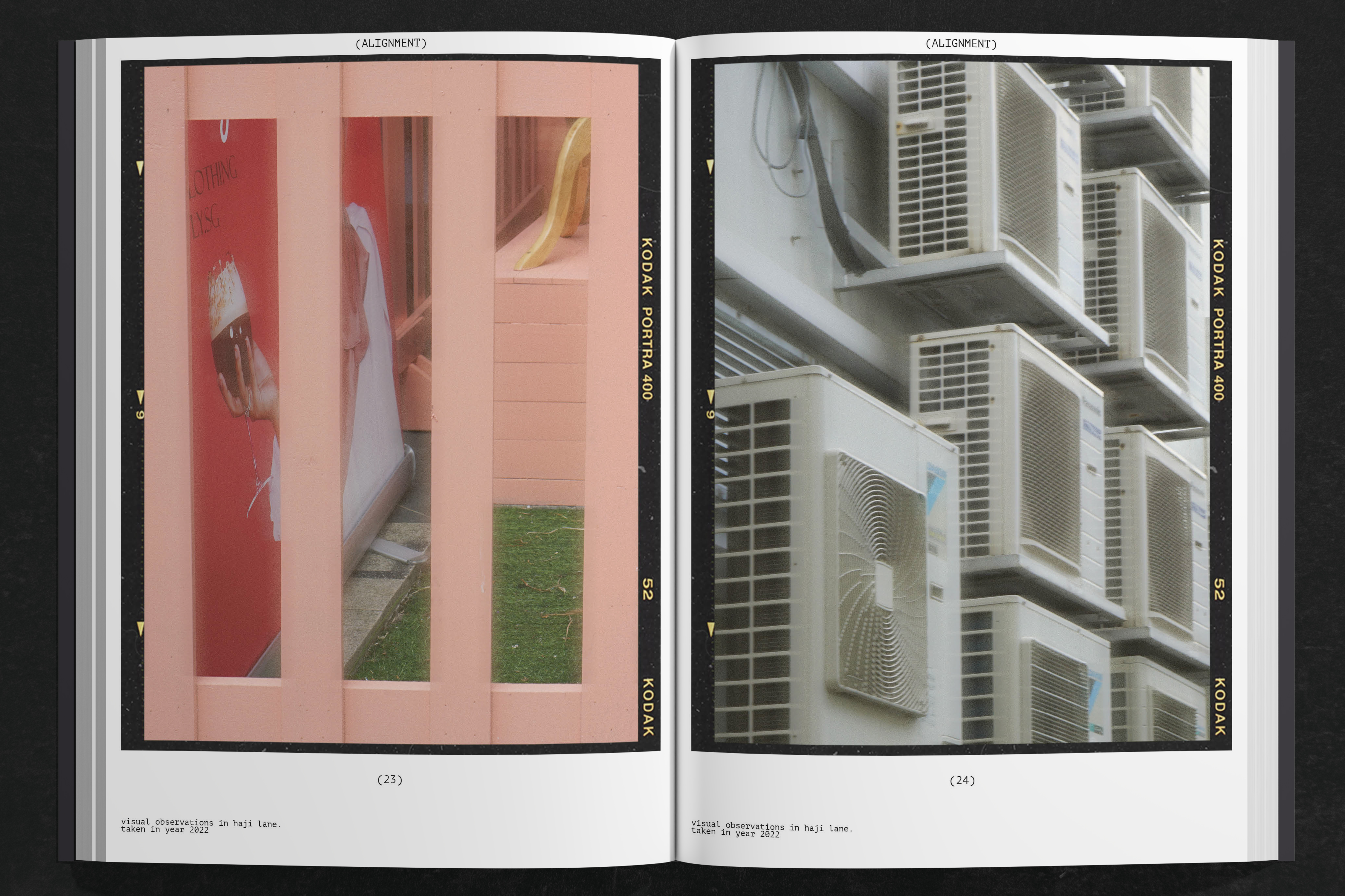
︎︎︎a dreamy afternoon in haji lane


210 x 297 mm
Visual Research,
Photography
Visual Research,
Photography
Take a visual journey through the lively streets of Haji Lane, Singapore, where every corner reveals a story of design principles brought to life. In this exploration, I captured a series of images meticulously selected to exemplify six key design principles: repetition, balance, proximity, contrast, space, and alignment.
Beyond the confines of textbooks and classrooms, this project invites us to witness design principles unfolding in our everyday lives. From the rhythmic repetition of patterns to the delicate dance of balance and contrast, each image offers a glimpse into the artistry and history that surrounds Haji Lane.
As we peel back the layers of visual storytelling woven into the fabric of Haji Lane, we uncovered the hidden symphony of design principles that shape our world. Through this lens, we not only learn to recognize these principles but also to appreciate their nuanced interplay in the rich tapestry of our surroundings.
2022
︎︎︎Parksinson’s Disease
Infographic Poster
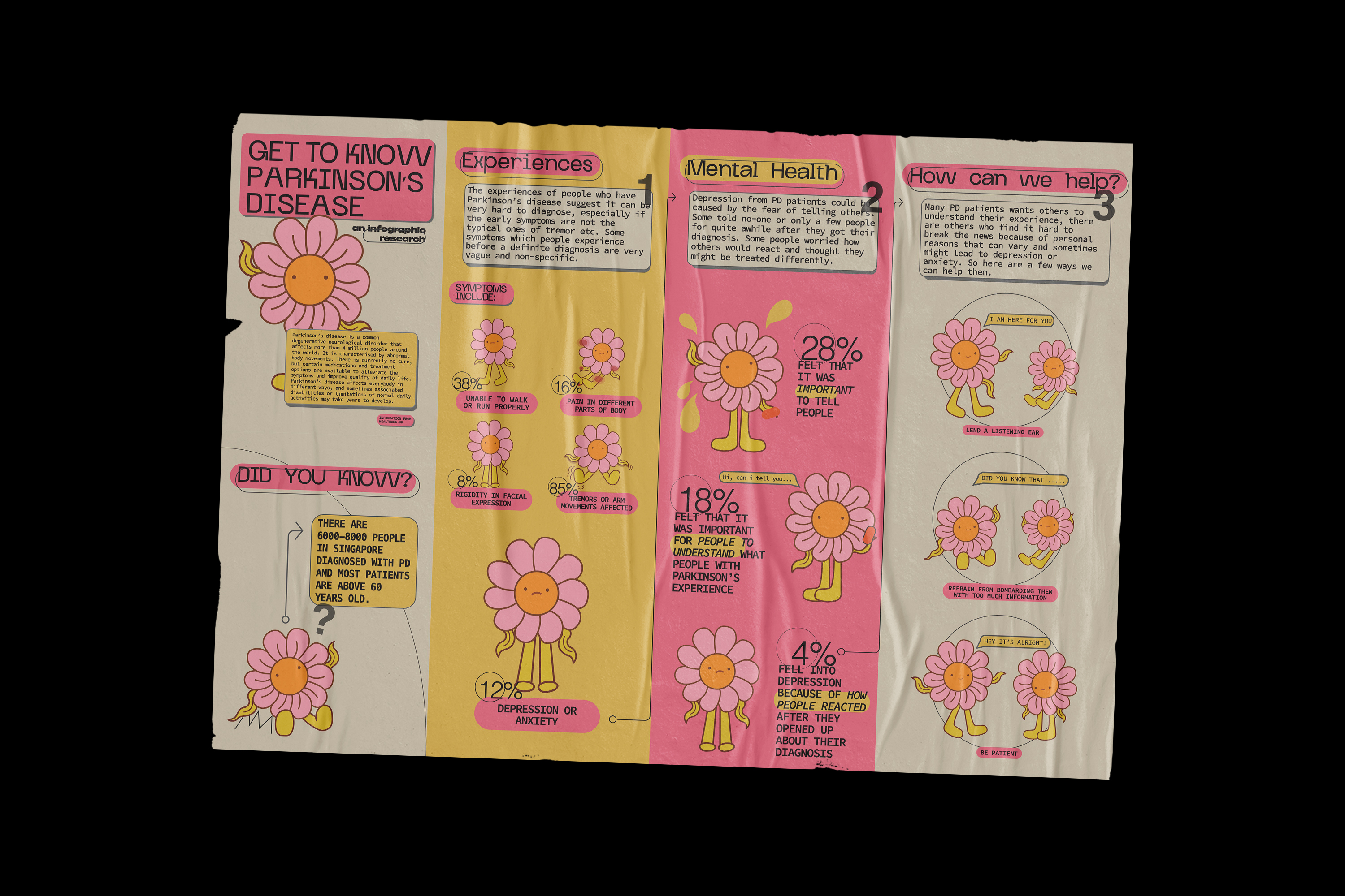


297 x 420 mm
Poster, illustration.
infographics
Poster, illustration.
infographics
Introducing a series of infographic posters designed to raise awareness about Parkinson's disease and foster a deeper understanding of Parkinson's patients. Inspired by personal experiences caring for my own grandfather who battled Parkinson's, these posters aim to illuminate the challenges faced by individuals living with the condition and provide insights into how to better support and empathize with them.
Each poster is meticulously crafted to convey essential information about Parkinson's disease, its symptoms, and its impact on patients' lives. Through visually engaging graphics and clear, concise messaging, viewers are invited to learn about the complexities of the disease and the daily struggles faced by those affected.
I hope these posters serve as a powerful educational tool and a beacon of hope for individuals and families navigating similar experiences. Together, let's shed light on Parkinson's disease and foster a more compassionate and informed community.
2021
︎︎︎Social Media for NTU HALL 3
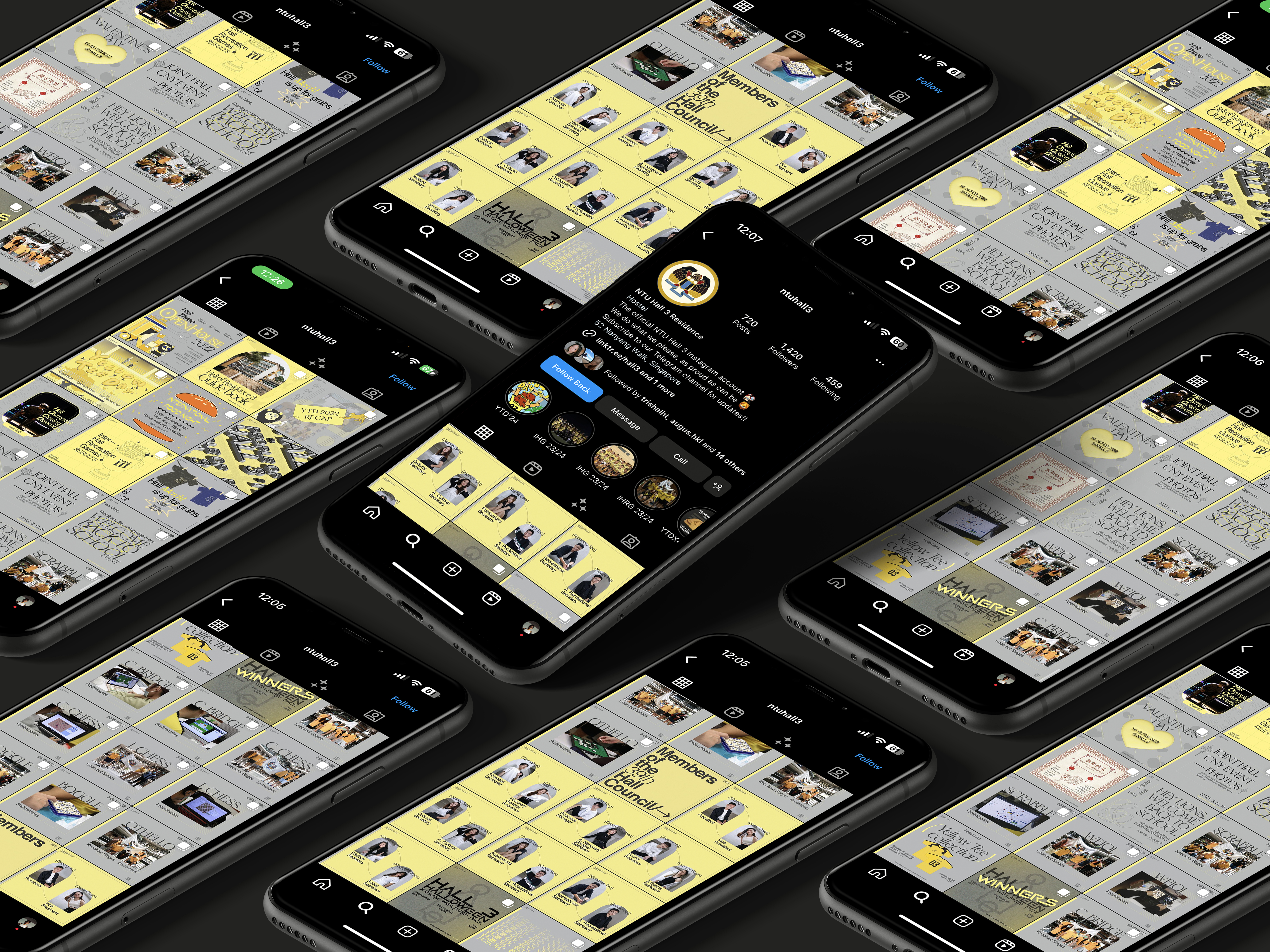
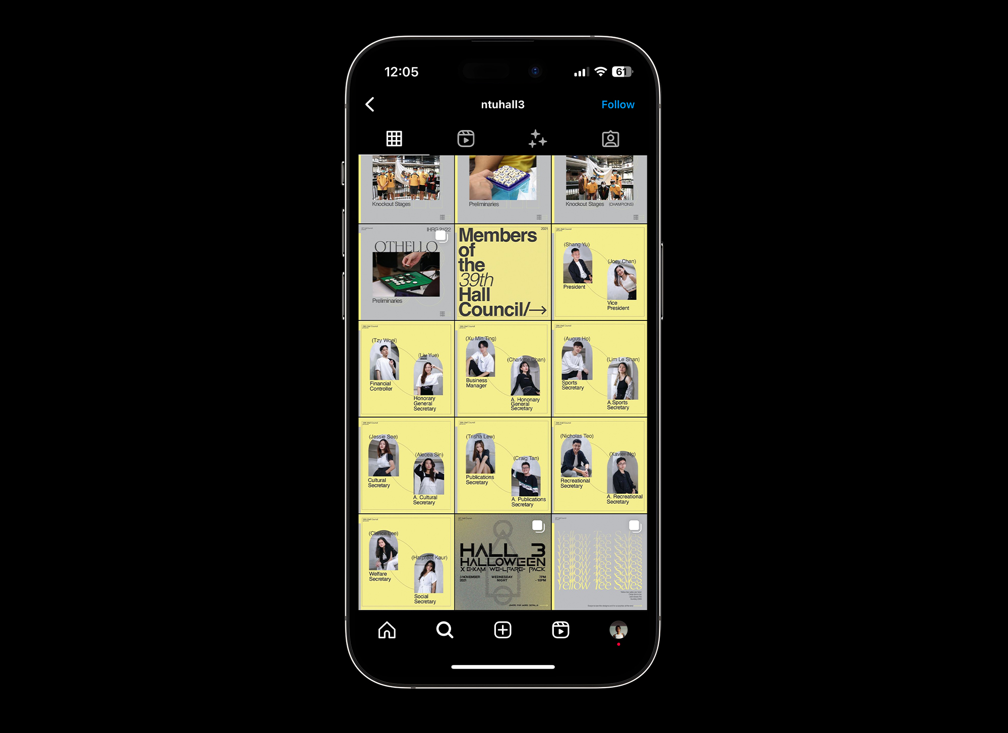


1080 × 1080 px
Social Media Assets,
Social Media Design
Presenting a comprehensive collection of social media assets I created during my stay at NTU Hall of Residence 3 from 2021 to 2022. This entires year worth of social media assets encapsulates the spirit and energy of my journey within the Hall, offering a visual narrative of my dedication and passion.
Head over to @ntuhall3 for more!
2021
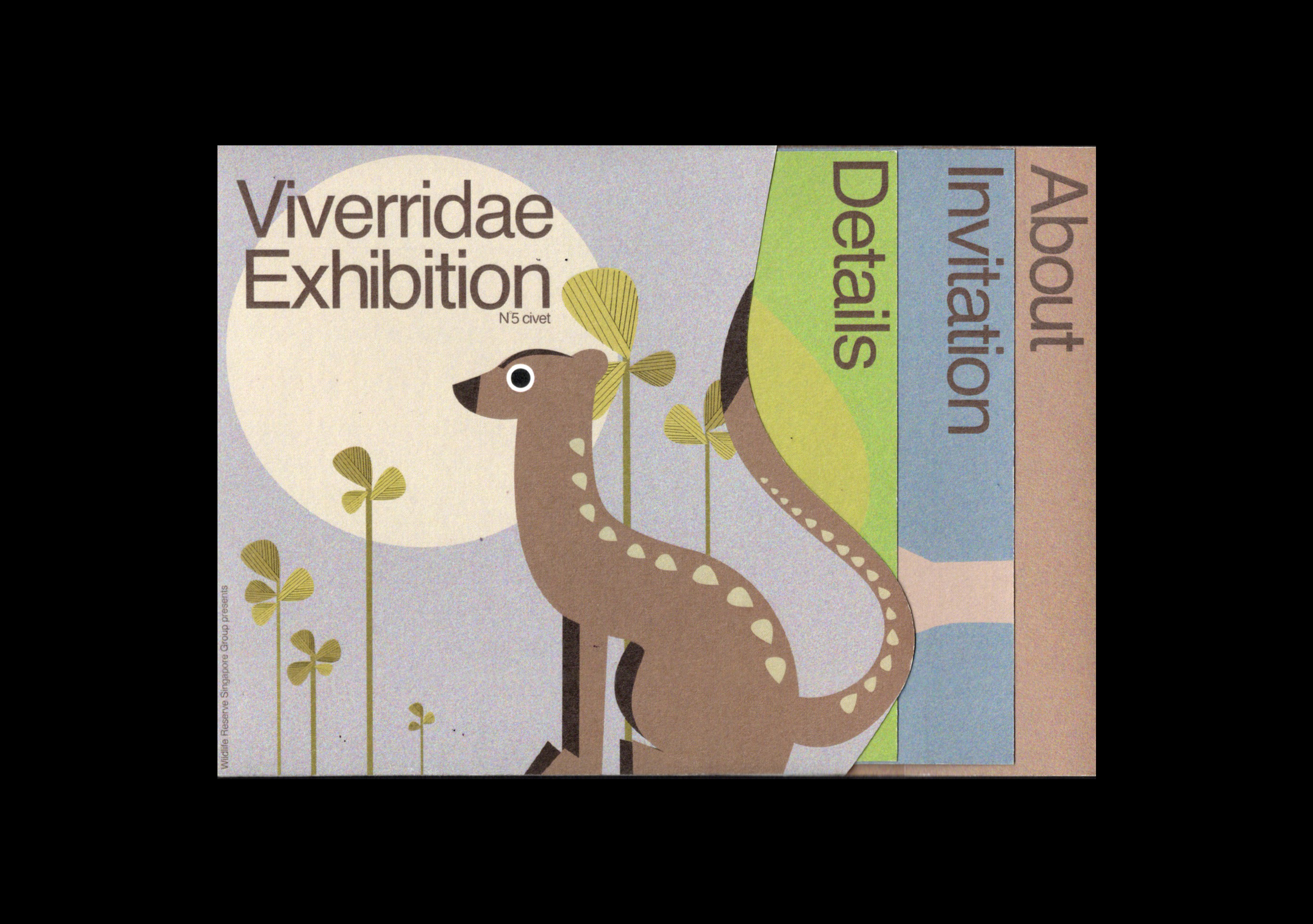
︎︎︎A Viverridae Exhibition

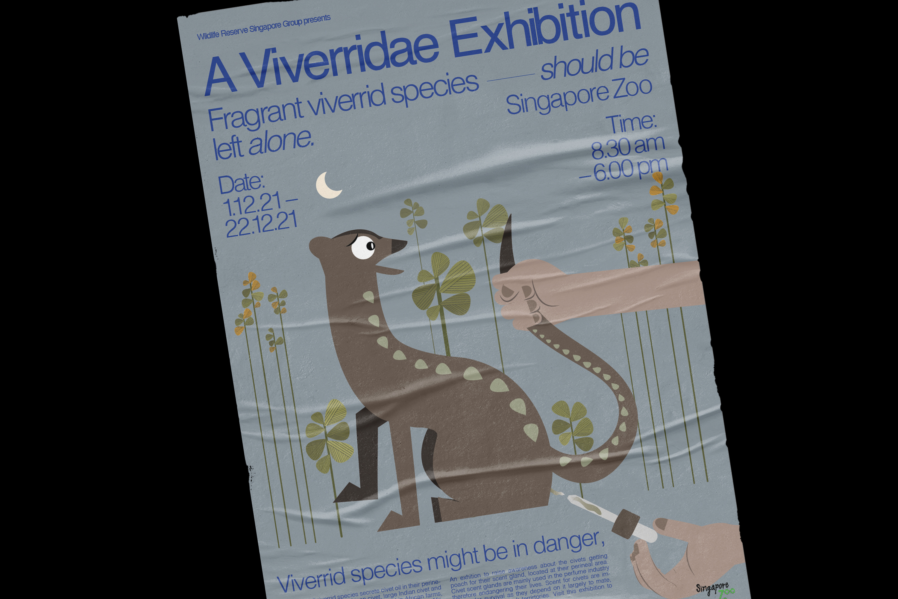


420 x 594 mm
Poster, Printed,
Gloss
115 x 160 mm
Invitation card,
Printed, Matte
Come along on a journey into the heart of Mandai Zoo Singapore, where we reimagine invitation cards and posters, all centered around the captivating civet cats. Diving deep into the captivating world of civet cats, we're on a mission to share the story of these incredible creatures, their endangered status weighing heavy on our hearts due to the exploitation of their scent glands.
Through vibrant colors and imagery that speaks volumes, we're breathing new life into the struggle of civet cats, hoping to spark a connection between visitors and these majestic beings. For us, this project isn't just about design—it's a personal crusade to protect these animals we've come to love.
So, step into our world as we explore the lush landscapes of Mandai Singapore, where each invitation card and poster is a testament to our dedication to preserving the future of civet cats and all endangered species. Together, let's stand as guardians of our natural world, ensuring its wonders endure for generations to come.
2021
︎︎︎thoughts out LOUD!

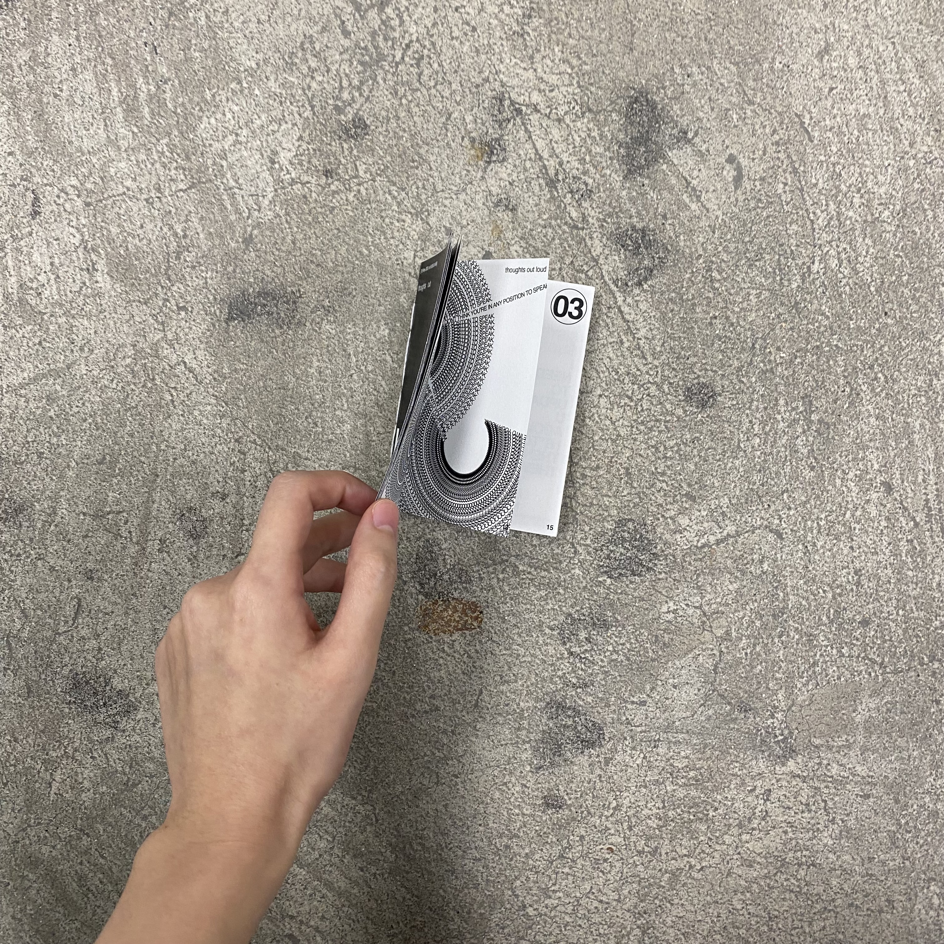


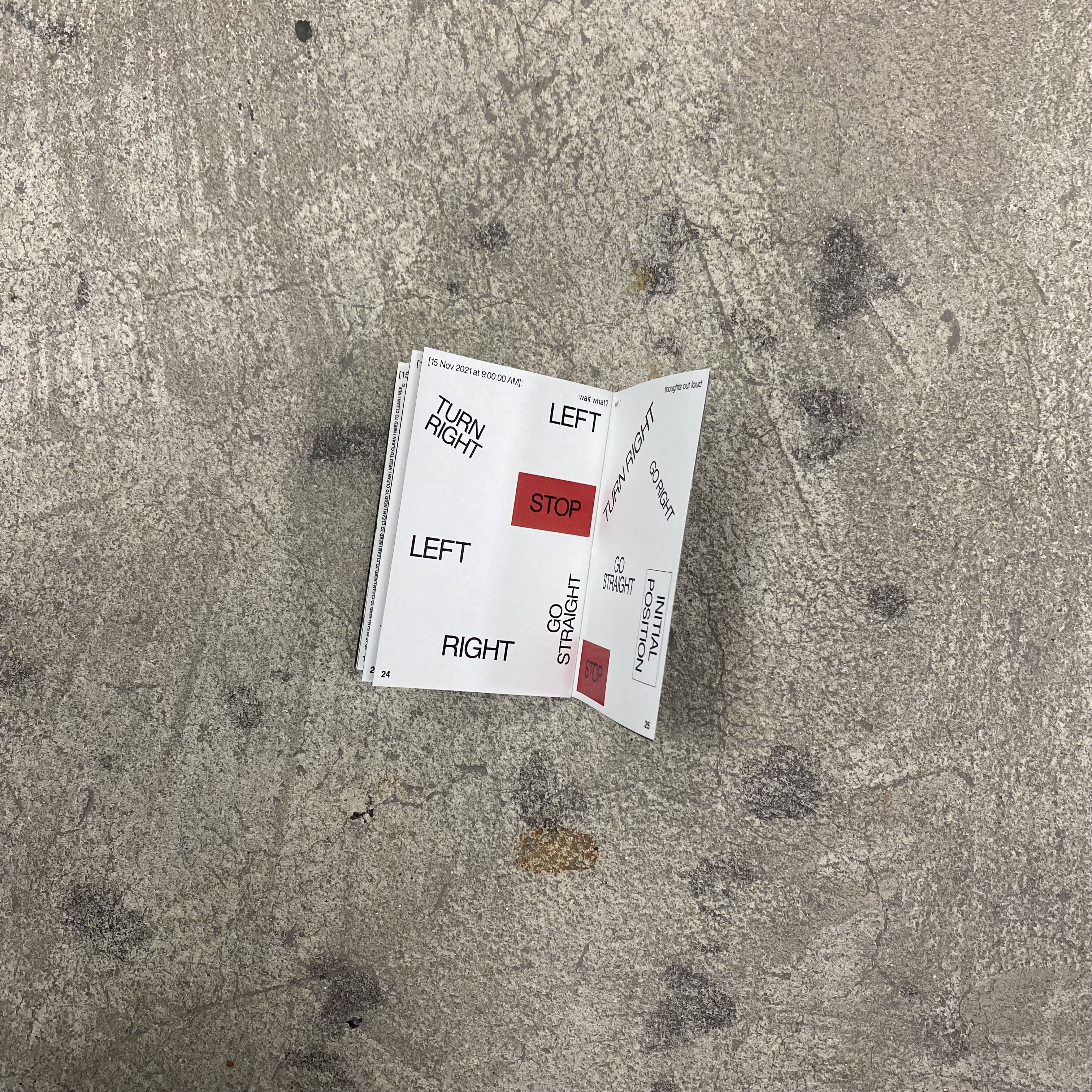
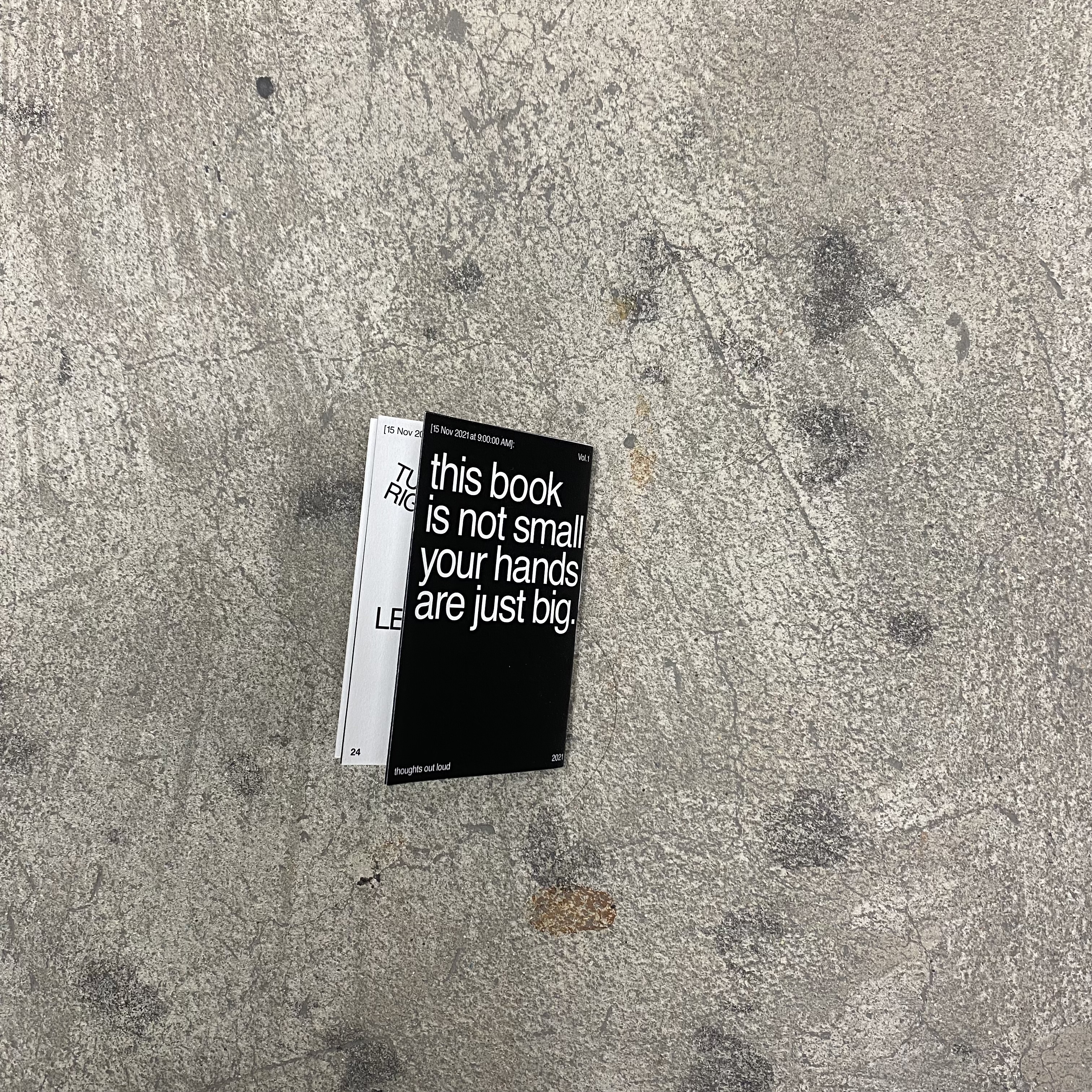

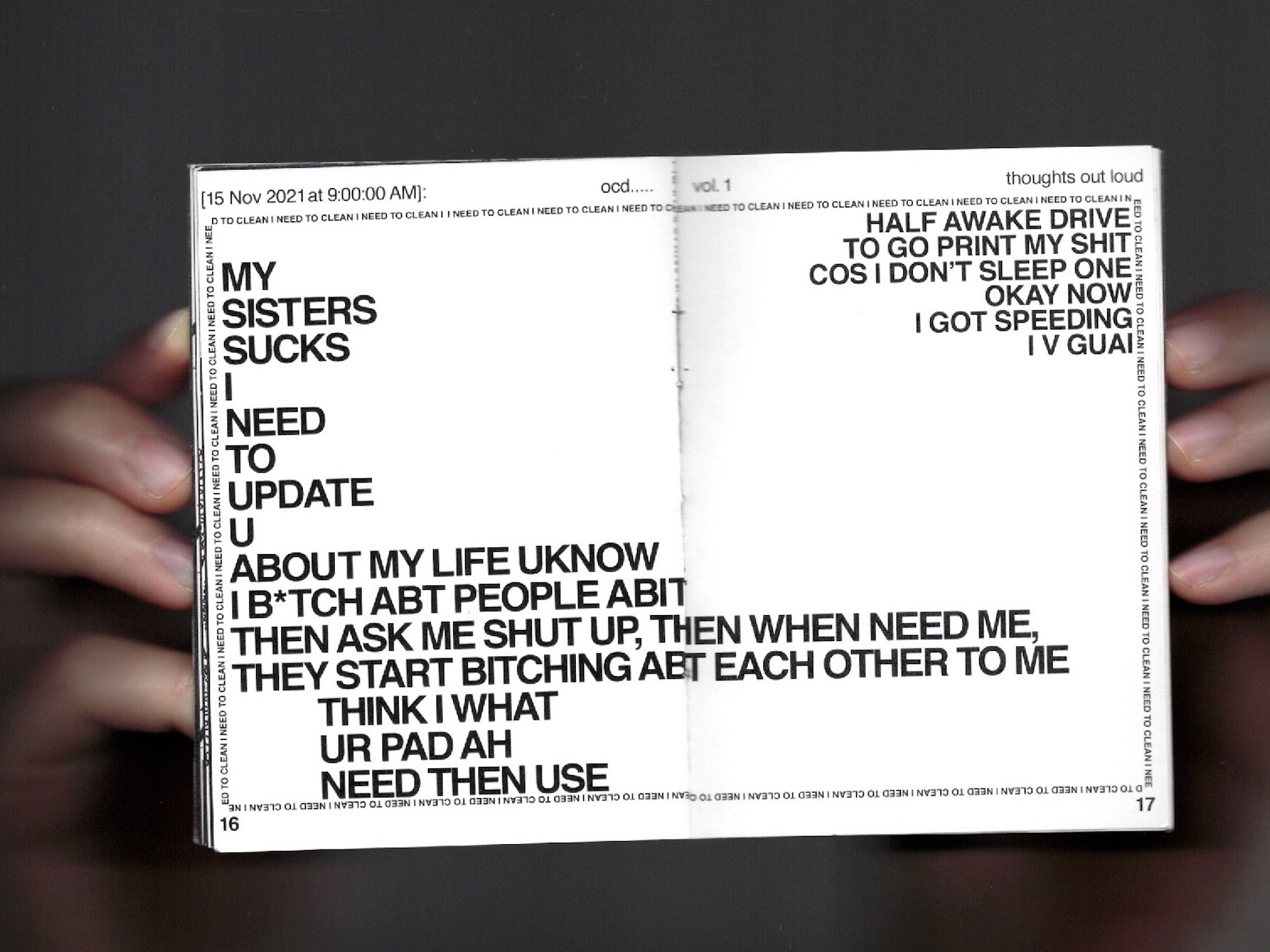

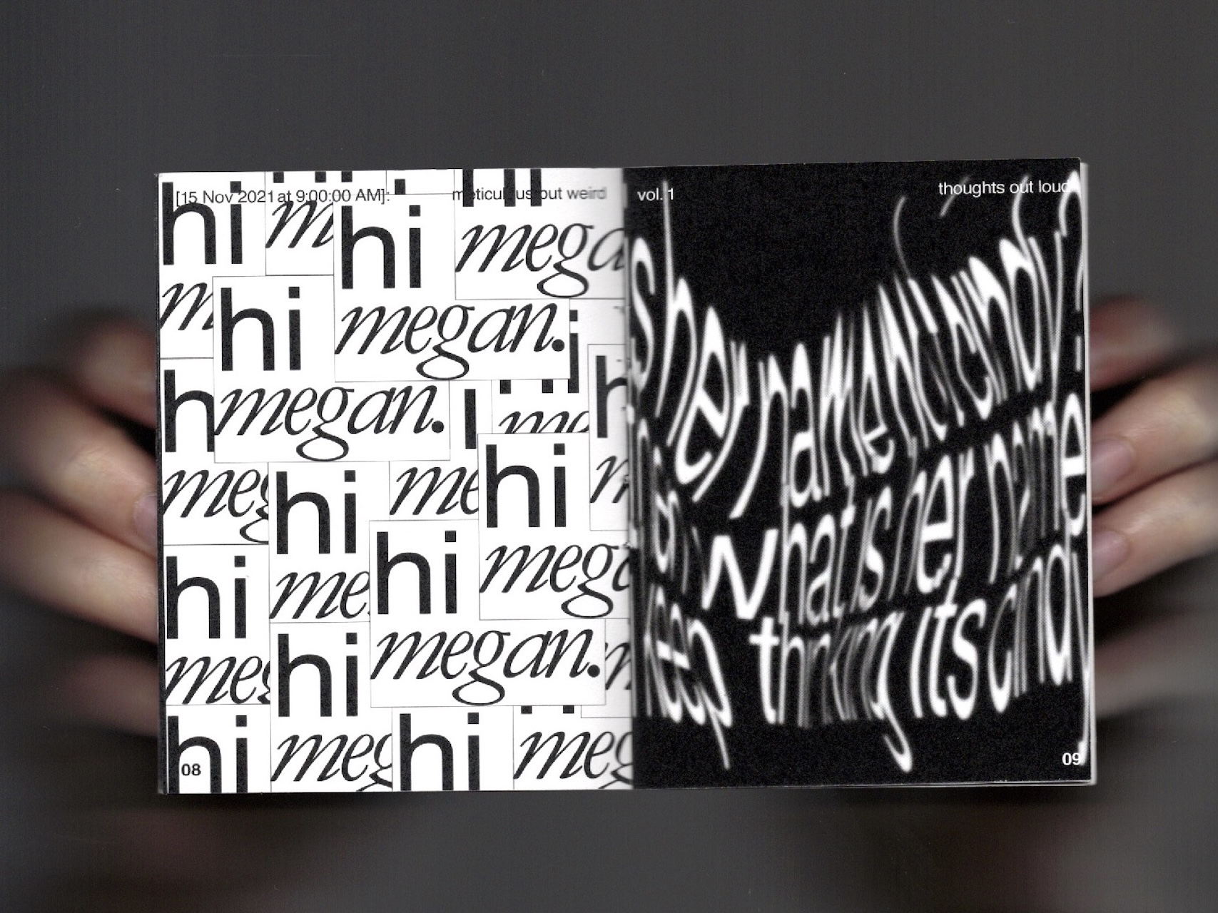
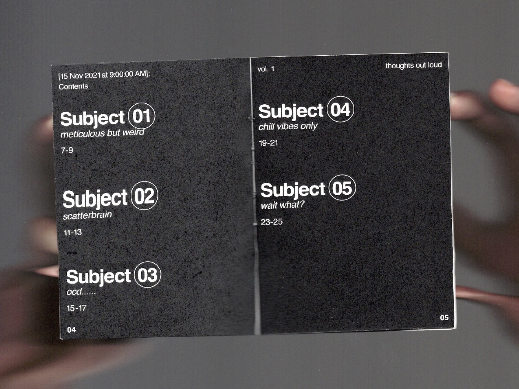

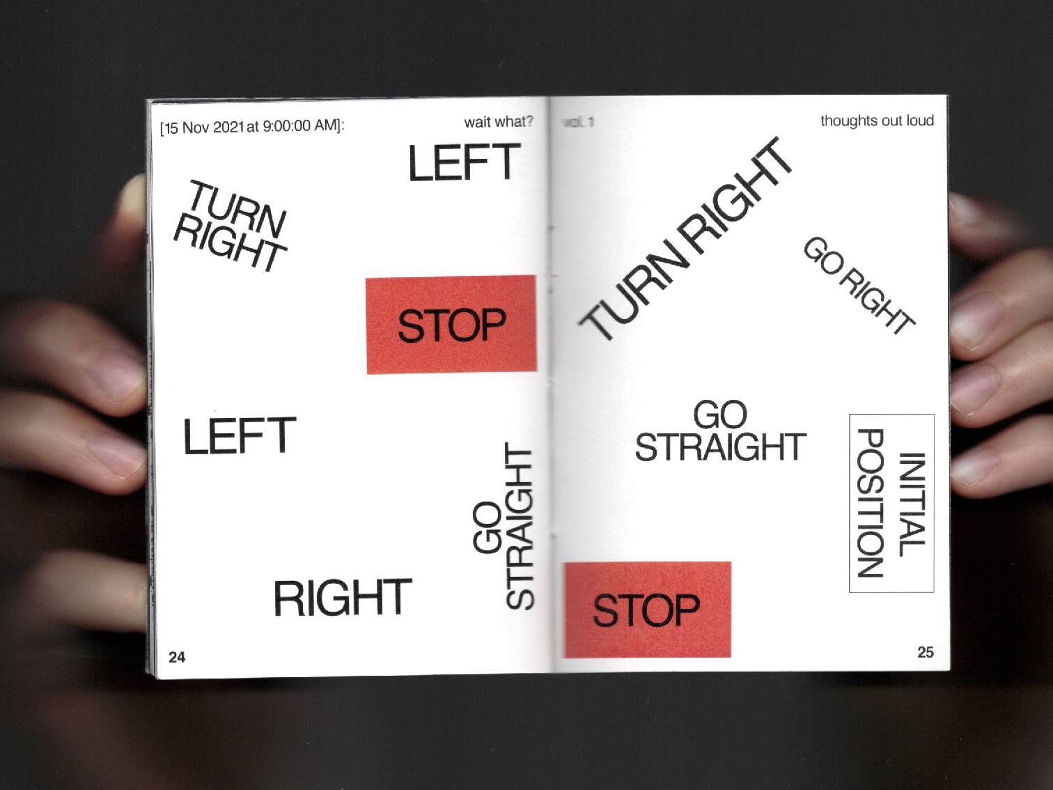
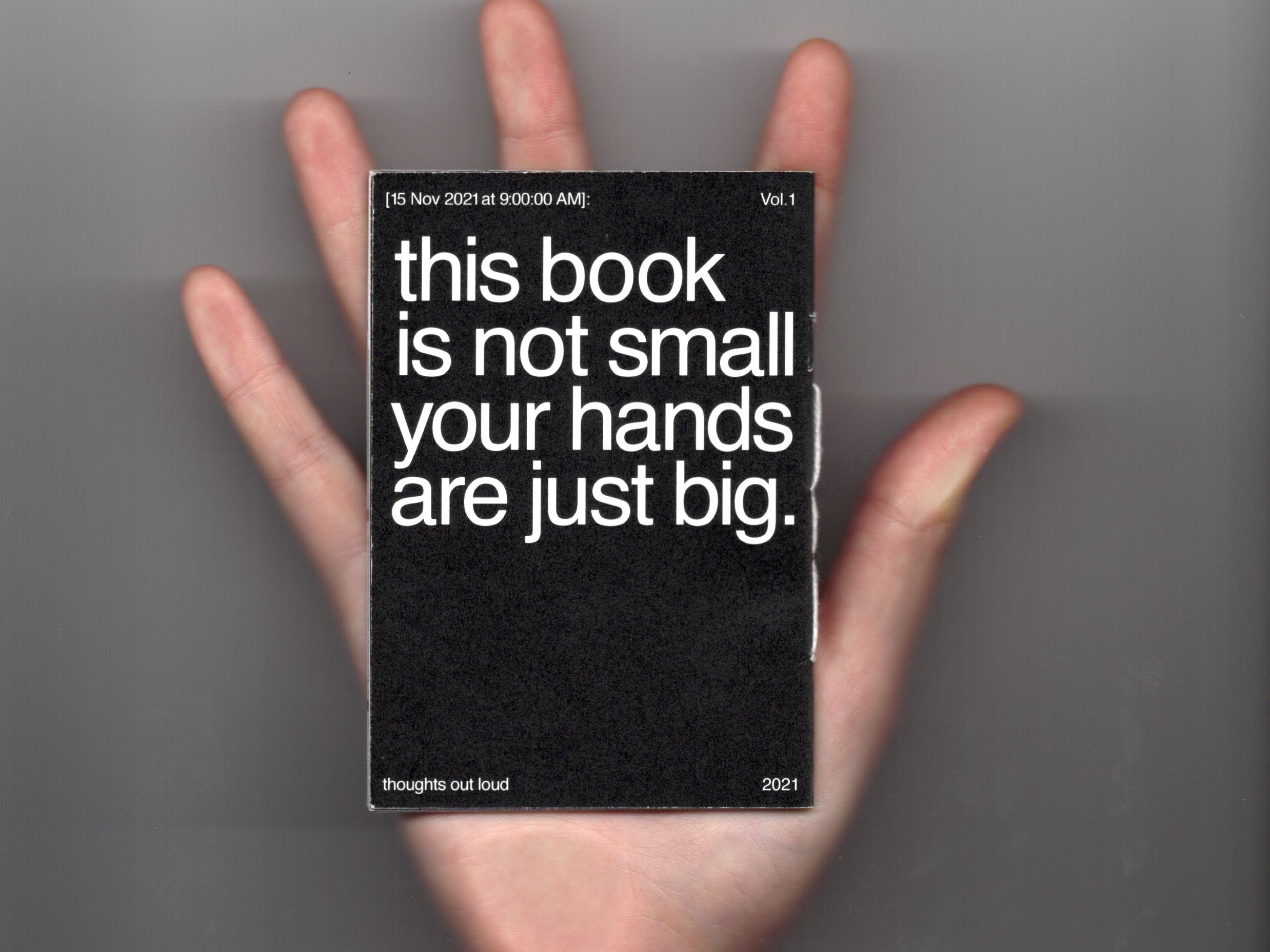
74 x 105 mm,
Experimental Type Zine,
Printed, Saddle Stitched
Experimental Type Zine,
Printed, Saddle Stitched
'thoughts out LOUD!'—a project that became my lifeline during the solitude of the pandemic. Born from the depths of isolation, this journey digs into the rich mosaic of personalities among my closest friends, capturing their essence through the art of typography. Each spread painting a vivid portrait of their unique quirks and idiosyncrasies.
As I navigated the unknowns of social distancing, these conversations with no context became my companions, offering solace in moments of loneliness and uncertainty. Through this project, I found a way to stay connected, to bridge the physical distance and hold onto the threads of friendship that bound us together.
'thoughts out LOUD!' isn't just about documenting conversations; it's a deeply personal journey—a testament to the resilience of human connection in the face of adversity. It's a tribute to the laughter shared, the tears shed, and the bonds that grew stronger amidst the chaos.
2021
︎︎︎Love Island Baby!

illustration
Love Island UK TV show depicted in art nouveau style~~~ just for fun!
2021
︎︎︎Helvetica
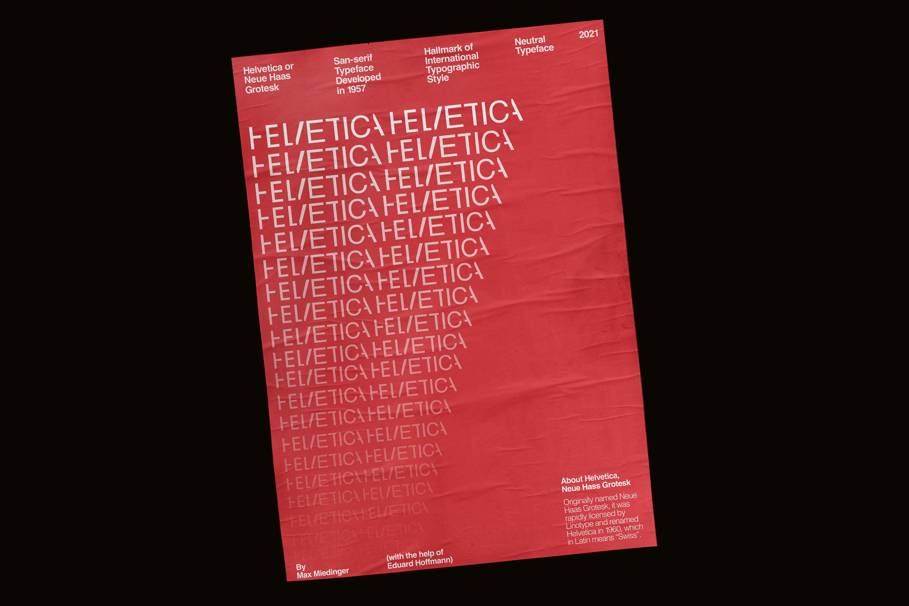


420 x 594 mm,
Type Poster
Type Poster
A poster tribute to the Helvetica typeface.
2021
︎︎︎Hold my Hand
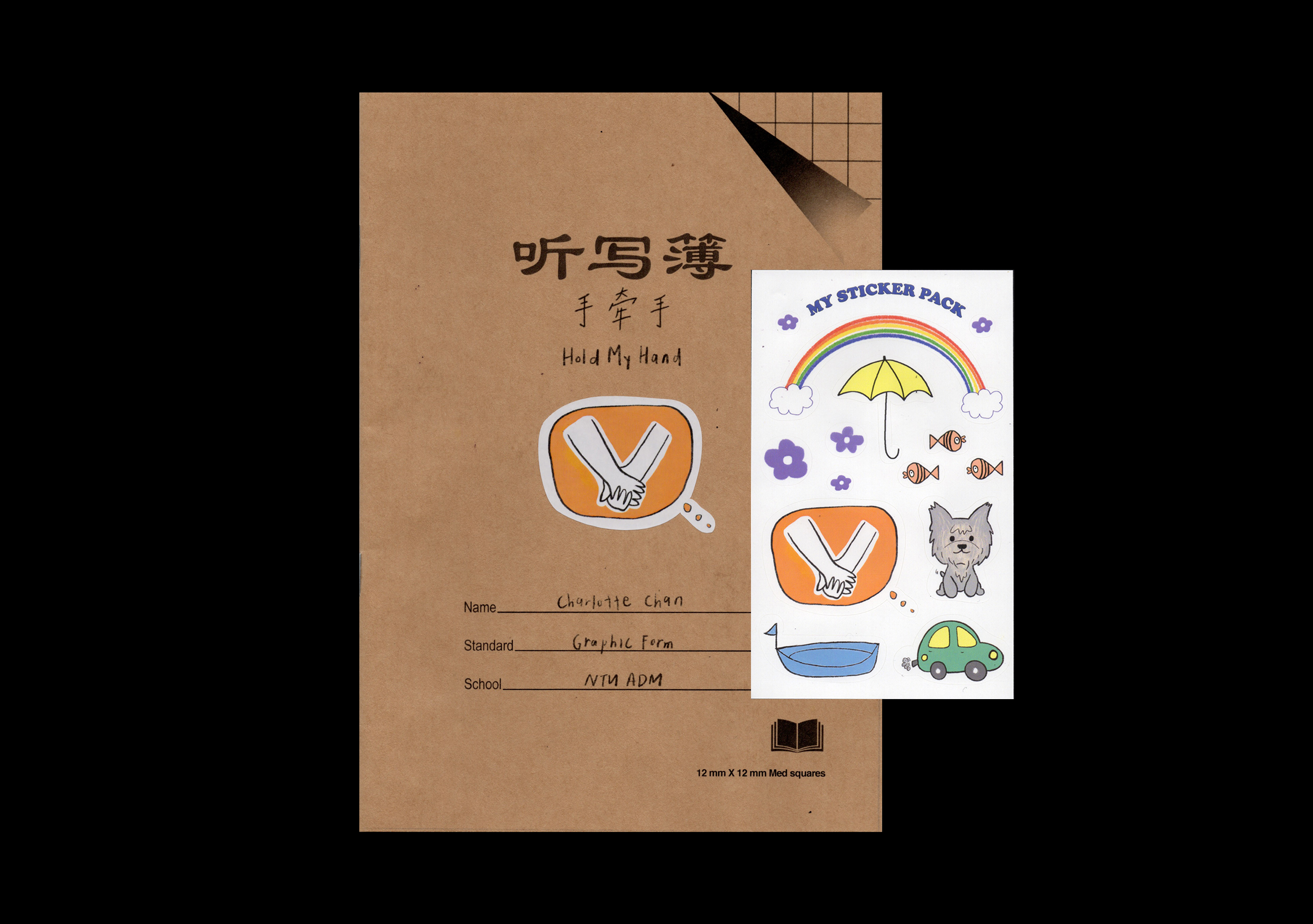
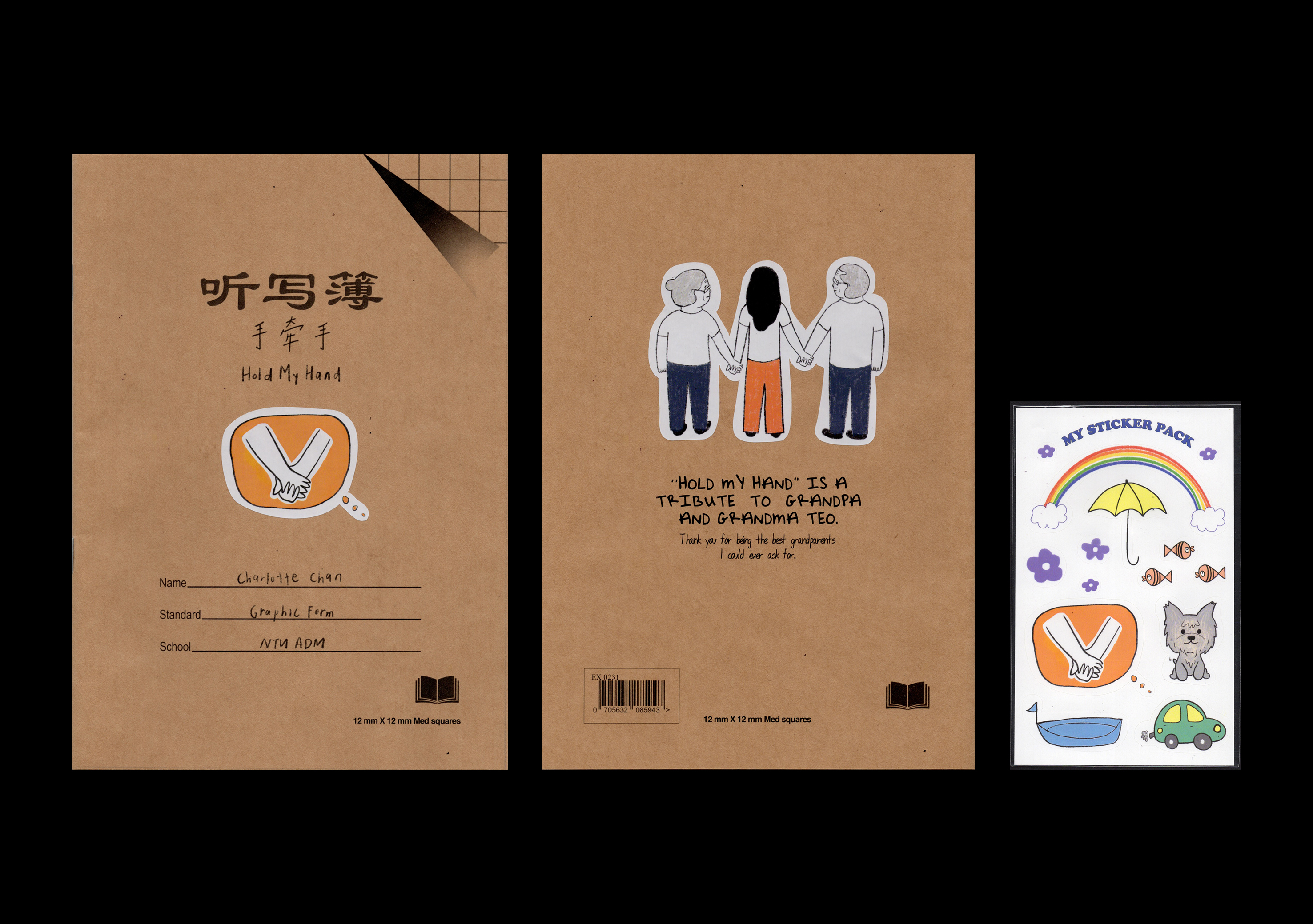
148 x 210 mm
Zine, Printed
Saddle-Stitched
Zine, Printed
Saddle-Stitched
'Hold My Hand’ is not only a stroll down memory lane, it is a heartwarming tribute made for my very own po po and gong gong —grandma and grandpa in Chinese. This project is really close to my heart—it's like pouring out all the love and gratitude I have for my amazing grandparents. You see, my childhood was a tapestry woven with threads of their boundless love and wisdom. Their home was my sanctuary, a haven where every corner whispered tales of warmth and plenty of affection.
I can still remember vividly the soft embrace of their hands, as they guided mine through the intricate strokes of that old Chinese grid workbook. It was in those moments that their love blossomed into my very being, shaping me into who I am today.
'Hold My Hand' isn't just another assignment for me; it's a love letter, a way of saying thank you for all the times they held my hand and guided me through life's twists and turns. I dedicate this zine to these incredible souls whose love continues to light up my path, forever intertwined with who I am.
design + illustrations made by moi.
2021
︎︎︎My Dream Job


297 x 420 mm
Poster, illustration,
Visual Representaion
Silkscreen
Poster, illustration,
Visual Representaion
Silkscreen
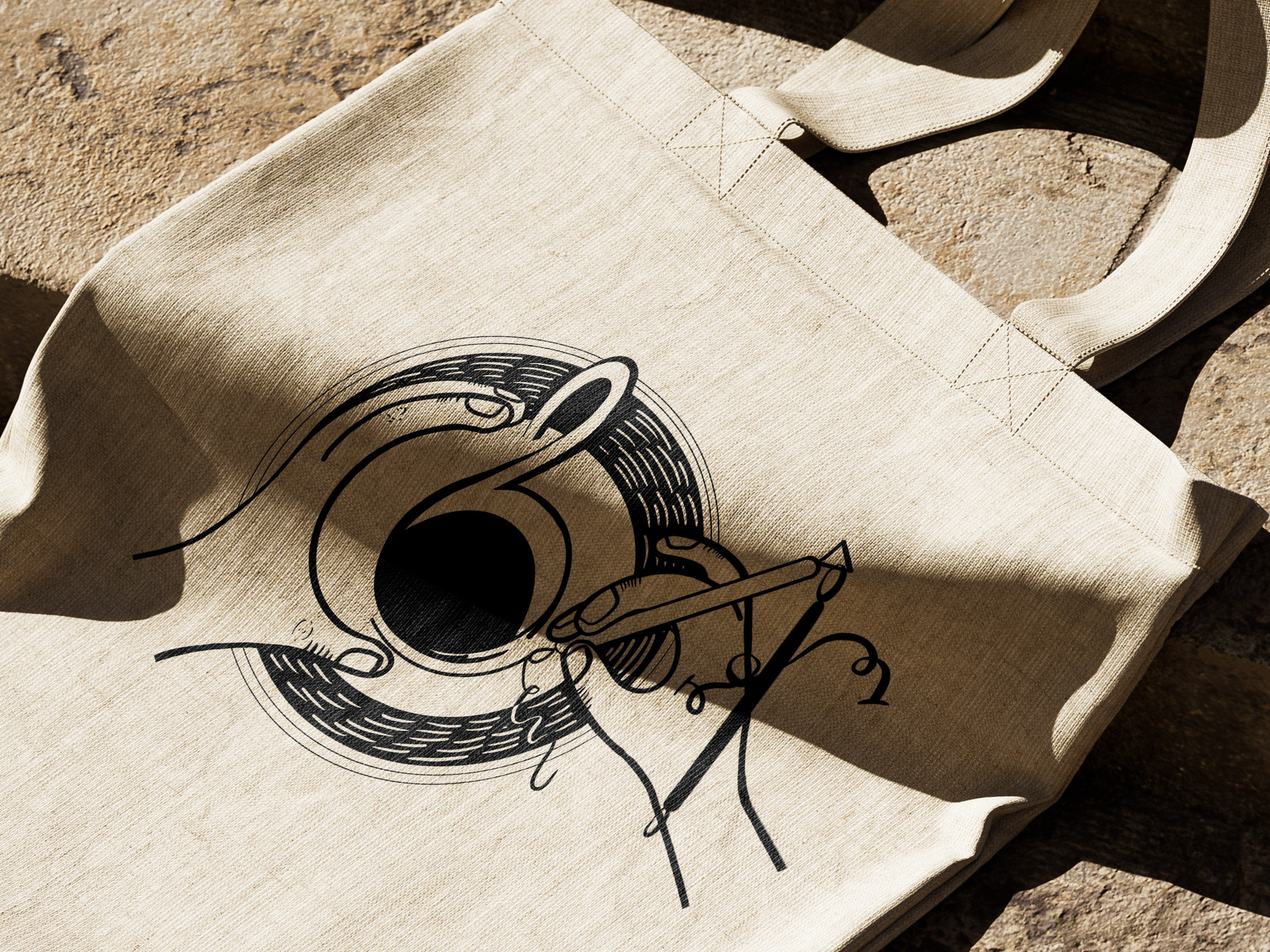
Enter into the intersection of passion and creativity as we unveil a typographic exploration that embodies my name in short 'Char.' Each letter a canvas, each stroke a narrative, this project merges the realms of design, illustration, and personal aspirations. Every element is a testament to the dreams that fuel my imagination. Through a seamless fusion of illustrated and visual representations using objects, four dream jobs emerge, each woven into the fabric of my identity.
As the design transitions to silkscreened tote bags, the narrative continues, offering a tangible embodiment of ambition and artistry.
design + illustrations made by moi.
2021
︎︎︎
OUR SELF PERCEPTION IS WARP
AND WE ARE IN CONTROL
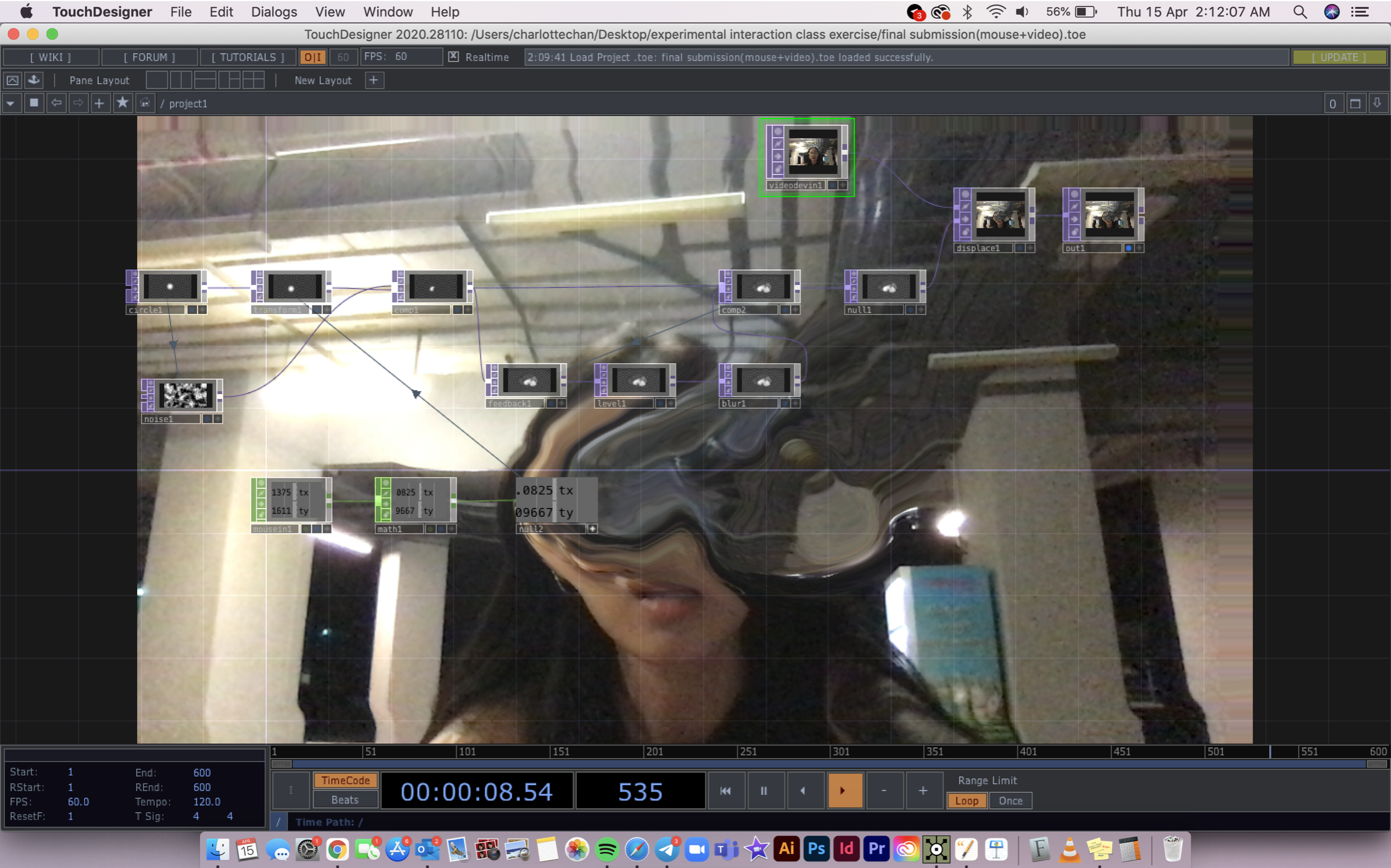
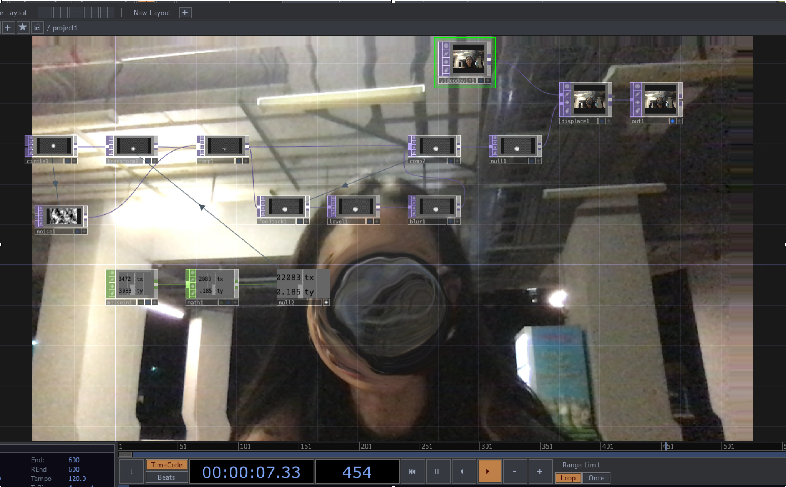

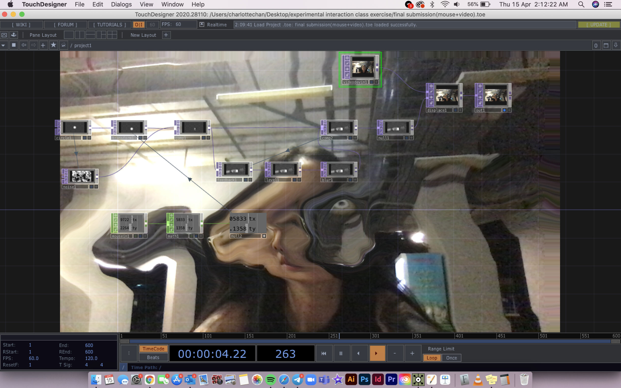
Still Frames,
Touch Designer,
Interactive,
Touch Designer,
Interactive,
This is an interactive documentation on how social media has affected the way we view ourselves, however we are in control on how we think, feel and react in the social media world. If we allow to negativity to seep in and conform to the norms of how society view…. us…. We warp the way we self perceive. I feel that issue is very prevalent in our generation these days therefore in this project I would like to explore that.
This project consists of a webcam video and mouse interaction. the mouse (that we are in control of) is warped so every time it goes over anything on the screen it becomes deform. Sit in-front of the webcam and show how you feel. Can you conform to society norms and feel alright?
2020
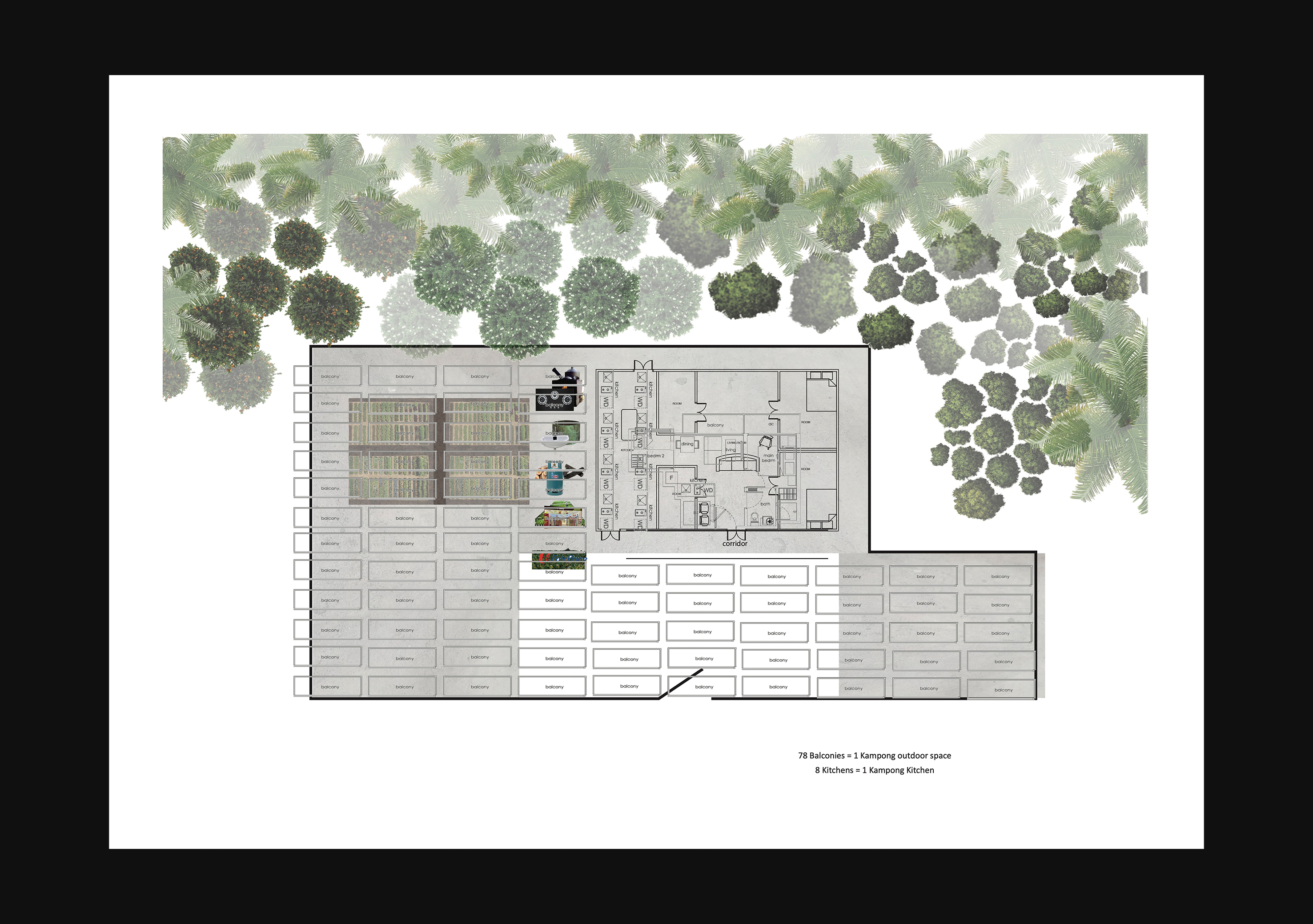
︎︎︎Upside Down Orchards of Babylon


849 x 1189 mm
Architecture,
3D Modelling,
Space Planning
Architecture,
3D Modelling,
Space Planning
‘Is sustainable life worth the effort? the problem is that none of us have lived a sustainable society so it is hard to imagine what it’d be like’
The 'Upside Down of Babylon' is an innovative housing community designed to integrate fruit trees into its structure, drawing inspiration from the sustainable practices of Singaporean kampung life. By reimagining the traditional kitchen as a central element, this architecture seeks to foster a reciprocal relationship with nature and promote self-sufficiency. Through the revival of ancestral practices, it aims to evoke a deeper connection to our heritage and cultivate a sense of unity across generations.


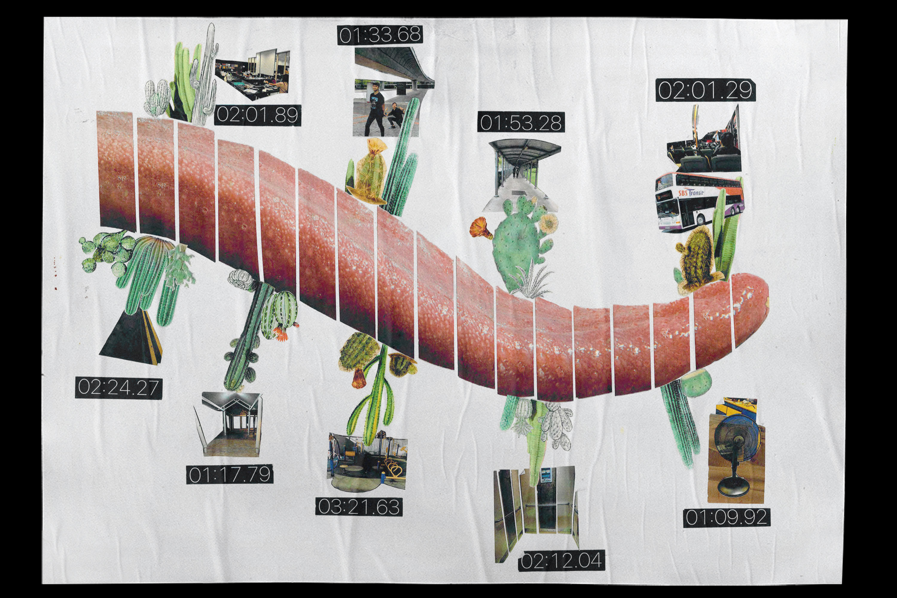
849 x 1189 mm
Architecture,
Process
Architecture,
Process
Captured within these process images is the evolution of 'The Upside Down of Babylon' project, which aims to integrate fruit trees into modern housing communities, echoing the sustainable ethos of Singaporean kampung life. With a focus on reimagining the traditional kitchen as a central hub, this architectural endeavor strives to nurture a symbiotic bond with nature, fostering self-sufficiency and sustainability.
2017
︎︎︎Human Interface —Dryness
420 x 594 mm
Collage,
Design Research,
Process Documentation
Collage,
Design Research,
Process Documentation